Friday, September 30, 2011

Step Out Of Your Comfort Zone - Pt 2

Hi it's Pam again sharing another day of stepping out of your comfort zone. Please refer to last Friday's post to see my first ten ways of stepping out of my comfort zone.  Here are ten more pages and how I stepped it up for each page!

1. Use digital circular text in a cool way.
This first page I created in April of 2008 utilizes a pre-made digital circle template and repeating it over and over within the next line. This was totally new to me - I just went with an idea!  I created it using this technique:
1.  Open circular text path in Adobe Photoshop Elements.  I used Jen Lessinger Follow the Path.  Go to File, new document, dimensions 3600 by 3600 pixels, 300 dpi, RGB color.  Click on the move tool.  Drag the circular text onto your new document. 
2.  Place the circular text onto the left side of the document with only half of it showing.  Click on the sides to resize shrink or enlarge your text. Click on the Horizontal Type tool and type in your first line of text.  I used the font Garamond, size 40, black color.  Click on the move tool again.  Rotate the text in the half circle to fit from end to end on the left side.
3.  Click and drag another circle path onto the document.  Resize it to fit inside the other circle.  Change the font once again to Garamond, size 40, black color.  Type in a new line of text.  Rotate as needed to fit inside the larger half circle.
4.  Repeat this step until you have all of your text.  Make sure that each half circle is size 40.  Go under Layer and flatten your document.  Print the desired size to fit the layout.


2. Create your own die cut paper.
On  my next page (created in June 2008) I actually used my Coluzzle (which has been discontinued forever :( :( ) to cut out circles which were connected. There must be another way to achieve this look, just not sure how? This layout is based on a sketch by Creative Scrappers.

3.  Use many colors in a interesting way - get inspiration from another scrapper.
This was totally inspired by a page by Elizabeth Kartchner that was in CK magazine. This layout (created in Jul 2008) was way out of my comfort zone.. I wanted to make something similar but different so I again used my Coluzzle and picked lots of monochromatic colors to create this cool look.

4. Use Photoshop Elements to create a neat wavy look.
This layout I created in Jan. 2009 shares how I was really trying to challenge myself. I used the cookie cutter tool with three photos that I cropped. Next, I added text to fit the empty space. :)

5. Make design pop by using black and white photos and lots of bold colors.
Here is a page I created back in Jan 2009 using my favorite colors in a fan design. I haven't experimented too much with GIANT shapes, so this was the first time I really went with it. See how much the photos pop when you use color and black & white. You can see a template very similar to this design here.
 
6. Go with a giant flower design.
Here is a page that took lots of planning to create a giant flower which was challenging. I created this page in Jun. 2009 and I designed it all in Photoshop and printing each template out to be traced over paper. You can actually download this template here.

 7. Let the motion in your photo inspire your design.
Here is yet another page (created in July 2009) where I really stepped out of my comfort zone. I was inspired so much by the curvy slides I created a page that would reflect that. As you can see there is lots of motion in this page. A very similar template is available as well here.

8. Go hybrid for almost an entire page!
This page created also in July 2009 shows how I went almost all hybrid. Each square was created out of digital paper and printed out. I also edited the photo in Photoshop Elements. The only real things are the text paper and background kraft paper.

9. Use pop dots to create a eye popping page.
I created this in June 2010 and it was ONE of the first times I used pop dots a lot of on a page. I feel like I missed out on pop dots for years. For this page, the challenge was to create a sort of stop-go page with my soccer photos. Pop dots did the trick for me.

10. Be Inspired by a patterned paper and create a design.
My last page I am sharing completed in Sept. 2010 is displaying how you can be inspired by patterned paper and create your own design. This was inspired by a piece of Bo Bunny paper I own. I challenged myself to step out of my comfort zone and draw the water splashes.


Next week I will be sharing examples of how the contributors stepped out of their comfort zones. Want to share how you stepped out of your comfort zone? Send me an email at scrappingpam73@yahoo.com with your page and how you got creative! **Btw- if you sent me an example last week please send it again. I was having trouble with deleting emails last week.

Thursday, September 29, 2011

Some Easy Ways to Finish Chipboard

With the growing popularity of chipboard use on projects, I thought I would share some of my favorite ways to finish raw chipboard.

On the shells, I first applied snow writer by Deco Art with my finger for texture, and then added some soft pink and brown chalk ink around the edges.

Here I used Tim Holtz crackle paint and light brown chalk ink on the edges for definition.

Simply pink acrylic paint on the dress form - so easy!

I stained the clock with walnut ink for a vintage look. Gets really dark in the cracks - so awesome!

A little Tim Holtz distress ink and gold Stickles on this flourish.

This rustic look is simply Tim Holtz distress ink applied GENTLY, directly from the ink pad and leaving some spots bare.

Here is Glimmer Mist at it's best - saturated and shimmery.

Here is more Glimmer Mist in a gold and then bronze Stickles over top on the edges.

Two more great ways to finish chipboard are glazing for an epoxy look and stamping painted chipboard - can't wait to try these techniques out too so stay tuned!

Dusty Attic Chipboard shown in this post is available through my Etsy shop at http://www.etsy.com/shop/vickyalberto. Christmas chipboard will be available mid to end of October.


Wednesday, September 28, 2011

Designer Showcase: Ribbons and Twine

This week we are getting all tied up in our Designer Showcase for you!  We are sharing some inspiring projects that use ribbon and twine.  What until you see these!


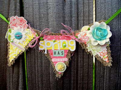
Heather created this amazing banner to welcome Spring.  Everything about this is so darling.  From the gorgeous flowers to the bright colors. Those frayed edges of burlap canvas are just the perfect touch!  Check it out, she has included both ribbon and twine on her project!


This is a jar candle that I altered.  I created a wrap to decorate the candle on a base of recycled cardboard. Now before you go wondering where the ribbon is, let me show you the back....

I used ribbon, laced through some eyelets, to secure the wrap to the candle.  This way I can keep using the pretty design even after this candle is all used up!


Pam has shared this layout with us. Look at how she used the ribbon as a focal design element to her page.  She steps the ribbon right out from the journal spot to add color, interest and flow. Notice too how she set the little bows up as part of a design triangle.  You can just feel your eye moving about her page from the beautiful pictures to the journaling and title work.


Take a look at how Vicky has used ribbon to "mend" her torn papers on this shabby chic page.  There are so many details on the page, yet non distract from the gorgeous photo. Her choice of a sheer ribbon in a complementary color blends so well with the background.  I'm really liking the peek-a-boo doily lace punched edge too!


This first page that Nancy is sharing with us has a few ribbons that really add details to her page.  The floral ribbon is a great divider below her photo.  Then the velvet ribbon adds some texture as well as shape with it's scalloped edge.  And finally, the cream ribbon layered with folds is an adorable fine touch to the page!


This page kinda rocked my socks off! I love the lollipop that Nancy created with twine!  How perfect is that for this page?  I really like the placement in with the flowers too. It's beautiful enough to be a flower!  I've got to give this a try!

I hope we didn't "tie you up" for too long today!  Sorry, couldn't resist the pun!  I do hope you have fun doing some creative things with ribbon and twine.

Hey - if we have inspired you and you'd like to see your pages here, please email them to me at scrappycath(at)gmail(dot)com. We'll feature you here on a Readers Pages post!

Tuesday, September 27, 2011

Dimension

Hi everyone, Nancy here with a fun technique to create dimension on your projects!

As you know, I love playing with my supplies and finding cool new ways to use them. One of my favorite supplies is Glimmer Mist and since I have a new love in Ranger's Multi Medium I thought...hmmm, how would these work together? I have seen people mix gesso and mist...what about these?

For this project I used Tattered Angels Glimmer Mist in Scarlett, Ranger's Multi Medium in matte, a Crafter's Workshop stencil, an old gift card and some craft sticks.
I began by placing a dollop of the multi medium on my mat.
I sprayed a bit (1 pump) of the Glimmer Mist onto my medium and
stirred with the craft stick
Placed my stencil over my cardstock...
and used the old gift card to pull the medium across.
I ended up with some great dimensional texture that I left to dry overnight. The matte Multi Medium has a great, wax-like appearance once dry.
With a quick sentiment stamp and a piece of older Prima Marketing paper, it became a cute card.

These cards are a little more simple than I usually make, but I just loved the detail and dimension that this technique offered.

Thanks for stopping by.

Hugs.

Monday, September 26, 2011

Digi Tip September: Photo Blend

Hello and welcome to this month's Digi Tip!  Today I'm going to show you how to do a photo blend.  Sometimes when you are designing a layout you have a special photo that just begs to be included in a large way.  Yet you may not want it to be "large and in charge" and taking over the entire focus of your design.

This is a time when a photo blend can come in handy.  I was working on pages for an album about a recent beach vacation. When I grabbed all the photos about our night at the boardwalk, there was one photo that I wanted to include, But I didn't want it to be the main focus of my page.  So I blended it and made it into a great background for my design.

This is the photo that I started with. I like that it captured so much of the rides on one of the piers, which just screams with the excitement of the boardwalk.  But if I scaled this photo down to include with the other photos on my page, it would lose some of it's charm.  That's when I thought it would make a great background!
In Photoshop, open the 2 images that you want to blend and bring them together into one document. I opened the digi paper that I am using and my photo.  I want my photo to be blended at the bottom of the digi paper. So I located it there and resized it to the constraints of the digi paper (in this case 12x12).

This is how the layers palette would look.  The 2 images, each on their own layer. Unlock the background image by double clicking it.

Click on the top layer to make it active.  Then click the Add Layer Mask button located at the bottom of the layers palette.
Notice the white border around the layer mask. This means that the mask, not the layer itself, is the active selection.
Select the gradient tool (or press G). 

In the options box, click the arrow to open the drop down gradient picker window. Choose the black to white which is in the top row, 3rd from the left.  Click elsewhere on the program bar to close the gradient picker window.
In the document, hold down the shift key and drag out a black to white gradient to blend the 2 images.  In the image above I've placed lines to show where I started and ended the drag to create the gradient in my example. Since you are actually drawing the gradient on the mask, you won't see it on your image. 

What you will see is a beautifully blended image!  I then played with the blending modes and opacity, added my photos and elements to complete my finished layout.


Tip: Don't use one of your images as your document where you will be blending. Create a new document to drag your 2 images into. This way you won't accidentally save the blended image over your original images.

Have some fun playing with the gradient feature.  You can blend photos together, elements, photos and papers.  Whatever your creative heart desires.

Remember too, if you would like to see your pages featured here, please email them to me at scrappycath(at)gmail(dot)com and we will include you in a Readers Pages post!


Friday, September 23, 2011

Step Out of Your Comfort Zone

Hi, it's Pam here! I don't know about you, but I love a challenge. I really enjoy trying new things and stepping out of my comfort zone. I started scrapping in 2002 and started to challenge myself a couple of years later.  So, I challenge you.. step out of your comfort zone for a day and try new things :) I am sharing a bunch of layout and how I stepped out of my comfort zone in each page and tried something new!

1. Create a paper/banner out of your photos.
One of the first times I stepped out of my comfort zone was in June 2005. I wanted to write about how wonderful a reader my son was, especially because he has just been diagnosed with Autism (thus the title: Diagnosis: A Reader to give him a good diagnosis as well). For the to banner I actually photographs a lot of his book and printed it on a transparency! This was BRAND new for me. Check out what I am referring to.

2. Create photo block and print on one sheet of photo paper.
For my next page I am sharing an example for the same year in November 2005. This is the first time I created a photo block of photo and printed them all of on my sheet of photo paper. This is also the first time I created a uneven frame!

3. Cut and arrange paper around a main circle.
In May 2006, I created this crazy page!! This is seriously the first time I tried anything like this. All papers and arrows pointing in the direction of the photo... check this out.

4. Experiment with negative space.
In this next example I experimented with negative space for the first time. That was fun!! I also created a title which bend around the journaling which was also a new thing for me!

5. Cut paper in unique way and photo edit pictures (like your eye).
In May 2007, I cut out each piece of paper so it was focusing outward. I also manipulated a photo of my eye for this page proving to be a challenging concept. This is one of my all time favorite layouts.

6. Create squares with lots of embellishments and stickers.
Another page is May 2007, I challenged myself to use different types of lettering along with different color of paper and embellishments. This was sooo out of my comfort zone, but I love it!

7. Distress chipboard with paint and ink. 
I created this next layout in Sept 2007. As you might have noticed I don't normally use much ink or paint. I challenged myself big time but painting chipboard pieces and distressing them afterwards.


8. Use a border created by journaling to create a visual circle with eye.
This page created in October 2007 shows how I used the journaling block to serve as the border of the circle. I like creating the false border of the circle.

9. Print off things/names on different pieces of paper and put the on a vine.
This page (created in April 2008) took he out of my comfort zone because I hadn't ever created anything like a vine before.  I drew what I thought a vine would look like and printed off words onto different scraps of paper. I traced and cut out each word an applied to layout.

10. Design a page around one single letter.
As you can see the "Z" in zoo really stand out here. I designed everything to fit into the open spaces. That was definitely getting me out of my comfort zone.

Next week I will be sharing 10 more examples of how I stepped out of my comfort zone. Want to share how you stepped out of your comfort zone? Send me an email at scrappingpam73@yahoo.com with you page and how you got creative!