Tuesday, January 31, 2012

Heather's Sketch & Template # 10

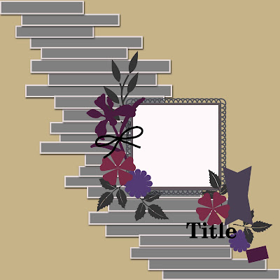
Hi everyone! It's Heather, and I'm back to share another sketch/template with you. I included room for a vertical 5x7 photo, but you could also put several smaller photos in the same space. If you would like to save the sketch to your computer, feel free to right click on the image and then click "Save As".


I asked the wonderful contributors here at Ideas For Scrapbookers to create example pages with the sketch. I was grateful that several of the ladies offered their assistance. Dolores sent me this beautiful page with a photo of her sweet dog! I love the color combination that she used, and the way she kept the scalloped circle accents. 


Marlene made a very frosty, fun page! I love how she substituted the photos inside of the scalloped circles. It's a great way to include more photos in the design. I also love the journaling on her page. It tells such a fun story! I'm a big fan of never growing up.


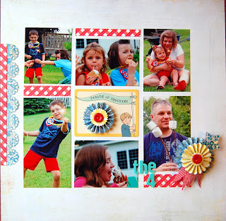
Nancy made this beautiful scrapbook page with four photos instead of one large focal photo. I love the floral accents and the spool of twine. I think her take on the sketch is a great reminder that a sketch is only a suggestion or jumping off point. Changing things up or making different design choices is a neat way to make the sketch uniquely yours! 


I made two examples with the sketch. This is a digital page that I created with supplies from Elle's Studio. (They're available at Jessica Sprague's website.) I stayed pretty true to the sketch but I added some swirls and a big cluster of flowers. I also didn't journal around the edges as indicated on the sketch. 


This is a paper page that I made with a Scraptastic Club kit. I loved the patterned paper with the banners on it, so I chose to fussy cut and use them on my page. The writing on the photo was done digitally in Photoshop Elements before I printed it out to scrapbook. 


Thank you very much to all of the lovely ladies who helped me provide example pages for this post! I really appreciate your help and creativity. 

I didn't forget the freebie! Please click on the link below if you would like to download the layered template that I created in Photoshop Elements.


Monday, January 30, 2012

Serendipity Heart Banner

Serendipity Squares have been popular with scrapbookers and cardmakers for many years.  They're beautiful, fun and so easy- all you need are scraps, a base piece of paper, and some sort of adhesive.  You simply choose some scraps that look good together, tear them into small pieces, and glue them randomly on the page.  When you cut the paper into squares, you end up with pretty squares that look great together.  

I made my own version- Serendipity Hearts!  I started by pulling out pinks (and a few purples) from my HUGE collection of scraps.   

I won a bottle of gold Shimmer Mod Podge recently and wanted to try it out, so that's what I used for my adhesive.  I used watercolor paper as our base.  Here is my paper after I mod podged my scraps: 


When the paper was dry, I turned it over and traced hearts all over. 

Then I cut out the hearts and added a single dot of gold Stickles to each.  Aren't they pretty?  Scraps never looked so good! 


I used Glue Lines to attach the hearts to a piece of gold ribbon to make a banner.


Here's a closeup:


I love how my banner has dressed up the house for Valentine's Day.  I'd encourage you to give Serendipity Hearts a try!

Friday, January 27, 2012

Reader's Pages!

As you know I love reader's pages and I have a few great pages to share with you from some of the readers of the blog! Remember if you have a project using ideas, templates, tutorials, or anything you see from the blog, send me an email at scrappingpam73@yahoo.com and I will happily feature it!


The first page I have is a wonderful double page layout using my Big Heart Template (download it here) by a scrapper named Theresa! She used the template for the left side of the page, which is such a cool idea!! I also love how she scrapped the right side, it goes so well with the template side ;). She created her page using a kit called Twitterpated (which you can find here) by A-Manda Creations. Let's check out Theresa's page!


The next fabulous page was created by Patricia using a template by Heather called Template #9 (you can download it here). The way she used the template is great, the color combinations are great as well as the fun photos! Here is Patricia's page. This page can also be seen on her blog here.


Last, but not least, we have two pages by a scrapbooker named Kelly! She used two of Dolores' templates to create her beautiful page. The first page features Dolores' latest template called Paper Strips Template (you can download it here).  I love the color scheme she chose and the way she used those gorgeous paper strips! She used a kit called My Girl by Tami Miller Designs (you can find the kit here). Check this out :)


The second page by Kelly features Dolores' All Aboard Template (you can download it here). Again, Kelly used that gorgeous color scheme and created this lovely page. :)


I enjoyed these so much, I hope you did too!! Have a great Friday!!

Thursday, January 26, 2012

Multiple Photos In A Layout

Hi everyone! Its Sara here today and I am excited to share a few layouts with you.  If you follow much of my work you probably have noticed I tend to stick with one photo per layout, its just my style.  In 2011 I pushed myself to try and use more than one photo on layouts.  It was a bit of a struggle for me but I did do some and I really love how they turned out.

Here they are!

I found it easier to use more than one photo when they were turned black and white.  This made these 'flow' better for me when creating my layout.


Although, there is more than one photo on this page I did feel like one photo still needed to be the focal point. Therefor, I like to highlight the 'main' photo, in this case with the frame. 


I was pleasantly surprised with this layout. I really had a hard time placing them on the page until I clumped them together!

Ok, this is the same photo but there are three of them, this counts as more than one photo right? :) I really loved using the same photo multiple times, especially if it was a small size.

 I knew when I printed these photos that I had to do a layout that showcased them all. So I was sure to get wallet sizes prints to accompany one large photo.


Lastly this one was a challenge! I was only trying to use up some scraps on this layout. I really love how the simplicity of the layout makes each photo sand out on its own.

So, this is how I go out of my comfort zone!  Be sure to push yourself once an a while. Try something new!

Wednesday, January 25, 2012

Designer Showcase: Capturing Life

As the new year gets off to a start, scrapbookers all around the world have turned up their focus on capturing the story of their life.  Some have done Project 365, Project 52, or Project Life to record the days and weeks as they fly by.  Others have taken to focusing their journaling on One Little Word as introduced by Ali Edwards.  And other crafters are setting resolutions and hoping that they can stick to them! Still others are looking back over the past year and putting together year-in-review pages.

What ever you have set out to accomplish during this upcoming year, know that all of us at Ideas For Scrapbookers want to help keep you motivated and inspired.  We have several Designer Showcase Wednesdays planned throughout the year that will re-visit the projects to help you tell your story, keep you focused on your one little word, your resolutions, and encourage you to meet your goals.

Today we have a few projects to share and some really great resources to keep you motivated.

Cindy is sharing this tag that she created with her OLW (One Little Word) for 2012.  Cindy posted about the OLW project in this post on December 15, 2011.  Cindy started following the OLW project idea at the beginning of 2011.  To keep her motivated and committed, Cindy created a banner. She has the banner hanging in her craft area. Each year, she creates a new tag with that years One Little Word.  I love this idea!  It's there in front of her, everyday, to help her concentrate and reflect on those areas of her life.  


These two projects are Year-In-Review projects that I did for 2010 (top) and 2011 (bottom). Yeah I know, it says 2012 on it, I used it as the cover for our calendar this year, but the photos are from 2011, one from each month. They are both digital designs that I then printed out. On the top one I included 132 photos!  These two examples really show how you can make this type of project quite simple; or more involved.

This is a cool idea for a Year-In-Review page. Pam has recorded a number of things from a past year, in alphabetic order!  The blocked layout is amazing and must have taken a good deal of planning. It really allows for a lot of journaling and photo content to be included on this 2 pager.


This Year-In-Review page by Sara lists a few thoughts that she wanted to jot down. They include things she accomplished as well as things she wants to get done. I love the design of her page, the way her photo is facing in toward the page gives a strong positive vibe,  The butterflies are very uplifting. And I absolutely love her final thought "I am honestly happy with my life". What a powerful statement!


This beautiful page was created by Dolores, digitally.  She has listed her resolutions, clearly and neatly. No avoiding them! They are even stitched down!  Now that is resolved!!  The blooms throughout the page are pretty and show such promise for the coming year!  I really like that date line that Dolores included too, it shows all the months. This is a year long commitment.

This page is a traditional paper page that I did at the beginning of 2010. The last time I actually made a list of resolutions! They are things that I continue to work on year after year.  Since this was made to go in my Book of Me album, I included a photo of myself at the time. 

You don't have to include photos at all. You could make an art journal page that lists your resolutions or One Little Word.  What ever helps keep you on task.  Let's take a look at some great examples both digital and traditional.

Heather created this art journal page digitally.  This just shouts confidence!  The distressing on the page gives me the impression of  the struggles that life can present. But the strength and beauty of the lines, circles, angles, images, and font show that this woman can handle it all!


Nancy created this art journal page using a mix of media.  I see some paints, mediums, stamps, rub-ons, chipboard, doodles, and photos.  I love the way she built up her page. It starts out somewhat free-form and then gains a bit more defined space. Just as her phrase, "organize and purge," is promising. What a beautiful way to remind yourself that finding order and letting go of a few things, can really bring tranquility to life.

Throughout the year, the Contributing Artists here at Ideas For Scrapbookers will continue to provide you with all sorts of creative inspiration, ideas, tips and techniques.  You can use any of these to keep you moving forward in capturing all the wonderful moments, big and small, in your life.  Here are some other resources that might help you with journaling and recording your life:

One Little Word: If you are interested in One Little Word, check out Ali Edwards OLW blog, sign up for her newsletter, or sign up for her class at Big Picture Classes.

Project Life: If you are interested in Project Life, check out Becky Higgins Project Life blog, as well as the physical products, and digital products (available from JessicaSprague.com) to help you organize and record your life.

Tell Your Story Everyday:  Looking for some inspiration, tips and tricks to help you journal, photograph and record your life?  Check out this new site  Tell Your Story Every Day

Are you doing OLW, Project Life, Project 365/52?  We'd love to know about it!  Leaves us a comment about how you are telling your story. If you'd like your life project to be featured on Ideas For Scrapbookers on a Readers Pages post, email me at scrappycath(at)gmail(dot)com.


Tuesday, January 24, 2012

Create a background from Strips of paper!

There are days when I can't decide what paper to use in a layout and I just want to use all of the choices in front of me.  I probably have more fun choosing the paper for my layouts than the embellishments, which somehow seems backwards to me.  Anyway, I thought of using strips of paper to build a background so I could include all the pretty papers I wanted.  Here is the layout I came up with using strips.

I have four different papers here all coordinating colors, but could easily have used even a greater variety.  I like the rich colors in these papers that have a touch of softness.  This is actually digital layout even though when I started out with this idea my plan was to raid my scraps (I have a whole file of them) and do a paper layout.  The kit is called "love yourself" and it is a collaboration by the Scrap Matters Design Team.  If you love paper scrapping, working with strips is perfect for using up those scraps.  Here is my sketch.


For those of you who would like to experiment with strips digitally, I have a template to share.  You may download it at either of the two file sharing sites below.


Hope you look at your scraps differently and give this a try.  If you are a digital scrapper, don't rule out strips of paper when creating those great pages!


Monday, January 23, 2012

Retro Scrapping

Although, I admire chronologicial scrappers, I am an all-over-the-place scrapper. I didn't start scrapbooking until my kids were merging into adulthood so a lot of my projects are Retro (as opposed to Heritage which would be from a different era). My scrapbooks reflect my scattered approach, most of them are a potpourri of my work mixing old and new pictures. The exception is an ongoing project of pages that reflect my kids' "cute-isms".
Needless to say, since I often scrap backwards a picture of the specific event is not available. Another problem I encounter is that my twenty something kids' childhoods were pre-digital cameras, film and development expenses meant that we didn't take as many pictures as we do now. It would be nice to be able to jump in the time machine and go back for the perfect shot, if you hear of a way to do that please let me know. On the possible side, when remembering something cute, don't let missing an exact photo from the event stop you. Just find a photo from same period of time and use journaling to tell the story. The picture on the first layout is from about the same time as the subject matter. 
 Slide out journaling reads: To help prepare Kyle for the arrival of a sibling I took him to a prenatal visit. The doctor let Kyle hear the baby's heartbeat and asked what he thought. Kyle said, "I remember being in my mama's belly". The doctor asked what did you do in there? Without hesitation Kyle replied "think".

The next example uses a picture of the exact day, but you can't always have a camera ready for the money shot - use what you do have.
The last example is from an incident that I did have a camera at the perfect time and place and the picture tells the story.

 
If you spend time with small kids, take a few seconds to WRITE DOWN their cute-isms, they are easy to forget.  Save up those pearls because Retro Scrapping is an excellent way to reminisce.
 

Friday, January 20, 2012

Collection Kit Versatility (Scrapping on a Budget)

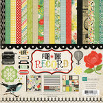
Hey everyone, it's Pam again posting another topic about saving money or scrapping on a budget.  As I might have mentioned before I am on a scrap budget. It is a pretty tight one and I sometimes go to my local Hobby Lobby to find some great deals. I purchased For the Record collection kit by Echo Park while I was there with an idea to make my money stretch! Here is an image of what I purchased. You don't need to purchase this kit to play along, just purchase one based on something you think you can use for a variety of pages.

Echo Park - For The Record Collection - 12 x 12 Collection Kit
Scrapbook.com

I am going to share with you four layouts with different styles and different themes so you can see how I made my supplies stretch and I still have leftovers!!
I used the papers for a Renaissance Festival, my son, my dog, and a family photo. How cool is that?

1. My first page called Nine Years is about my son. This collection works well for boyish pages.  When picking out a kit or paper pack that you want to make last, chose something with some neutral papers like I used here. For instance, I have not used anything floral on this page which is fitting for this theme.  I used letters I cut out to make this even more boyish, plus the number paper strip works great for the age theme. (extras on page: Bazzill Kraft cardstock and My Minds Eye die cut)


2.  On my second page, I went with a different style and a different theme. This paper works really great for vintage or renaissance photos, which is what I did here.  Just creating this leaf theme enhances the whole feel earthy to the page. I used the same collection as above but this has a completely different look! The swirlie and flower elements really go great with my page style. (extras on page: Bazzill cardstock)


3. For my third page, I changed up the style again completely! I went with a more free flowing page but I used the same exact paper line. Adding rounded corners and swirles really changes up the mood of this page. I knew that I wanted a less graphic page and a more lovey dovey page. The floral tag really dressed up my page! (extras on page: Jenni Bowlin butterfly, American Crafts letter stickers and flower)


4.  My last page is of my new puppy, Ollie. Again, I used a completely different look and theme.  Adding the large flower gives this a slightly more soft look for my "new puppy" theme. I used three main colors from the kit that would make my photos pop even more.  The banner gives my page that playful look which also goes along with a puppy theme.  (extras on page: Bazzill Kraft cardstock, Epiphany Crafts buttons, American Crafts letters, and Jenni Bowlin butterfly)


So, now it's your turn.. next time you are shopping, consider buying a collection kit and creating lots of different looks and themes with your kit. You will save money and have fun in the process!