Hi all, IFS is taking a short break! We will be back in a couple of weeks!! Please browse the archives for TONS of ideas!!
-Pam

Wednesday, October 31, 2012
Saturday, October 27, 2012
Heat Embossing
Hi it's Lesley here! Love using the resist method of heat embossing with distress inks, I have done a sample of this here.
You need to have the following: a couple of pieces of scrap paper for ease of using the embossing powder, stamps, embossing powder ( if your choice of stamp is detailed, you will need to use 'fine' embossing powder for best results), a anti static cushion, and a glue ink pad such as 'Versamark'.

The anti static cushion should be rubbed over the entire area that you will be applying your embossing powder and is used to stop any powder staying on the page in any area other than where the ink has been applied.
There is nothing worse than applying heat to your embossing to see little flecks of stray powder outside the design area which cannot be removed. I also tap the page with my finger over the piece of scrap paper to ensure any excess is removed. Gently shake the embossing powder over the stamped area as soon as you have stamped, the glue dries quite quickly. Shake any excess powder that doesn't stick to the stamped area, on to the scrap paper (this can be held in a funnel shape and poured back into the embossing powder container). Apply the heat gun not holding it too close as it will scorch easily.

You can see in the above photo the embossing is showing up nice and clearly.

And I have now added distress ink blending from the outside in. It does not take to the embossed area as the embossing ink resists the ink, if you think the embossing isn't showing up clearly you can carefully give it a quick wipe of with a diaper cleaning wipe.

I have complete the page by keeping the embossed background as my feature. I have used a Chevron mask and added some further embellishment whilst keeping the embossed area clear.
Give it a try it can really make plain paper look very nice, adding black embossing works really well especially with pastel inks blended over and around it.

Thursday, October 25, 2012
Hybrid Halloween Card
Hello there, it's Cathy here today to share a hybrid card with you. 6 days until the little trick-or-treaters come about. At least here in the states. Do you celebrate Halloween where you are? It's one of those "holidays" that people seen to either love or hate.
It's also another reason to share a greeting with others. As a card maker, I love that!! Any excuse to create a card!!


It's also another reason to share a greeting with others. As a card maker, I love that!! Any excuse to create a card!!

I designed the layout for this card in the Silhouette Studio Software. I find myself doing that more and more. For a hybrid crafter it makes things less complicated. It's easy to layout the shapes and design, drag in the digital papers that I want to use. Then I print and cut the various elements and assemble my card. For this card I used Halloween Party Kit by Quirky Twerp. The kit is adorable with lots of cute stuff for making scrapbook pages, invitations, party favors, decoration and more!
The vintage image gets a bit of updating sitting atop all those sassy upbeat patterned papers. To cut the vintage image, I dragged that element in from the digital kit. I traced it in the Silhouette software before printing and cutting it.

Wednesday, October 24, 2012
Designer Showcase: Doilies and Lace
Welcome back for another Designer Showcase. It's Cathy here and I get to show off the wonderful creations using Doilies and Lace that our Contributing Artists have provided.


Marlene shares this page titled "Pina" with us. The page is about a visit to a pineapple plantation. Marlene made the crocheted pineapple doily !! Isn't that cool?? I love the colors and patterns that she chose for this page, especially the lattice that she created behind the photos. It reminds me of the look of a pineapple!

Cindy shares 2 pages with us today. While she says that she rarely uses lace or doilies, I think she has some samples of great ideas for using them! This first one is using lace in a very simple way. I love the way it brings your eye to the journaling. It adds a touch of vintage and charm too. It also looks great with the framing on the one tag!

On this page, Cindy has used a doily in a really neat way. She has placed it as a mat under the title of her page. It helps to highlight the letters rather than placing them directly against the patterned background. It's also a great visual addition of shape in her otherwise blocked design.

This is a card that I made for my niece's bridal shower. I wanted the card to be light and delicate. I thought the doily added a bit of elegance and made a good base for building upon.
As I was preparing for this post, I was thinking that much like Cindy, I rarely use lace or doilies either. I remembered the above card but couldn't really think of other projects where I've used wither. I was surprised to find several examples to share.

On this hybrid card using digital papers and elements, I created a paper doily to accent the printed rose. It was given some extra sparkle by coating it with glitter.

On this page, I created a border to frame the bottom of the photo from lace. I used 2 pieces of lace. Between them I used some embroidery floss to string beads to add color and character.

Not all doilies have to be "real" this is a digital page that I created. It uses a pink crocheted digital element to build a cluster and offset the photo.

Gael sent this lovely page to share. Lots of frill and flowers. The lace that she used fits right in! She created some pattern to her background by running some lace vertically and horizontally. She also added a lot of charm with the strip of scalloped lace at the bottom. It's all so gorgeous! Would you believe that Gael's background started out as plain white cardstock? She added subtle detail to it by applying gesso over a script mask, she highlighted it with pan pastels in soft shades.

Is this page just too cute? Lesley created this beauty. She is really showing off some ides for using doilies on your projects. Here she has used one for the journaling, made extra sweet by having it peak out from behind the photo. The other two she colored with shades of pan pastels.
Some other great ideas for doilies that you pre-purchase or die cut yourself is to use them as masks with inks, spray, pastels. You can use the doilies as mats or to create flowers for your projects too.
I really like that our samples for you today are full of variety. Some are frilly and girly as you might expect, but not all. You can use lace and doilies on all sorts of themed pages and projects.
Tuesday, October 23, 2012
A new Template to highlight a solo photo!

Here is my layout that I created with the template. I used a kit with lots of brights and warm fall colors called "Summer Fades" by Traci Reed and Meghan Mullens to give this layout life.

For our paper scrapbookers I put the basic background pieces in the image below so you can print and trace the shapes.

For our digi scrappers you can download the PhotoShop template at either of the file sharing sites below. Enjoy!!
4Shared: ds-template-26.psd
MediaFire: ds-template-26.psd

Monday, October 22, 2012
Tuxedo Card - Revisited
UPDATE: I've added a link to download the PDF version of the templates for those that want to hand cut. Download the PDF version HERE
Way back in 2007 I made a Tuxedo card for a friends wedding. I hand cut it. Then recently, I got an email from a blog reader asking me about that card. She mentioned that she has a Silhouette Cameo. So, I decided it was time to revisit the Tuxedo Card.

This is the original card that I created. The reader that contacted me is trying to make this card for each of the groomsmen in her wedding party. No bride-to-be should have to suffer through hand cutting these pieces when they've got a Cameo. And since I'm a new Cameo owner myself, I thought I'd whip up a .studio file for this card to make her task that much easier. And guess what? I'm sharing it with all of you! You can download it HERE. In return, I'd really appreciate it if you could take the time to become a follower of my blog Scraps of Life and like my Facebook page.

Here is the new card created using the .studio file that I created. Now here is how to assemble the card:
1. Download .studio file to cut using your Silhouette electronic cutter.

3. Fold back (slightly) the back of the black jacket on the dotted lines.
4. Fold down the shirt collar corners on the dotted lines.
5. Insert mini black brads for the buttons on the shirt front. Or use self adhesive pearls as buttons.
6. To make the bow, cut ⅝” wide red ribbon to 3.5”, then fold the short ends under to make a 1 ⅛” loop.


8. Align the shirt with the back of the jacket and adhere in place.


11. Refold the dotted lines on the back of the jacket (slightly) to make the card easy to open.
12. Adhere the two small white pieces of cardstock to the bottoms of the sleeves to make shirt cuffs. Adhere the sleeves to the jacket back, placing the adhesive on the top half only (from shoulder to just below elbow).
13. Adhere lapels to the front pieces of the jacket using thin foam adhesive.
14. Set two black brads through the right piece of the jacket. Adhere the pieces to the jacket back, placing adhesive on the sides only. Be certain to tuck under the lower part of sleeves.
15. Refold the dotted lines on the back of the jacket.
You can also dress up the lapel with a boutonniere if you like.

Saturday, October 20, 2012
Fall Page and Sketch
Hi, this is Pam sharing a page and sketch with you!! Fall is once again upon us! We adore our annual trip to the pumpkin
farm to pick out our own pumpkins. We always have a blast when we are
there! My layout reflects the great fall colors that day! On my page I
showcased my photos in a neat way and later on I will share with you my
sketch so you can use it as well. First, was choosing my papers. I
found some great fall colors in the Splendor Collection that would go
perfectly with my page. I also chose some background cardstocks to
match. To create my background I used a circle cutter and also used that
same cutter for my smaller circles. Adding touches like banners and
pumpkins really enhanced my page.
 Supplies:
GCD Splendor Collection, Bazzill Basics cardstock, My Mind Eye
cardstock and banner, Chic Tags embellishments, Jolee's Boutique
stickers, American Crafts thickers.
Supplies:
GCD Splendor Collection, Bazzill Basics cardstock, My Mind Eye
cardstock and banner, Chic Tags embellishments, Jolee's Boutique
stickers, American Crafts thickers.
Here is the sketch which goes along with my page. I hope you enjoy this and are able to to get some inspiration from it!

Have a great day!


Here is the sketch which goes along with my page. I hope you enjoy this and are able to to get some inspiration from it!

Have a great day!
Thursday, October 18, 2012
Tips to Reject Rejection!
Hello friends. This is Anupama with a post on how to deal with setbacks/ disappointment in the scrapping world. Some of us including me have design team aspirations and when rejection shows up in your inbox, it helps to remember a few things -
1. Do not take it personally. Challenge blog owners/ manufacturers etc. might be looking for something specific and your style may not fit in their scheme of things at the moment. So just say "Next!"
2. You might want to use this opportunity to work harder on your signature style. I personally see this as a sign to spend more time at my scrapping table and GROW in the process.
3. Try and remember why you got into scrapping in the first place - to preserve precious memories for your family and leave a legacy for your grandchildren. So keep scrapping.
4. The most talented and experienced of scrappers have had to deal with disappointment well into their scrapping careers. Persistence is what sets them apart from the has-beens.
5. Simply scrap and have fun! If you are not, maybe your ladder (of success) is leaning against the wrong wall.
As a newbie in the scrapping world, I sometimes struggle for answers to a lot of issues that do not necessarily deal with techniques, etc. Experienced scrappers sometimes share tips on their blogs that have helped me immensely and others have replied to my emails with generous advice. I am hoping that this post answers a question or two that you had but didn't know how to ask! Happy scrapping :)
Wednesday, October 17, 2012
Designer Showcase: Lots of Patterned Papers
Yeah, hard to believe it is Wednesday again. And the middle of October already!! Cathy here with the Designer Showcase. This week we are sharing projects that use lots of patterned papers.
This is one of those skills that takes a really keen eye, or just a lot of guts to give it a go. Mixing up patterns together on the same project can be really intimidating. A great guideline to make it easy for you if you're just getting started trying this is to use papers from the same manufacturer/line. They've already done the coordinating for you. The colors go well and the patterns are a good mix.
If you want to pick and choose papers from your stash and try mixing them, here are some great examples from our Contributing Artists.

Marlene created this page. I love the design. She told me this page nearly put itself together. I wish my pages would go together so easily and look as wonderful as this! I like that she used colors in her papers that pull the colors from her photos. Her papers were all part of a monthly kit. So some coordinating has been done, but not quite as readily as staying with one manufacturer/line. Marlene chose a larger yet subtle pattern for the background with the grid paper. She then built a base on it using a small print (polka dot) with a contrasting darker color. On top of that she used a medium sized pattern (floral) which goes back to the light shade. She also used border punches which helps to add distinction to the patterns. The photo is matted on plain cardstock, but surrounded with a border cut small patterned yellow paper. Off topic, but I also like the balance that Marlene gave her page by placing a string of elements under the smaller "string" of photos and one larger element above the larger photo (made larger by the yarn).

Pam shares this great example of many patterns on one page. Her papers are by GCD Studios and My Mind's Eye. First, she kept her colors bright and her backgrounds lighter. Pam took advantage of the off white paper behind her photos. Not only is it a great neutral color, but it has a fantastic pattern that lends itself well to blending with other patterns. The grid design on it goes great with blocked shapes (the red and green papers), as well as stripes (the dark blue and yellow papers). But since the grid is on a diagonal, it coordinates just as well with strips on the diagonal ( the light blue paper). By blocking her design, Pam also gave the eye a break between each of the patterns - another great tip for coordinating patterns on the same project.

Cindy shares this great tip for combining patterns - use moderation. She started out with the large dot pattern as her background paper. This gave her a great base to coordinate with. She used those color when selecting other patterned papers for her page. She created a mat for her photos using a medium sized pattern in one color and kept it trimmed close. She cut several different patterned papers into narrow strips. This allowed her to include several patterns without creating a large conflict to the eye. Another great tip that she incorporated on this page, is how Cindy made the chipboard letter mimic the background paper, but reduced the size of the dots.
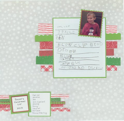
Again using moderation, Cindy was able to include 7 different patterned papers on this Christmas List page. She kept her background a medium sized pattern in a subtle light shade. This allowed her to build some cheer on her page with those seasonal colored patters. Cindy added to the whimsy and fun of the page by cutting them with different scissor shapes too. Another neat thing bout this page that has nothing to do with patterns. I love that she included her sons actual hand written list. What a great way to really preserve those memories!

I hope this gives you some ideas of ways to combine patterned papers on your next project!
This is one of those skills that takes a really keen eye, or just a lot of guts to give it a go. Mixing up patterns together on the same project can be really intimidating. A great guideline to make it easy for you if you're just getting started trying this is to use papers from the same manufacturer/line. They've already done the coordinating for you. The colors go well and the patterns are a good mix.
If you want to pick and choose papers from your stash and try mixing them, here are some great examples from our Contributing Artists.

Marlene created this page. I love the design. She told me this page nearly put itself together. I wish my pages would go together so easily and look as wonderful as this! I like that she used colors in her papers that pull the colors from her photos. Her papers were all part of a monthly kit. So some coordinating has been done, but not quite as readily as staying with one manufacturer/line. Marlene chose a larger yet subtle pattern for the background with the grid paper. She then built a base on it using a small print (polka dot) with a contrasting darker color. On top of that she used a medium sized pattern (floral) which goes back to the light shade. She also used border punches which helps to add distinction to the patterns. The photo is matted on plain cardstock, but surrounded with a border cut small patterned yellow paper. Off topic, but I also like the balance that Marlene gave her page by placing a string of elements under the smaller "string" of photos and one larger element above the larger photo (made larger by the yarn).

Pam shares this great example of many patterns on one page. Her papers are by GCD Studios and My Mind's Eye. First, she kept her colors bright and her backgrounds lighter. Pam took advantage of the off white paper behind her photos. Not only is it a great neutral color, but it has a fantastic pattern that lends itself well to blending with other patterns. The grid design on it goes great with blocked shapes (the red and green papers), as well as stripes (the dark blue and yellow papers). But since the grid is on a diagonal, it coordinates just as well with strips on the diagonal ( the light blue paper). By blocking her design, Pam also gave the eye a break between each of the patterns - another great tip for coordinating patterns on the same project.

Cindy shares this great tip for combining patterns - use moderation. She started out with the large dot pattern as her background paper. This gave her a great base to coordinate with. She used those color when selecting other patterned papers for her page. She created a mat for her photos using a medium sized pattern in one color and kept it trimmed close. She cut several different patterned papers into narrow strips. This allowed her to include several patterns without creating a large conflict to the eye. Another great tip that she incorporated on this page, is how Cindy made the chipboard letter mimic the background paper, but reduced the size of the dots.

Again using moderation, Cindy was able to include 7 different patterned papers on this Christmas List page. She kept her background a medium sized pattern in a subtle light shade. This allowed her to build some cheer on her page with those seasonal colored patters. Cindy added to the whimsy and fun of the page by cutting them with different scissor shapes too. Another neat thing bout this page that has nothing to do with patterns. I love that she included her sons actual hand written list. What a great way to really preserve those memories!

Here are some neat ideas in this layout by Gael. Her background is a large subtle print orange paper with a wispy look to it. This makes it a nice choice for adding other patterns on top. She then used some yellow striped paper to add an analogous color and blue dotted papers to add a complementary color by the color wheel. This adds some contrast and more vibrancy. To create the frame for the photo, Gael cut out a Prima tag - great reuse/recycle idea. Down the sides she rolled up small pieces of the accent papers to add dimensional texture to her page. What a great idea for using up scraps of paper! Another idea for using scraps of paper is the pretty bow that Gael made from paper at the top of the page. Adds just a bit of floral pattern to tie in with the journal tag and flowers on the page.
I hope this gives you some ideas of ways to combine patterned papers on your next project!
Tuesday, October 16, 2012
Creating your own flowers
Hi,
it’s Gael here today and recently I’ve created a couple of layouts
where I couldn’t find the exact colour of flower I wanted, so this got
me looking at ways to make my own flowers. Today I thought I’d share
with you how I made the flowers and show you a layout where I’ve used
them.
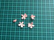
To create the flowers I used 3
punches, 2 circles and one small 5 petal flower punch. From white
cardstock I punched one each of the circles and from a light pink
cardstock I punched 5 of the 5 petal flowers.

Next
I inked the centre of the smaller circle with the ink coming out
slightly towards to end of the circle. I then cut some V shapes into
both the circles to form 6 petals. These don’t have to be perfectly
even.

Spritz
the circles with water and crunch them up to get some creases on them.
I found it worked better if I crunched them up twice, so I just
carefully opened them up and crunched them up again and this softens the
cardstock and the creases seem to hold better. Do this for both the
circles.
For the smaller flowers give
them a light spritz and crunch them up as well. Make sure you have one
which is crunched really tight, this will be the centre of the flower.
I found if I pressed the centre of each petal with my finger nail to
give it a fold and then crunched it up, it held the shape better.

Leave the petals to dry.
Once dry gently open up the two larger petals and curl over the corners. This gives the flower a more realistic look.

- a close up showing the curled over edges.

For the smaller petals, gently open the four other petals. Leave the tightly crunched centre petal as is.
Put
a dot of glue in the middle of the four opened petals. Pick up the
centre petal and put into the glue in the middle of one of the petals,
continue until you have all the small petals stacked together. Then add
glue to the middle of the two larger petals. Pick up the centre stack
of petals and place them on the glue on the smaller of the remaining
petals and then put that onto the glue on the larger petal. (I hope
that makes sense!!)
The end result should look like this -

This
is one of the layout I’ve created using these flowers. In this layout I
made some of the flowers the reverse colour and I also added some
glitter to the petals.


Friday, October 12, 2012
Dress up a Tin Box
Hi there, it's Cathy here with a hybrid project for you today. What's hybrid? It's the combination of digital and tradition crafting. You may think that it requires an extra step of getting the digital products out of the computer and into your hands, but there are some great benefits to hybrid. The one I like best is that I can re-use digital papers over and over again!
The project I'm sharing today is dressing up a tin box. You could use this for presenting a special gift, or keep some cherished items in.

The digital papers that I used are from the digital Kit "Cherries Jubilee" by Kristin Cronin Barrow.
Here's how I made this box:
1. Select two digital papers to use for flowers and one for leaves.
2. Open digital paper selections in photo editing software and prepare for printing.

3. Print selected digital papers on inkjet cardstock ( I used Red River Linen 60lb)
4. Use large and medium flower punch (Paper Shapers Retro Flower)to punch required number of petals to create flowers. For the twisted rose, punch three large flowers and one medium flower. For a rose, punch three large flowers. For the open rose, punch one large flower and two medium flowers. For the small rose, punch three medium flowers.

5.Work on a soft surface such as the back of a foam mouse pad. Create two twisted rose flowers. Use three large and one medium punched flower for each of these. Spritz the flowers lightly with water to make them easy to manipulate. Using tweezers, hold the middle of a petal and twist it about 90 percent.

6. Push the twisted petal in towards the middle of the flower. Repeat for the remaining petals on all three large punched flowers.


7. Using your fingers, scrunch medium punched flower in to a ball. The image below shows one punched medium flower and one that has been scrunched.

8. Lay one of the large punched twisted flowers on the work surface. Place a drop of liquid adhesive in the center (I used Beacon Adhesives 3-IN-1 Advanced Craft Glue). Layer another large punched twisted flower on top, alternating the petals. Use the handle of a small paint brush to push the center of the flower into the foam work surface to shape and adhere the flower. Repeat with third large punched twisted flower.

9. Add a drop of liquid adhesive in the center. Using tweezers, place the scrunched medium punched flower in the center to complete the twisted rose. Set aside to dry.


12. Layer the three shaped flower pieces starting with the most open on the bottom. Add a drop of liquid adhesive in the center and layer the middle open flower piece on top. Add a drop of liquid adhesive to the bottom of the tightest flower piece. Using tweezers, insert it into the middle of the two layered flowers to complete the rosette. Set aside to dry.

13. Create one rose. Use three large punched flowers. Use the handle of a small paint brush or stylus to curl the petals on one punched flower under.

14. Using the handle of a small paint brush, push the center of the remaining two large punched flowers into the foam surface.

15. Make one of the flowers tighter by squeezing it against the handle of the paint brush.

16. Layer the three shaped flower pieces using the same technique that was used to layer the rosettes. Start with the most open flower on the bottom and end with the tightest flower on the top. The image below shows the three shaped layers, most open on the right and tightest on the left.

17. This completes the creation of the flowers. See image below to identify each flower type.

18. Punch leaves from green digital paper.
19. Prepare the tin by coloring it with inks. Color the outside of the lid and base. Simply place dots of alcohol ink on the tin surface. Use an alcohol ink applicator tool to spread or overlap the inks if desired. Allow the inks to dry. Below is a picture of the tin prior to coloring with the inks. The inked tin is seen below in step 20.

20. Once the ink has dried, spray the lid and base of the tin with Beacon Decoupage Gloss Sealer. This will seal the inks and provide a nice smooth, glossy surface to the tin.

21. Wrap ribbon around the lid of the tin using fabric adhesive (I used Beacon Adhesives Fabri-Tac)
22. Adhere rhinestone sticker to lid.
23. Cut dimensional glue dots in fourths using non stick scissors


24. Use the cut glue dots to adhere the flowers and leaves to lid.
Here are some additional photos of the tin.


The project I'm sharing today is dressing up a tin box. You could use this for presenting a special gift, or keep some cherished items in.

The digital papers that I used are from the digital Kit "Cherries Jubilee" by Kristin Cronin Barrow.
Here's how I made this box:
1. Select two digital papers to use for flowers and one for leaves.
2. Open digital paper selections in photo editing software and prepare for printing.

3. Print selected digital papers on inkjet cardstock ( I used Red River Linen 60lb)
4. Use large and medium flower punch (Paper Shapers Retro Flower)to punch required number of petals to create flowers. For the twisted rose, punch three large flowers and one medium flower. For a rose, punch three large flowers. For the open rose, punch one large flower and two medium flowers. For the small rose, punch three medium flowers.

5.Work on a soft surface such as the back of a foam mouse pad. Create two twisted rose flowers. Use three large and one medium punched flower for each of these. Spritz the flowers lightly with water to make them easy to manipulate. Using tweezers, hold the middle of a petal and twist it about 90 percent.

6. Push the twisted petal in towards the middle of the flower. Repeat for the remaining petals on all three large punched flowers.


7. Using your fingers, scrunch medium punched flower in to a ball. The image below shows one punched medium flower and one that has been scrunched.

8. Lay one of the large punched twisted flowers on the work surface. Place a drop of liquid adhesive in the center (I used Beacon Adhesives 3-IN-1 Advanced Craft Glue). Layer another large punched twisted flower on top, alternating the petals. Use the handle of a small paint brush to push the center of the flower into the foam work surface to shape and adhere the flower. Repeat with third large punched twisted flower.

9. Add a drop of liquid adhesive in the center. Using tweezers, place the scrunched medium punched flower in the center to complete the twisted rose. Set aside to dry.

10. Create three rosettes. Use three medium punched flowers for each. Push the center of one of the flowers into the foam surface using the handle of a small paint brush.

11. Repeat step 10 for the two remaining medium punched flowers, making them each slightly tighter than the previous flower. There will be three shaped flowers pieces of varying openness as shown in the image below.

12. Layer the three shaped flower pieces starting with the most open on the bottom. Add a drop of liquid adhesive in the center and layer the middle open flower piece on top. Add a drop of liquid adhesive to the bottom of the tightest flower piece. Using tweezers, insert it into the middle of the two layered flowers to complete the rosette. Set aside to dry.

13. Create one rose. Use three large punched flowers. Use the handle of a small paint brush or stylus to curl the petals on one punched flower under.

14. Using the handle of a small paint brush, push the center of the remaining two large punched flowers into the foam surface.

15. Make one of the flowers tighter by squeezing it against the handle of the paint brush.

16. Layer the three shaped flower pieces using the same technique that was used to layer the rosettes. Start with the most open flower on the bottom and end with the tightest flower on the top. The image below shows the three shaped layers, most open on the right and tightest on the left.

17. This completes the creation of the flowers. See image below to identify each flower type.

18. Punch leaves from green digital paper.
19. Prepare the tin by coloring it with inks. Color the outside of the lid and base. Simply place dots of alcohol ink on the tin surface. Use an alcohol ink applicator tool to spread or overlap the inks if desired. Allow the inks to dry. Below is a picture of the tin prior to coloring with the inks. The inked tin is seen below in step 20.

20. Once the ink has dried, spray the lid and base of the tin with Beacon Decoupage Gloss Sealer. This will seal the inks and provide a nice smooth, glossy surface to the tin.

21. Wrap ribbon around the lid of the tin using fabric adhesive (I used Beacon Adhesives Fabri-Tac)
22. Adhere rhinestone sticker to lid.
23. Cut dimensional glue dots in fourths using non stick scissors


24. Use the cut glue dots to adhere the flowers and leaves to lid.
Here are some additional photos of the tin.


Subscribe to:
Posts (Atom)