Sunday, January 31, 2010
New Contributor!!
I decided to ask a past featured artist to be a regular contributor to the blog!! And I know you will love her posts and ideas. Her pages and fresh and inspiring! I was so excited when I asked her and she said yes! So... it's time to reveal the new contributing artist, Dolores!!
She was the featured artist a couple of weeks ago, so please click here for for information about her! You can also see her first post by going here. Here are some questions I asked her to get to know her better! You can also visit her blog at this address: http://www.thejoyofscrapbooking.blogspot.com/
1. What is your favorite aspect of scrapbooking?
I get a great deal of enjoyment from the friendships I have made scrapbooking. So when I look at the whole scrapbooking process it is really the friendships that I have made along the way that are most important to me as opposed to the physical end product. However, from the creative point of view, my favorite part of scrapbooking is the design process. The time I put into this phase is the most enjoyable.
2. What products/kit clubs are a must have for you?
I love to buy paper, I'd almost call myself a paper junkie but I do have a bit of restraint. Having said that I do watch for the new releases of Basic Grey, BoBunny, K&Company among others. I also use extensively a digital craft cutter. I own both a Silhouette and a Klic-N-Kut Groove-e. I hardly do a layout anymore without cutting out something. I enjoy experimenting with different fonts to create interesting titles.
3. How many pages do you think you completed in 2009? Was it more or less than you wanted?
I probably created about 60 pages in 2009 which is less than what I would have liked to accomplish. Part of my time I spend creating greeting cards. I have found that people really appreciate receiving a hand made card and that makes the work I put into them rewarding.
4. Is there any secret advice on how you complete your pages?
I am sure there are many different approaches to any creative endeavor. With scrapbooking I like to choose my photos and do any modification to them,cropping, resizing, exposure correction, etc. before I look at paper. I then like to choose the colors I will use based on the photo I am working with. For the page design I draw mini sketches taking into account patterned paper and how I might mix them together. When I do my sketch I find myself thinking of some of the design principals I learned while studying watercolor painting such as balance of items on a page, contrast of objects, the harmony of the colors, and so forth. I think these skills have really helped me in scrapbooking.
5. Name 5 of your favorite fonts.
I have so many fonts on my computer its hard to choose just 5, but I guess I'd have to say my favorites are: Scriptina, Amazone, Century Schoolbook Bold, Fontleroy Brown and Victorian. I am sure I have used all of these in page titles several times.
Saturday, January 30, 2010
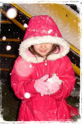
Photo Overlays
The best way I ever heard to describe using layers in the layers palette was to think of it as building a sandwich. One layer is the bread, then mayo, then meat, then lettuce, and cheese. To rearrange the layers you can drag them by clicking on them with your mouse and pulling up or down in the layers palette. See the little slider setting that says opacity? If the overlay looks a bit too bright and strong on your photo, you can drag the slider to make it more transparent, and tone down the effect a bit.
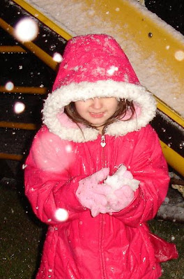
Of course I wouldn't tell you all of this without providing some overlays to play with! Here is my photo before adding the overlays I made...
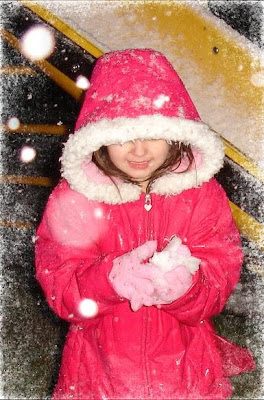
This is how it looks after I applied the first overlay...
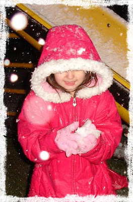
Here is the second overlay...
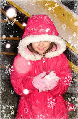
And the third...
And one more!
After you apply your overlay and get it sized how you want, go to Layer-Flatten Image, and then save the image with a different file name so you don't write over the original file in case you want it later.
To download the zipped file with all 4 overlays click here... http://www.4shared.com/file/202203940/594c69d1/HL_Snowy_Overlay.html
Friday, January 29, 2010
One Sketch, Two Projects by Cheryl
The first project I made using this sketch as my guide is a layout of my grandson. I wanted the layout to reflect the images of a boy at play. I chose colors that I thought were more boyish and tilted the central squares of the sketch to help give the feeling of motion.
I added a triangle banner border to the scallop element to also add to the boyish, playful nature I wanted in this layout. I then added some embellishment and journaling.
The second project I made using the sketch could not be any more different than the first and yet they both use the same sketch as a starting point. This project is a Valentine card and I wanted the feeling to be romantic and feminine. I chose colors that reflected that and changed the squares in the sketch to a softer shape. For the scallop element I chose to use lace. Notice that this project is not square like the sketch, but I was still able to use the basic elements of the sketch regardless of the shape of the card.
Although I chose to use a layout and a card for this post, I could have also used this basic sketch as the basis for an altered item as well. The possibilities are endless. Take a simple sketch and make it your own.
Introducing Our Featured Artist for Jan. 29!
I have been married 27 years to my hubby and we share 5 children and three adorable grandchildren. I have been scrapbooking for five years and making cards for one year. I am currently on the 2Sketches4You design team. I love to cook and read, but my very, very favorite thing to do is play games with my children. It is just THE BEST when everyone is home and we sit and play games all day together. I also really, really love playing and being silly with my grandchildren. I have one daughter who is currently serving as a missionary for our church in Paraguay and will be gone for another year and my son will be leaving soon to serve as a missionary and he will be gone two years, so it will be another two years before all the family is together again. My favorite TV show is So You Think You Can Dance? and anything on The Food Network. I love, love, love the music from Glee and have both the CDs. I feel like I am the most blessed person on the planet. I have so much to be grateful for.
Here is her blog: http://cheryljunegirl.blogspot.com/
Her gallery:CherylJuneGirl
And a sketch site she is on the design team for: http://2sketches4you.blogspot.com/
I am so excited for you all to see her very fun post. so stay tuned!!!
Thursday, January 28, 2010
Exploding box
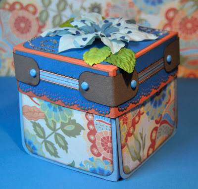
Looking for a great project that will allow you to share many photos, and display them in a pretty package? And you want to be able to finish this project in a flash? Then an exploding box may be just what you are looking for!
This is a fun project that can be completed in about an hour. The box has 3 layers that fold out or “explode” when you remove the lid. Each layer has space to hold photos or mementos.
You’ll need to gather your supplies:
Cardstock:
3 sheets of 12x12 for the 3 box layers
1 sheet 8x8 for the lid
Patterned paper or cardstock as desired for matting and embellishing
Ink, ribbons, flowers, buttons, gems or other embellishments
Cutting/Scoring tool
Adhesive
To help make it a bit easier to follow, I’ve used a different shade of cardstock for each of the 3 box layers and a contrasting color for the lid. There is a template that you can download and print out. You’ll find the link at the bottom of this post.
Outer layer: Score a 12x12 piece of cardstock 4” from each outside edge. Fold on the scored lines toward the center. Cut from the outer edge toward the center (stopping at the center fold line) on the left side only of each side. Round corners and ink edges if desired.
Middle layer: Cut the cardstock to 11 1/2“ square. Score 3 7/8” from each outside edge. Fold on the scored lines toward the center. Cut out the corner squares. Round corners and ink edges if desired. Save the scraps of paper to use as matting or embellishments.
Inner layer: Cut the cardstock to 11” square. Score 3 7/8” from each outside edge. Fold on the scored lines toward the center. Cut out the corner squares. Round corners and ink edges if desired. Save the scraps of paper to use as matting or embellishments.
Lid: Cut the cardstock to 7 3/8”. Score 1 5/8” from each outside edge. Fold on scored marks. Cut on dashed lines (per template). Fold tabs to the inside. Glue in place.
Cut patterned paper for the exterior of the box. You’ll need 8 pieces cut to 3.5” square. Round corners and ink edges if desired. Lay outer layer of box inside facing down, adhere paper squares to the outside panels on the box.
At this point you can place photos and embellishments on all of the surfaces of the box layers making sure not to put anything on the middle square of each layer. Embellish the lid with decorations such as flowers, bling, bows, brads, gems. Consider wrapping the edges of the box with strips of paper or ribbon in your design. This is not only decorative, but can add some stability to the lid.
When you have finished adding photos and embellishing, you can assemble the box. You are going to stack the layers on top of one another. When you lay the layers down, the panels should be able to fold up towards you. Start by laying the outer layer inside up, then center the middle layer over it. Adhere at center. Place inner layer centered over middle layer and adhere at center. You can embellish the center square of the innermost layer if desired.
The inside of the lid is a nice place to add some special journaling about the project, or a special photo.
Now that it is all glued together, all you need to do is fold it up and top with the lid. Start by folding up one side. Fold all the layers along the scores, and wrapped the end tab to the outside as you fold up the next side.
The lid will hold the box in position.
When you remove the lid, the layers of the box pop out or “explode” before you. It’s a great way to present photos from a really special occurrence, or a year in review. These make great gifts and they look really cute!
This box holds pictures from 4 different trips to Disney World
This box holds a year in review for my mother-in-law and includes photos of all her children, grandchildren and great grandchildren.
So when you want to try making something other than an album, think INSIDE the box!
Click here to download the printable template.
Wednesday, January 27, 2010
Need Some Sun?
Here is the link to the site to download the page template!
http://www.4shared.com/file/209056384/4ff2eda1/pc_sunshine_template.html
Have a great Wednesday!!
Tuesday, January 26, 2010
Using Die Cut Shapes
Many of us love the look of die cut papers. I know when I go to any scrap store I love all the shapes, and curves the die cut papers come in, but try not to go too crazy as these gorgeous papers do cost more. In the first layout I wanted to use a die cut shape, but wanted to keep my page basic. So instead of looking to buy, or making a die cut shape from paper, I decided to use a template for just a die cut edge. I started with the shape I wanted and then used a paper piercer (or a pencil would work just as good), and placed a dot every 1/8 inch or so, until I went around the entire edge of the template frame. I was then left with a tiny pin hole showing the shape I wanted. At first my plan was to sew the shape, but I decided to dress up the page a bit and used pearls. I used 4 larger pearls for the top, bottom, and side points, and then used smaller ones for the remaining shape. The pearls come in a line glued together, so I took an exacto knife and just cut them individually, and then used tweezers to adhere them on each pin hole. I love the how the pearls dress up the page and think it would work great for a wedding or engagement layout.
I then took the same template and placed it where I wanted my photos to be, outlined it on the back of the photos, and cut the photos out. It would have worked just as well keeping the photos standard shape, but I like the look of photos taking on a non traditional edge.
I also made a journaling block out of a square of lined paper for the writing, and then a triangle on top, to form the shape of a house.
For the final touch I wanted the page to look like it was hung in a frame. So I cut strips of wood grain paper and then cut the ends on a diagonal to give them a mitered look like wood corners would have. I then I adhered them with pop up strips to make it look like a picture frame.
The second page was a very simple layout using pre-made die cut paper. I loved this paper and really wanted to use it to highlight one of my most favorite holiday photos. The paper had multiple layers of design that I didn't want to cover up with my photo. So I used my cricut to cut circles until one fit the right size (a plate, or bowl edge also works great for making circle templates in different sizes). Once I had the shape, I just glued my photo to the circle and then cut around the edges so my photo was the perfect circle shape to fit the die cut frame. I then just applied some bought paper ornaments, and then used pearls to make it look like the ornaments were hanging from them. Once you have the right circle shape, this is a page that can be made in 15 minutes, so it is great for quick and easy layouts where you are looking to show off your one favorite picture.
Monday, January 25, 2010
A frame + Template!
(click on link to download file)
http://www.4shared.com/file/206613144/28cb3c5/pc_flourishframe_template.html
I have also created a tag! You just open the layered template below in Photoshop Elements and put your photo behind it. Next, Type in your to: and from: names. Flatten the image and print it at the desired size. Cut out the image and attach to a present or even an party favor! It makes is great customized tag for anyone.
(click on link to download file)
http://www.4shared.com/file/206609958/4eef56c3/pc_flourishtag_template.html
Next, is a template based on this older page, but I still love it!
Here is a preview and below is the digital layered template.
(click on link to download file)
http://www.4shared.com/file/206616290/85d747fa/pc_eight_circles_template.html
Please keep in mind if you use my digi items, please give me credit and leave the blog address so others can access the templates! Thanks and enjoy!
Sunday, January 24, 2010
Ask the Artists
1. What are your favorite color combinations to scrap with?
Susan: The color combo I fall back on over and over is red, black, and white. But I also love the red and black with kraft paper. Then there is the blue/brown combo that really looks great. Really…do I have to chose just one?! LOL!
Sarah: I like brown and green shades put together, but in reality, I use all sorts of colors depending on the picture that I want to scrap. I think I've used every color combination you can possibly think of.
Melanie: Right now my pages are sporting lots of pink and brown and blue and brown (I have one boy, one girl - what can I say -grins.).
Julie: I love bright colors! I tend to use a lot of lime green, orange and teal in my work.
Heather: This is going to sound terrible, but my favorite colors to scrap with are neutrals. I love white, kraft, and black cardstock! I buy it in bulk because it matches everything, and always works. If I had to chose a particular color after that, I'd say I use a good bit of blue. Outside of scrapbooking, I love green! I have a green laptop, ipod, and purse.
Delaina: Pink, Red, and Brown
Cindy: Since I have a little boy I tend to use a lot of reds, blues, and browns.. But I really love the summer shades that I do not get to use near as much.....the pinks, greens, and yellows.
Cathy: Since I mainly scrap stuff about my boys, I love to work with blues, browns, oranges and greens.
2. What are some blogs you love to visit for inspiration?
Susan: Ideas for Scrapbookers, of course! This blog has something for everyone!
Sarah: I visit a compilation of other scrapbooking related blogs. I appreciate that a lot of them share their talent with the rest of the scrapbook world. For instance, I love Ideas for Scrapbookers! There's always something interesting and clever to read here. *wink*
Melanie: I am currently loving the classes over at inkingidaho.blogspot.com and I also have a blog roll of blogs in the sidebar of my own blog that I visit almost daily.
Julie: I follow a ton of blogs and it's really hard to say which ones I'd consider my faves. That being said, I get a lot of wonderful ideas and inspiration from the following people and sites:
Jillibean Soup (http://jillibeansoup.typepad.com)
Bo Bunny (http://bobunny.blogspot.com/)
Juliana Michaels (http://17turtles.blogspot.com)
Amanda Muirhead (http://amandamuirhead.blogspot.com)
LollyChops (http://www.lollychops.com/)
Moxie Fab World (http://www.moxiefabworld.com)
Oh, and if you want a good giggle or two I highly recommend The Bloggess (http://thebloggess.com)
Heather: For digital scrapbooking inspiration I visit:
Sue Cummings' blog, http://mychalkboard.typepad.com/designsbysuecummings/.
I also love Natasha Na St Designs, http://natashanastscrap.blogspot.com/.
For paper inspiration I visit:
Ideas for Scrapbookers (of course!)
Julie Bonner http://julie-bonner.blogspot.com/
Jana Eubank http://frommyfeatherednest.blogspot.com/
and the Scrapbook.com gallery.
Delaina: http://carolejansons.blogspot.com/
http://schulu.blogspot.com/
http://stacycohen.blogspot.com/
Cindy: I don't really visit blogs much since I just recently got a home computer. But I am excited to see where everyone else visits, so I can go and check it out. I am for learning and seeing new ideas!
Cathy: There's tons of inspiration in the galleries at scrapbook.com and the blogs of all the contributing artists here at Ideas for Scrapbookers. I also like to visit Mojo Monday for a little card inspiration.
3. (fill in the blank) The first thing I grab at a scrapbook store is ________ because _________ .
Susan: The first thing I grab at a scrapbook store is adhesives because I always seem to run out of adhesives first!
Sarah: The first thing I grab at a scrapbook store is usually the latest release because I have a horrible addiction to paper.
Melanie: The first thing I grab at a scrapbook store is adhesive because I can't keep it on my scrapbook table . LOL, seriously, I bought the Glue Glider Pro and I have been known to buy 2-3 refills for one weekend!
Julie: The first thing I grab at a scrapbook store is the sales flyer because I'm trying to be frugal these days.
Heather: The first thing I grab at a scrapbook store is patterned paper because I'm totally addicted to it. I have more patterned paper than I will ever admit. LOL
Delaina: The first thing I grab at a scrapbook store is cardstock because I collect it ...LOL!
Cindy: The first thing I grab at a scrapbook store is journaling pads because I use them all the time. I use large ones for titles and embellishments, and I use the smaller ones for dates and notes regarding the page. I am also a sucker for paper pads.
Cathy: The first thing I grab at a scrapbook store is the basket to put all my goodies in because even if I tell myself I'm going in for *just* one thing, I know several things will catch my eye and I'll *have* to have them! When I am perusing the aisles, I probably spend the most time in the paper and stamp aisles. I can never seem to collect enough!
4. If you could have a superhero power, what would it be? Why?
Susan: I would like to have super energy, enough energy to get everything I want to do done without needing to rest or sleep before I can finish. Of course, if I just had more hours in the day, I wouldn’t need super energy!
Sarah: I would want to read people's mind, so that I could use that to my advantage. muhahahaha! Just kidding about the using it to my advantage part, but I really would LOVE to read people's minds. Then, I would know what to say or do around certain people. LOL.
Melanie: Oh, definitely, super speed, keeping up with the kids, the house, the pets, and the scrapping would be SO much easier!
Julie: Without a doubt... invisibility! I can't tell you the number of times in a day I'll mutter, "gee... to be a fly on that wall". I'm a Nosy Nellie! If I could listen in on a conversation not meant for my ears, and no one be the wiser, that'd be super! That'd be a SUPER power!
Heather: I would be able to alter time. I've always wanted to give myself more hours in a day to get things done!
Delaina: To Fly....then I could travel to every CHA for free.
Cindy: I would love to have the power to see into the future. It would be really cool to go 20 yrs from now, and see where my life it, and the man my son grew into to.
Cathy: Only one? Well I could wish for the power to be able to grant powers and then I could have all the powers I wanted and share them too! I'd like to be able to fly, but if I could only have one power, I'd really like to have the power to heal. Then I could help everyone that deals with chronic conditions like autism, cancer, multiple sclerosis, etc! Wow, just imagine all the power that could generate! And then we could use that to help us fly! :-)
Saturday, January 23, 2010
Journaling 101
- Make a list. (A top 10 list, a list of likes or dislikes, there are so many possibilities!)
- Answer the questions who, what, when, where, and why?
- Use lyrics from a song.
- Find quotes that work with your theme.
- Pretend you’re talking to the person in the photo. Give them some advice.
- Tell a favorite story about the person in the photo.
- Pretend you are telling a friend why you are making the layout. If you’re making it to remember an event, imagine you’re telling your friend what happened, and write it down.
- Use a poem instead of journaling.
- Pretend you’re writing a newspaper article, invent your own byline, and paper. Don’t forget the location and the date.
- Interview someone. Ask your kids what they think about their Dad for a layout with a photo of them together. Ask your grandmother what it was like growing up. The possibilities are endless.
- When all else fails have someone else write the journaling. Give the photo to your husband or one of your children, and ask them to write about it.
Different ways to incorporate journaling on your layouts:
- Write it on a tag and tuck it behind your photo.
- Use a hinge to attach a photo and attach your journaling underneath it where you can read it when you flip it up.
- Write it right on the layout. Wherever you can fit it. It doesn’t matter if you like your handwriting. I promise you that your children and grandchildren will treasure it.
- Print it out on the computer in a journaling box, or space it so you can cut it apart and make strips of journaling on your layout.
- Journal on vellum or transparencies to add interest, and adhere it to your layout using brads or staples.
- There are lots of journaling stamps… if you are concerned about the neatness of your handwriting, stamp on a piece of paper that you can cut out and adhere to your layout. If you mess up just stamp and try again!
- Journal directly on a photo.
Journaling resources:
- Quotes and Phrases: http://scrapbook.com/quotes.php
- Poems: http://scrapbook.com/poems.php
- Song Lyrics: http://www.lyrics.com/
Various tips:
- I often type my journaling and titles in Word or another program with spell check to make sure that everything is correct before writing it on my actual layout.
- There is really no wrong way to journal. Tell the story that’s on your mind or in your heart!
I have a few different examples to share:
Journaling directly on the photo. (Be sure to use pens made for this application!)
Journaling on strips, and adhering them to the layout.
Using journaling stamps. You'll notice on this one that the journaling stamp wasn't big enough for everything I wanted to say, so I stamped it several times and continued the journaling across the page.
Friday, January 22, 2010
Fun Template Creations by Dolores
First I have taken one of Pam's templates, the Ellipse, and created a page that showcases one of my favorite pastimes, hiking. This activity my husband and I have loved for years and years; I imagine that we will continue to hike as long as we are able so I have lot of pictures of the Rocky Mountains. I selected some photos from a memorable trip in which my niece joined us and created a page featuring 4 of the many photos we took that day. The ellipse shape was great for highlighting a good sized photo of my husband and it was a nice fit for the 3 smaller photos. I embellished the page with a pinecone and pine braches that were cut with a digital die cutting machine. Here is my "Enjoying the Great Outdoors" layout.
When we take vacations, I'm always the one taking lots of pictures. When I'm home and putting a page together, I often want multiple pictures on a single page. That's one of the reason I love the many templates available here. As I considered the possibilities for a template I thought an octagon might be a very picture friendly shape. I divided the octagon into nine sections as seen below.
I felt there were a number of possibilities with this template considering that depending on how I placed it on a page, I could work with a square and rectangles, or the look of diamond shapes if I rotated the octagon just a bit. After experimenting with pictures, I also thought about how I could change the look of the finished layout just by combining some of the sections within the octagon so that I would need 5 pictures rather than 9. I combined a rectangle and triangle on each side of the octagon which gave me 4 pictures on the outer edge of the template and retained the single square in the center. I liked my last experiment the best, so here is a shaded version of the template to illustrate my final decision on the number of pictures and placement.
I chose some pictures from Athens, Greece which display some of the many ancient buildings we were able to see on our trip. I placed the pictures on a black background then placed a 1/2" mat of patterned paper behind the octagon. I distressed the edges of the patterned paper mat to improve the definition against my 12 x 12 background paper. Then I added a title, flourishes, flowers and butterflies to embellish the page. I created a small triangle journaling box in the lower left corner. Here is "Athens, Greece."
This last page I did just for fun! I love the changing of the seasons and winter brings its own memorable moments. Since we have lots of snowy days here in Colorado I decided to try creating a snowflake template. The template is three pieces, a background, a foreground and a small shape that resembles the end of an arrow. The template is hand drawn, so it's not geometrically perfect, but as long as you note the top of each shape and stack them appropriately it should fit together as the sketch example here.
In the template below the small arrow shape is separate from the foreground template shape. I decided to do this for a few reasons. First, by removing this more delicate piece of the snowflake design it made it much easier to cut out the shapes. Second, it gives me the option to make this shape a different color which could enhance the end result depending on your choice of papers. Last, it makes assembling the snowflake shape a little easier, because you have some flexibility with placement. You will need to cut out six of the small arrow shapes.
Here is the template with the Background, Foreground and small arrow piece.
BoBunny came out with some very pretty papers this winter. I selected a few from their Snowy Serenade collection to produce this layout with me and my two dogs. My two buddies here just can't get enough of the snow, they could play for hours. Hope you enjoy "We Love the Snow."