Before going on vacation we have to pack our bags. I made this suitcase box to hold a mini album that I created of a road trip that my family took last summer. I made it using foam board, a grocery sack and digital and traditional scrap supplies. You can find my step-by-step tutorial on my blog Scraps of Life.
This is the cover of the mini-album. I created the cover digitally, printed it out and decoupaged it to the chipboard album cover. Using photos from our trip, I created the look of post cards from the states that we visited.
Here is a sample of one of the interior pages. You can see that I included photos as well as memorabilia that collected too.
Cindy shares 2 pages that truly showcase her style. This one and 2-pager are very clean and simple. This is a great tip for getting your vacation pages recorded quickly. Blocking the photos and journaling helps to fit many pictures on the page. Cindy also keeps her embellishments to a minimum, which keeps her pages from looking crowded and allows the pictures to shine.
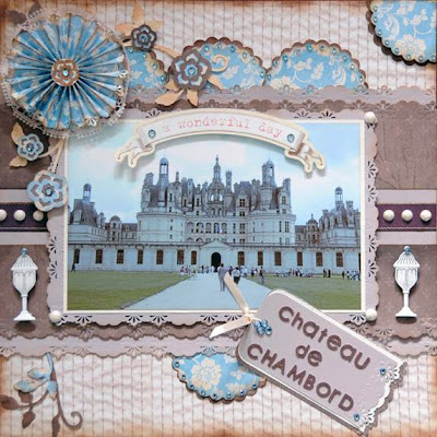
Vicky created this beautiful page that shows off a gorgeous photo from her travels. She tucks some pretty lace patterns behind the main mat paper and repeats it at the frame of the photo. The flower cluster is wonderfully balanced by the detailed work of the chipboard faerie.
Anupama created this beauty. I really love how she has brought the soft pink colors from her photo onto the page. I like how she has created a photo corner out of the title word "dawn". She adds dimension to her page with the strung seashells and chipboard accents.
On this page Anupama used a travel related patterned paper as her background. The paper is filled with labels and could be an overpowering background. But Anupama has calmed it to help her photo stand out by ripping the paper and separating it on the page. What a great technique.
Wow, I feel like I've traveled around the world and collected some new techniques to try out on my next vacation. I hope you've enjoyed this showcase as well.


I am sooo in love with the suitcase box you created for your mini, Cathy. GORGEOUS!
ReplyDeleteWonderful projects everyone!!
ReplyDeleteBeautiful pages ladies! Great work!
ReplyDelete