Showing posts with label Anupama. Show all posts

Monday, December 17, 2012

Texture Paste - One Product , Many Uses!

Hello, this is Anupama Choudary. I use mixed-media a lot on my pages...Glimmer mists,  Gesso, Texture Paste, Acrylic paints, Inks, Chalks and so on. Of all these, I reach for texture paint the most while scrapping.
I made this page Just Love featuring my kids last week for a couple of challenges and I want to show you how texture paint can serve many purposes.


1. You can use texture paint with a stencil or a mask to create a beautiful pattern on your layout.


2. Brushing texture paint lightly on embellishments can unify them visually. In other words, it helps to tie different colored flowers, etc. together.


3. I felt that the bling was drawing too much of attention and used the texture paste to tone down the stones. 


4. You can use the medium to dress up chipboard.


A lot of traditional scrapbookers feel overwhelmed by mixed media. Start small and enjoy the creative process with this versatile product. 
Happy Scrapping!


Wednesday, December 12, 2012

Designer Showcase: 30 Minutes or Less

Welcome to another Wednesday!  All of us at Ideas For Scrapbookers would like to start off by wishing those of you celebrating a very Happy Hanukkah!!


This time of year is so busy, isn't it?  There are so many things going on.  We've got school events, work gatherings, parties to attend, shopping to do, holidays to prepare for and participate in....  Sometimes it's hard to find time to do it all!  But we don't want to see your scrapping and crafting suffer.  So this week our theme is "30 minutes or less".  We've got some great pages and projects to share that can be done in less than 30 minutes!!


Cindy has 2 pages to share with us this week.  This first one is just so cute!  The construction of this page is simple and quick, but the impact is lasting!!  Cindy used photos of her son and his grandmother at different times, but in the same basic pose and props.  She cropped them to the same size and aligned them on the designer paper.  She placed a heart (in a color that coordinates with her son's outfit) as an accent. Then added a title and journaling.  Fantastic memories recorded in no time!


This second page by Cindy is colorful and a great use of scraps of your favorite designer papers.  Cindy used the strips of paper to create a mat that really brings your attention to the photo.  She add a bit of journaling on a piece of paper, added a few elements for detail (apple and tags) and used the teachers name as the title.  Another special moment in life recorded!


Pam shares this beautiful, bright page with us.  She cropped each of the bird photos the same size and kept with a blocked design to help speed up the process.  Using paper strips as accents and a few die cut elements adds some shape and interest to the page.  Pam added some stitching around the edges for a little texture.


Anupama created this quick page. She used a great combination of designer papers to give her page a feel of traveling, vacation and leisure.  She tore the travel icon paper and layered it over some striped paper.  She added a touch of cardboard below her photo. Using small letter stickers, Anupama was able to quickly add her page title. A sweet wreath made from twine adds dimension to her page.


 This is a digital page that I made in a jiffy.  I used some plain paper in the background. I added some digital stamps on top to make it look like a designer/patterned paper.  The double frame was an element in the kit. I duplicated it to create a row of four. The word art made a great title and journaling all in one.


This is a quick Christmas card that I created. It's made from plain red, white and green card stock. I cut the white to look like a door and layered it.  I added an inked wreath and bow. A black brad made a perfect door knob.  A quickly made card with lots of holiday spirit.

We hope these samples give you some inspiration to create pages when you are short on time!


Thursday, November 29, 2012

3 ways to work with Designer Vellum


Hello, this is Anupama Choudary. I love Websters Pages! Who doesn't? Their Designer Vellum is something to die for and I am constantly looking for new ways to use the sheets. 
I wanted to use the Ladies & Gents vellum with negative space in the page above. So I fussy-cut the floral portions using a craft knife.


Then I laid the extreme ends back to back in the centre of the page before layering and embellishing.


In the second layout, I simply glued the 12x12 vellum sheet from Lullaby Lane collection to white cardstock before adding other elements.


In my last page, I randomly tore the Life's Portrait vellum into small pieces and modge-podged them to cardstock. Then I used texture paint with a mask and stamps to build the page.


Hope you find your own ways to explore the versatility of  Designer Vellum. 
Happy Scrapping!


Wednesday, November 21, 2012

Designer Showcase: Heavy Distressing

It's Wednesday so that means it's time for a Designer Showcase!  This weeks theme is Heavy Distressing. There are many ways to distress a layout or project.  You can use inks, you can age the papers by tearing, sanding and ripping them. All will give some texture, dimension and detail to your project.  These techniques can be used on varying styles as well.  Let's take a look at the samples that some of our contributing artists created for today's theme.


This gorgeous envelope was created by Anupama. This image shows the front and back of the string tie envelope.  There is an image transfer of her husband dressed as a king for a school play.  To create a vintage look, Anupama used tea staining, paper tearing and distress inks.  These blend so well with the designer paper that resembles an antique map.


Gael shares this lovely layout in which she has done some distressing to add character.  She did some paper tearing and inking on the papers as well as the photo. The effect on the photo makes it look like a very old treasured photo.  The background is distressed using the resist technique that Lesley shared with us in this post. The heart doilies have a blue distressing shade added to them.  Gael also distressed the material behind the photo. She pulled the threads to fray the edges.  The results all total up to a beautiful page!

Give some heavy distressing a try on your next project. Just start ripping, sanding, inking and tearing up your pages!  


Tuesday, November 20, 2012

Get inspired by Patterned Papers!


Hello. This is Anupama Choudary and I want to show you how to draw inspiration from the motifs on your patterned papers to build a layout.
I used a 12x12 paper called Emperor from Prima Marketing's Printery Collection as the background for my page. 

I used the clock motif on the pp as a recurring element. I matted the photograph with Dusty Attic's Skeleton Clock face.


To emphasize the clock shape, I placed the negative chipboard from the clock face on my background. This also helps to draw the eye to the photograph.

In the next layout, I was inspired by the brocade pattern on an old 12x12 Kaisercraft paper.

To tone down the busy background, I matted the paper with a neutral pp but carried the theme forward by using a Crafter's Workshop Brocade stencil with texture paint.
Hope this post helps you to use the motifs on a patterned-paper as a recurring element.
Happy Scrapping!


Thursday, October 18, 2012

Tips to Reject Rejection!

Hello friends. This is Anupama with a post on how to deal with setbacks/ disappointment in the scrapping world. Some of us including me have design team aspirations and when rejection shows up in your inbox, it helps to remember a few things -
1. Do not take it personally. Challenge blog owners/ manufacturers etc. might be looking for something specific and your style may not fit in their scheme of things at the moment. So just say "Next!"
2. You might want to use this opportunity to work harder on your signature style.  I personally see this as a sign to spend more time at my scrapping table and GROW in the process.
3. Try and remember why you got into scrapping in the first place - to preserve precious memories for your family and leave a legacy for your grandchildren. So keep scrapping.
4. The most talented and experienced of scrappers have had to deal with disappointment well into their scrapping careers. Persistence is what sets them apart from the has-beens.
5. Simply scrap and have fun! If you are not, maybe your ladder (of success) is leaning against the wrong wall. 
As a newbie in the scrapping world, I sometimes struggle for answers to a lot of issues that do not necessarily deal with techniques, etc. Experienced scrappers sometimes share tips on their blogs that have helped me immensely and others have replied to my emails with generous advice. I am hoping that this post answers a question or two that you had but didn't know how to ask! Happy scrapping :)

Wednesday, October 10, 2012

Designer Showcase: Gritty, Grungy

Welcome back for another Wednesday of Designer Showcase.  Last week we really made things sparkle.  This week we are going to get grungy, gritty, and rustic.  We've got some edgy designs, but using new products and techniques. You just might even see some


Let's get this showcase started with some great examples from Pam. Ok - what's not to love on this page?  Sure it's grungy and gritty, but Pam used bright and light colors that are really popular right now.  She did a great job of inking things up and using a krafty colored gridded background that really pulls together the fresh  new colors with the aged grungy look.  Her choice of shapes is also a neat design. The patterned papers are cut in a shape like old style admission tickets, and then they are stitched down - oh so cute!!  And that little flag on the toothpick is just so chic!


This page, also by Pam, is another great example of how to blend the rustic old look, with updated techniques and products.  She uses darker colors for the background and lighter, fresher colors in the foreground.  Pam adds some really trendy flair with the scattered stars, cut pendant banner and tabbed journal spot. Yet the selection of patterns and colors keeps the page looking rugged enough to tell the story of these handsome cowboys!


Cindy shares a couple of rough and tumble pages with us. On this one about a trip to a petting zoo, she picked a great background paper to set the tone for the page. The scruffy spots on the brown paper add texture and the feel of grit and dirt.  Just perfect for this page.  The large strip of animal skin pattern paper adds some interest and is in keeping with the theme of the page.  I know this is not a grungy thing, but I also like the way she right aligned the journaling strips. Great little design tip.


Talk about rough and tumble - check out the great action photos on this page by Cindy.  So great to capture that energy. To help her page reflect the vim and zip, she used a combination of dotted papers. The small pattern in the background with the larger dots in the foreground gets your eyes hopping.  The colors in the larger dots also play off the balls in the one photo.  For some additional grittiness, Cindy tore the edges of the papers and inked them up.  A simple technique that adds a lot of detail and texture to your pages.


Grungy and gritty is not just for guy pages.  Anupama shares this page that she created with a photo of her children on it. She has worked in some great rustic feel with some mixed media techniques. Anupama has done a bit of misting and masking and painting to build up her background and create a frame of sorts for her photo.  she's added metal with the little chicken wire which really gives a nice dimension and feel to the page. I love the spot where she poked the paper through to the front. Keep that in mind for the next time you accidentally tear a paper, all is not lost, look how great it looks!


Speaking of using mixed media techniques, Gael has shared this page and has done some really cool mixed media work as well.  See that awesome pattern below the bridge picture on the left, and again under the "Prague" title?  Gael created that using gesso. Yep, gesso on a scrap page!  She also sprayed the paper with glimmer mist allowing some of the ink to run. She also did some stamping on the background too.  Now check out the stack of circles.  She layered circles with differing patterns and colors and added some texture with pleating, die cuts and gems.  Then she snuck in some string that wanders it's way around the circles. A beautiful page with lots of rustic charm and gritty edginess.

These pages have so many great ideas and techniques on them, I really need to make notes in my inspiration book. I hope you've been inspired too!


Thursday, October 4, 2012

How to Salvage a Page gone wrong!


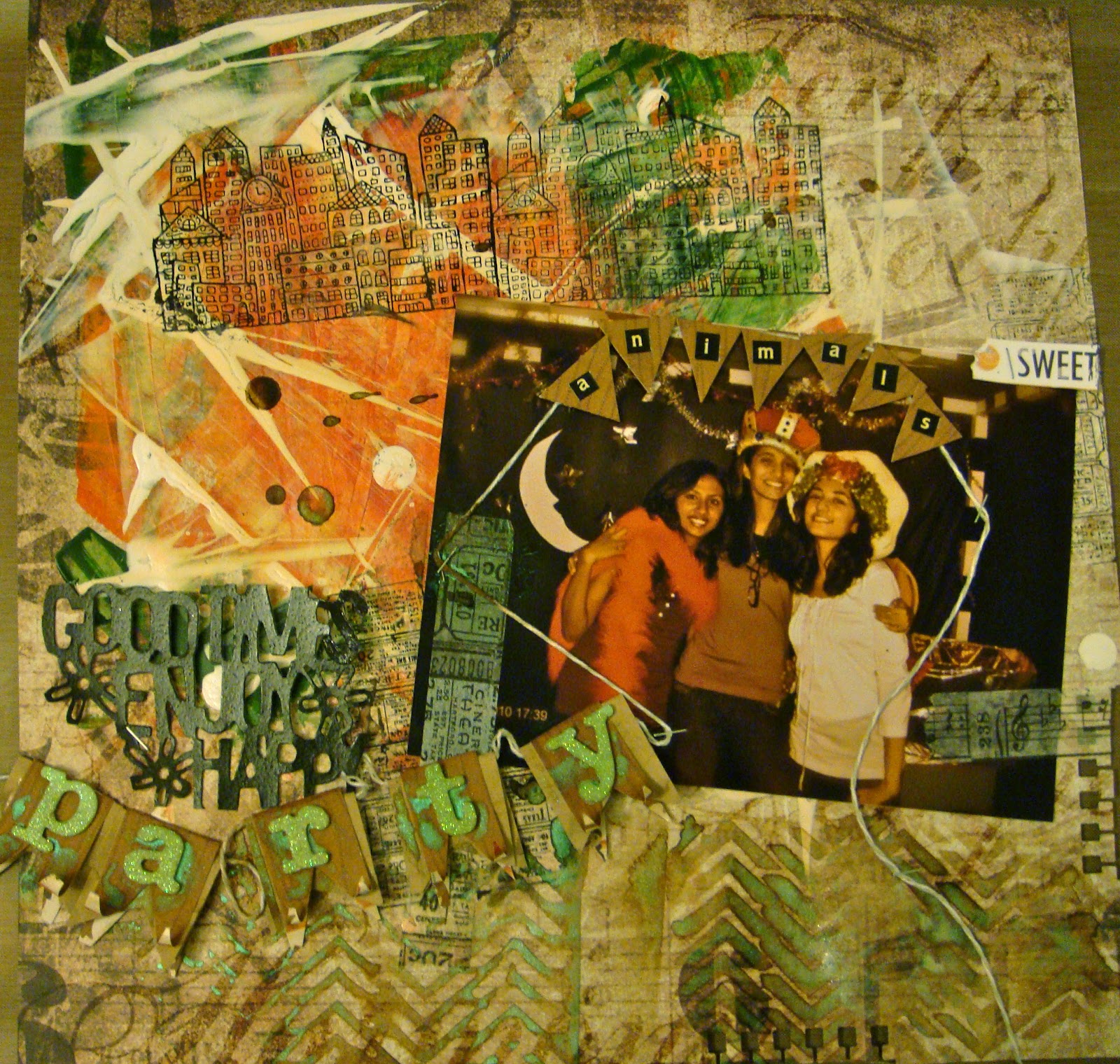
Hi, this is Anupama Choudary and I want to show you an easy way to rescue a page that has gone south!!!
This is how I started with my layout.


After picking the dominant colors from my photograph, I had fun with acrylic paints covering a patterned paper randomly.


I then used a cityscape stamp with black ink several times.


Experimenting with a ticket stamp and tissue tape!


Masking/ misting with a chevron template in different colors  


I made a title banner and then realized that the page was not coming together :(
Just before binning it, I changed my mind and decided to do some fussy-cutting to salvage the page.


On a white cardstock, I adhered the cropped cityscape and title banner with 3-dimensional tape. I used the piece of pp previously treated with the chevron pattern to mat the photo. I added a few Kraft die-cut embellishments.

A few splats of paint and there you have it....
a totally COOL page!


 Think twice before rejecting a page. You can always pick your favorite elements from it and redesign a new layout around them!


Wednesday, October 3, 2012

Designer Showcase: Sparkle!

One of the many addictions that scrapbookers can have, is to things that sparkle. Be it beads, bling, gems, glitter, foil, you name!  For this Designer Showcase, we are going to be sharing things that sparkle. So sit back and enjoy. And you might want to grab your sunglasses, this is going to be one bright post!


Let's get this party started!  Cindy created this darling birthday card. To bring out the shine, she glues sequins on the background paper like dots!  What a clever idea!  It adds detail and design to the background - which goes perfectly with the polka dot cake! And it adds glimmer!  But she didn't stop there. The ribbon is glittery and then she added some Stickles to the cake too!


Cindy also made this brilliant card. She started with a shimmery gold paper and dressed it up with dots made of Stickles.  The ribbon wrapped around it is glittery. The sentiment is a gold shiny sticker!  It's so cute!


I've got some holiday altered items to share with you. This first one is a wooden box that I dressed up to hold our Christmas cards. I used digital papers to decorate the inside and out of the box.  Along the edges, I painted, then coated it with glitter.  To keep all that glitter from flaking off, I sealed it with Mod Podge.


This one is just right for this season. Last year I decoupaged a pumpkin. Not a real pumpkin!  One of those carve-able fake ones that you can get at a craft store.  I used some glimmer digital papers to cover the pumpkin. To add even more sparkle, I added some bling!  It's a rhinestone sticker flourish.


Anupama has shared this dazzling page with us. First just take this page in. There is a lot to appreciate!  I love the way she has prepped the background paper. The paint wash tones down the pattern a bit and allows her to build a stunning page on it.  The flourishes add some interest to either side of the photo.  There is some masking and texture and netting going on there too! Even some upcycled packaging from Prima.  The bird is glittered up and blingy!  I love the way the flourishes blend out from the extraction of the hand with the henna on it. But that's not the coolest part.  Check out those baubles dangling about the gorgeous flower.  Guess what they are?  Earrings!!


Here's a closer look. What an ingenious idea!  Anupama said she got this earrings for about $1 US (SCORE!). You could use earrings that have lost their mate, or old costume jewelry.  But can you imagine using a special heirloom from an ancestor on a page about them? Wouldn't that be a radiant idea?

These are just a few ways that you can add a bit of luminous, lustrous, dazzling shine to your pages and projects.