Friday, August 31, 2012

Journaling about Older Photos

Cindy here!  I've been unearthing a lot of old treasures recently, including pictures from when my husband Steve and I were first dating.  I scrapped before we met (2002) and after we married (2004), but I stopped scrapping during the year we were dating and the year we were engaged.  I'd like to go back and get those pictures in albums.  I started with our first Halloween together.


I had so much fun cropping and arranging the pictures, choosing papers, and selecting embellishments!  It all came together so quickly and easily... until I got to the journaling.  I really struggled with what to say.  Do I write from the perspective of 10 years later?  Or do I write what I would have written back in 2002?

It's tricky.  In 10 years, a lot has changed.  Steve and I got married, as did one other couple from the photos.  The only couple in the pictures that was married at the time have since divorced, and two other couples have separated.  Two friends have moved far away.  None of us get together for Halloween anymore.  In the end, I decided to keep my journaling fairly general, mentioning who was there and how much fun we had together.

As I scrap the rest of the pictures from 2002 and 2003, I'm sure I'll face this issue again and again.  I'd love to hear how all of you journal about older photos!


Thursday, August 30, 2012

A ShabbyChic Page in 7 easy steps


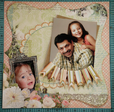
I made this Shabby Chic layout in a frame for a dear friend. Let me show you how in 7 easy steps -

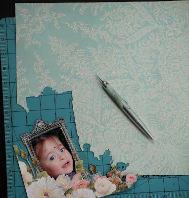
Step 1 - I drew the outline of a circle on a die-cut. I pricked holes and 
hand-stitched around the outline. I used an edge punch and then cut the border into individual floral pieces. I inked them and adhered them to the stitched circle. 

 Step 2 - I fussy cut a frame from another pp and adhered it to the photograph using pop dots. 

Step 3 - I layered the page with the background pp, die-cut and the fussy-cut frame in the foreground. I inked the edges before sticking them down. 

 Step 4 - I matted the photograph with corrugated paper and created a banner for the title alphas. 

 Step 5 - I left the birds on a branch chippie untreated because the kraft color pops off beautifully against the black. I used distress inks on the hinge chippie, fastened it with metal brads and added flowers.

Step 6 - I added a rub-on for part of the title.

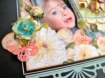
Step 7 - I use another edge punch to create a border and finished off with embellishments like misted flowers and a punched butterfly.

Hope you found this Shabby Chic tutorial helpful. Happy scrapping!


Wednesday, August 29, 2012

Designer Showcase: Lots of Journaling

Welcome to another Wednesday edition of Designer Showcase. It's Cathy here, bringing you the topic of Lots of Journaling.  In trying to preserve memories, we so often focus on getting the perfect photo. Journaling is an important part of preserving our stories as well.  Think how great it will be when years from now our children, friends or other loved ones, are looking through our albums and they read the journaling and relive those fantastic memories.

You don't have to be an author to journal.  And you really don't need any special tools.  Recording your thoughts, feelings, or recollection of activities can be done in your own words, and in your own handwriting.  Let's take a look at a few samples of layouts with lots of journaling.


In this layout, I wanted to share some of my feelings about my husband. I used the quote "To the world you are one person, to me you are the world" as a basis for building out my journaling.  I picked different thoughts and wrote a paragraph about each. For instance I wrote "To the world you are a firefighter" and a few sentences about that. Then I wrote "To me you are a hero" and I wrote a few things about how he changed my life.  This is a digital page so it was easy to type out my journaling.


For this page I wrote about the coffee mugs that I collect. Some people, including my husband and kids, laugh at me for having so many mugs.  I really enjoy starting my day off with the mood they set or the memory they bring. So I typed about this on my page. Something that my kids might enjoy reading and learning about me in years to come. I hope.  I left a lot of open space on the page and typed  it all out above the photo. I then set a few elements in the upper left corner of the journaling to frame it. Since this is a digital page, I could allow the journaling to flow under the elements.  What's really funny about my collection of coffee mugs? I don't even drink coffee anymore!  But I still use them for my morning cup of orange juice.


Pam shares this page with us. The layout of the page is awesome, I love the circular shapes of the photos. The colors that she chose really highlight her son's shirt and the garden greens in the photos.  She used a lined paper to type her journaling on to. It gives a nice clean, crisp look.  Pam talks about what happened on this particular day, but also some general observations that she has about her son. A perfect way to capture both the immediate memory as well as thoughts about your child's character and development.  It will be great to compare several pages like this over time to reflect on how your child grows and changes.


Marlene shares a page about a situation that happened to her. She was a bit afraid when boarding a boat.  But as other's got on the boat with ease, her family giggled at her. I love the way she tells the story first person, yet includes the humor that her husband and son saw.  She typed out her story and inked the edges of the paper. She also framed the journaling with some buttons and elements.


Cindy has two pages to show some different journaling. On this first one she hand wrote her journaling. This is her preferred way.  This is a great way to make your writing and design all that much more personal.  Here is a neat tip that Cindy shared. She doesn't write her journaling directly on the background of the page. She writes it on a piece of paper that can be adhered to the page, This way if she makes any mistakes in her writing, she can just re-do it without messing up her whole page. Great idea!


Now on this page, Cindy had a lot of journaling that she wanted to fit on the page. She chose to type this journaling.  By typing it, she could adjust the font size smaller to fit in more journaling that is still legible.  Typing the journaling can also make the layout a bit more formal. Or you can chose from so many different fonts that coordinate with your page to add to the design of your layout.

Whatever you are journaling, it's important to remember that there is no right or wrong way to do it. Just write!  And keep writing. Write to your hearts content.  When you look back at your pages, you'll appreciate all the details that you recorded.


Tuesday, August 28, 2012

Bird Watcher and a Sketch :)

I really like creating happy/bright colored layouts. I also love photography, so mixing the two is even better. Today I am sharing a page and sketch featuring some adorable birds that I took at the zoo. The local zoo has a great bird exhibit and I was able to get natural photos of birds from all over the world. I especially like taking photos of brightly colored birds as you will see below. I used my telephoto lens with my Canon Rebel to take these snapshots. My layout consists of four photos: three photos of birds and one photo of my son, the bird watcher. The page features all of the main photos together and the last photo by itself to give emphasis to it (my son's expression is priceless). I also designed the colors of the page so the bird photos would pop over the yellow background. Going along with the "bright" theme I used a sun accent and a couple of clouds to give it that outdoor look.  All of my papers are from the GCD Flower Child Collection. Take a peek at my page!

Here is a sketch of my page. Feel free to flip it, alter it, whatever you like to suit your page!


Hope you have fun with the sketch!!


Monday, August 27, 2012

A Shopping Opportunity


Hello, it's Marlene. Today I am talking about something I rarely get to do, scrapbook shop. Oh sure, I can do some damage when presented with the opportunity, but the closest scapbook store to me is 2 1/2 hours one way so I am usually promoting making your own backgrounds and embellishments. During a recent visit to my sister's (near Detroit, Michigan), I did my usual excursion refilling my supplies and checking out new stuff, buying pretty generic things on spec so to speak. Since starting with a photo is essential to my process, the way I scrap shop is backwards because I don't plan ahead far enough to have a series of photos in mind. That is the downside of being a random scrapper.
Even while taking photos of the basilisk, I knew I was going to scrap it, but the pictures didn't enter my mind while I was in the stores. I am frustrating like that. My trip was extended (now that I'm retired, I can do that) so I decided to treat myself to the luxury of going to Archivers with a specific project in mind. All of you who live near scrapbook stores are so lucky! I took my time choosing papers and accessories to match my picture, only another scrapper will understand how enjoyable that is. This Authentique line was perfect and once back in my scraproom, this page fell together quickly. In the future, this scrapper will try to be more disciplined and have a few photos in reserve.


Saturday, August 25, 2012

New Contributing Artist!

Hi all, it's Pam here again. Before I announce our newest contributing artist, we must say good bye to Sara. We will miss her posts and contributions!

I am excited to announce Karen Anderson as our newest contributing artist. She was a guest artist a couple of times and now we are lucky enough to have her on the team!! As you may have seen before, her blog is packed with lots of great ideas. You can see it here. I know she will have some fabulous ideas to share and I look forward to working with her :) Let's get to know her better!

Hi I am Karen Anderson and am so very excited to join the amazing team here at Ideas for Scrapbookers.  I have been featured here a couple of times as a guest over the past few years and was blown away to be invited to become a regular contributor, thank you so much for making me feel so welcome!!
I suppose I should let you know a little about me, I live in the sunny south-east of the UK, about 5 minutes away from the beach with my husband Dave, son Jack and our two cats Molly and Lily.  I also have two gorgeous step-children; Jack and Melissa (yes, we have two Jacks in the family which can get confusing!!).
I am really fortunate that scrapbooking is my full-time job and I have never been happier.  I run Total Papercrafts, an online scrapbook supplies store which give me the opportunity to indulge my real passion which is teaching classes.   I teach every week which is wonderful as it gets me away from the computer and meeting amazing people, crafters are some of the most generous and fun people I have ever had the good fortune to teach.  If I'm not teaching or designing then I'll be working on my blog or creating YouTube videos demonstrating techniques.
I have always been creative and over the years I have loved knitting, dressmaking, cross stitch and dabbling in art.  I was introduced to scrapbooking over 10 years ago by sister in Canada who thought it might be something I’d be interested in.  Little did she know what she started when she sent me that 12x12 album with a couple of pages featuring our two children! 
My scrapbook style is busy and a bit eclectic, I like a lot of layers and techniques on my pages.  I cross over techniques from other crafts into my scrapbooking so you’ll often find a card making idea, stitching technique or a mixed media concept added to my pages – often all on the same layout!  I love the idea of clean and simple pages but white space scares me if I’m honest! I love to fill my designs with patterned paper, colour and embellishments, it just makes me happy.  I also love to create mini albums and projects with my usual technique-heavy style. 
I was asked to showcase two of my favourite scrapbook pages or projects so I thought I’d share one of each! 

The first is this single page layout featuring photos of my beautiful sister Nikki (the same one who introduced me to scrapbooking!!).  I think this highlights a lot of the elements that you’ll find in my designs – fussy cutting, layering, stamping, punching, handmade embellishments and inking.  One of the reasons I love this layout so much is that despite all of the busy elements of the page, the photos are still the main focus and your eye is drawn to them first – plus it’s a page for my sister which makes it extra special to me.


My second favourite project is this Configurations box which I altered to become a ‘book’ of things that are important to me and my family.  For example, there’s a toy car for my car-crazy hubby, a saying about turning off the lights which is a constant issue in our house and film strip & tickets for our love of movie nights.  Every little niche holds something meaningful, it might not be literal (I don’t play bingo for example) but for these reasons this is really special to me.  This was a lot of work but the process was as enjoyable as the finished project, its almost sad to finish things like this at times don’t you think?
Anyway, I hope you got to learn a little about me and understand a bit more about my style.  I am really looking forward to sharing more of my projects and ideas with everyone here at Ideas for Scrapbookers and seeing how you take these and make them your own.  I have a feeling its going to be very exciting!!
____

Thanks for joining the team, Karen!!We are lucky to have you!

Here is an updated list of the amazing IFS Contributors!!
Cathy Dippolito
Dolores Schaeffer
Nancy Keslin 
Cindy deRosier
Marlene Murphy
Lesley Walker
Gael Spence
Anupama Choudary
Ina Bela
Karen Anderson


Friday, August 24, 2012

Special Guest Artist: Lourdes

Hey there all, it's Pam sharing a special guest artist with you named Lourdes. She has been a featured artist once here before and you can see her amazing post on created Chinese Lanterns here.  You can also read her bio at that link as well. To read up on all of the neat thing Lourdes is creating now, please visit her blog here: http://tarjetasydetallitosenpapel.blogspot.com/ . Lourdes is sharing a cool distressing technique with us today. I love the look of old distressed embellishments. Today you can learn how to create them as well!! She creates such neat projects.. enjoy this tutorial!!

___________________________________

How to create backgrounds: coffee staining
By: Lourdes
Materials:
·         Tissue Paper
·         Spray bottle with water
·         Coffee
·         Tray
·         Absorbent paper
Instructions:
1. Place the wrinkled tissue paper in the tray
2. Spritz water on the tissue paper
          3. Sprinkle the coffee over the moistened tissue paper
4. Spread with your hands, the coffee over the whole surface. Leave it in the tray for 10 minutes.

          5. Then, carefully remove the paper from the tray and put it over an absorbent paper.
6. Place another absorbent paper over the stained paper and leave it dry 4 hours
     
  7. Once the paper is dried, remove carefully all the coffee grains and VOILA!
You can use it as background for your scrapbooking projects, cards or even tags, as the example showed here


_____________________________


Thank you Lourdes for sharing you time and talent with us!

Thursday, August 23, 2012

Step by Step by Gael

Hi, it’s Gael here this week and I would like to share a layout I’ve done where I’ve used a mask to create some dimension to the background.
For this Layout I used the Prima brick mask.
To create the background I started by white washing an area where I was going to use the mask.  Then positioned the mask and inked over it.  I repositioned the mask a number of times to cover the area I wanted to have the showing the brick pattern.

The church window was cut using SCAL on my cricut and then embossed on the Cuttlebug using a brick embossing folder.  I then rubbed some gold rubon onto the frame. 
It finished up like this –

I positioned a photo behind the church window and also cut around the photos I’d taken of the tomb with the children and the statue of the lady and positioned them in front of the window.  There is a hidden tag with journaling behind the children’s photo on the right of the layout. 
The border on the top and bottom is a Martha Stewart punch and I used different colours to give the layout a bit more dimension.  To finish the layout I added the vines which were cut on the cuttlebug and some flowers which were from a punch.  The final touch was the butterfly which is from the Collections range.

FYI the tag says –
“On our tour of the Cotswolds we stopped at this beautiful church in Burford.  It had a lot of interesting features inside including the 16th century memorial to Edward Harman, the barber/surgeon to Henry VIII.  The monument included carvings of his family of 6 girls, 9 boys and his wife.
Every nook and corner of the church had another interesting feature including beautiful statues (like the lady in the middle of the layout) and a Ladies Chapel separate from the main chapel.  There was even a tomb with the bones on display.”

The finished church layout looks like this – 

Thanks for looking and I hope you try using masks as they are a lot of fun and can make a very individual background for your Layouts. 


Wednesday, August 22, 2012

Designer Showcase: Camping

Happy Wednesday!  It's Cathy here to share this weeks Designer Showcase.  Our theme this week is camping.  Many families spend their vacation time camping, some squeeze in a camping trip on weekends.  When my boys were younger, we would camp out in the back yard. Sometimes even in the living room when it was too rainy.  Whether it's a full blown camping vacation, or a night spent in a homemade fort in the family room, there's always fun memories to capture when you've been camping. So make up a batch of  S'mores and let's take a look at some of the pages that the Contributing Artists have shared.


Cindy gets us started with this amazing 2-pager.  By keeping her embellishments to a minimum, she is able to fit 12 photos on her layout.  I love the way she journaled right down the middle of the page!  The color choices that she made really fit with the woodsy feel of camping.  Cindy used a stamp to create the background. Great way to add interest to cardstock.


In this second page that Cindy shares with us, she really took a different perspective.  She turned the camera over to her son who was 4 years old at the time.  Check out the things that he took photos of and the angles that he got. Very different than we adults might do.  Cindy cropped the photos all to the same size and was able to fit 16 on her page, along with a title and journaling below.  I love this idea of capturing the memories from your child's eyes.


Marlene created this beautiful 2-pager.  Her blocking of the papers and photos adds so much detail to the page. I really like that she included different papers along the top and side, yet continued the pattern of the cars across the bottom of the page. It really gives the feeling of motion, especially with the large photo of the road on the right.  I also like the matting of red and little touches of red in the papers and embellishments, it really brings out the color of the trees.  Those gorgeous pine cones were created by Marlene. She cut them from wood veneer using the Cricut. Then she wood burned them to add the shadowing detail.  How creative!


This awesome layout is by Nancy.  The first thing that grabbed me was how her design pulled me right through the various photos on the 2 pages, as if I was hiking along with them.  A few things that give the layout that flow and sense of motion are the paper hinge pointing in from the left side and the zig-zag paper running across the 2 pages. Those zigs and zags also give the feeling of a mountain range.  The large yellow matting under the center photo really makes it shine.  Looks like it was a perfect day for a hike.


Gael shares this beautiful page with us.  There is so much detail on the page that I could see this framed on a wall to enjoy.  Gael created a wonderful vine of flowers and foliage that creates a 3/4 frame around her photo. It makes it feel as if the environment of the photo has grown out on to the page.  She balances it with the floral border punch and title area on the left side.  Another little detail to take note of is how she has included some extra word art in with the title, very clever.

I hope you've enjoyed taking this little camping trip with us.


Tuesday, August 21, 2012

A Template/Sketch with the look of a Flame

Hi, Dolores here today to share a template/sketch with a new look.  I was experimenting with shapes and liked the flow of a flame shape.  The template here lets your photo peak through the flame and gives you lots of white space to work with.  Here is my sketch.


Here is the layout I created using the template.  This picture is of my husband and mother-in-law taken at a wonderful family gathering.  I have great memories of this trip.  I created this page using a lovely digital kit called Cherished by Kristin-Cronin Barrow and Penny Springmann.


You will need a high resolution photo to make the end result look like my sample.  My photo reaches the full height of the page, but you can always add a pretty background paper and adjust the photo size to get the look you want.

If you would like the PhotoShop template you can download it at either of the file sharing sites below.  Enjoy!

MediaFire:  ds-flame-template.psd


Monday, August 20, 2012

Big Photo Template

Hey there! Cathy here, it's been a long time since I had a template to share with you. I created one that I'm sure you'll find plenty of use for.

While working on pages from a recent trip that my family took, I wanted to make a page about the room that we stayed in.  It had an amazing view.  Not that we spent a lot of time in the room, but it certainly was nice to enjoy the sights and sounds of the ocean at the beginning and end of our fun filled days. The view from the room was so spectacular in all directions, that I created a panoramic photo from a series of 4 photos. I wanted to include that on the page. That was one of the driving forces behind this template design.


I made the big photo spot at the top. But since I like to include multiple photos on a page, I also included room for 3 more photos below. I also wanted to include some design elements found at the resort. We were staying at Aulani, in Ko 'Olina Hawaii. Plants and flowers surround you. Designs at the resort have both linear and flowing lines. So I used some curves as well as sharp angles in my design and of course included room for flowers and foliage.


I used a combination of digital kits and elements from different designers to create this page. For a list of credits click here.

If you would like a copy of this template that I created in Photoshop, click either of the links below. I have shared the template as both a .psd and .tif file.
4shared: SCD_Template_20