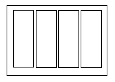
Simple card design, huh! To me a sketch or design is just a starting point. Its not meant to be copied identically, it servers more as and aid to your creative style. We are going to take the sketch and change the size and style, here we go! Oh, one more thing this sketch the best for using up your scraps!!!!
This cars is pretty strait forward from the sketch. Four coordinating papers cut down to fit the card size and adhered side by side. I added a simple cream strip with a sentiment and cork star with a stamped image layered on top. Simple.
Here is card #2. I selected a more pastel color pallet out of my scrap bucket for this card. I also embossed the pink card stock paper to give it a 'pop' and rounded the corners of the 2 outside paper strips for a softer look. Topped it off with a pretty pike and a hand made banner - up, the post of the banner is a tooth pic!
I went to a square 6x6 card therefor changing my size of my strips of paper. I also decided to make the strips in to flag and over lap them just a bit. I added the decorative boarder to the top and some embellishments and its done!
Lets recap the things to change to make this card different:
*Card Size
*Paper Colors
*Paper Strip Size
*Alter Paper Strips (flag bottom, rounded corner, border punch the bottom or sides, so many options)
*Number Of Paper Strips (only use 3 or 2 and leave part of the card showing!)
*Embellishment and sentiments to keep the card unique


Beautiful cards!
ReplyDeleteVery nice! I love seeing how one sketch can produce such different results.
ReplyDeletewonderfulllll cards!!!
ReplyDelete