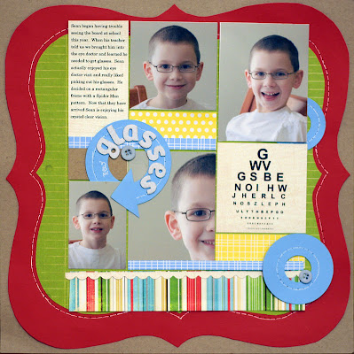
Up first is a page by Pam. This page really highlights the happiness in her sons face. It is really neat how she selected some close-up and some more full view photos. Pam is really great at using shapes on her pages. I love the way she has included 2 circles on the page, like the lenses of glasses! The blocked layout also looks awesome matted by the bracket shape.
Pam's use of shapes is wonderful on this page too. Those clipped strips of paper remind me of flags flying in the breeze. This is a neat way to display multiple photos. The vertical strip of blue paper acts as a divider to the page and Pam has located one focal photo on one side and the 2 close-up photos on the other side. It helps to move your eye across the page to take in all those really neat details.
Vicky shares this beautiful page with us. In addition to all the wonderful shabbiness of this page, the placement of the photos is perfect. With the photos looking in toward each other, it keeps your focus. It also looks like 2 babies having a conversation, doesn't it?
Next up is Nancy. This is such a cool idea for the layout of multiple photos of the same subject on a page. Nancy has book-ended two smaller photos in black and white on either side of the larger color photo. So cute!
Here's another page by Nancy that uses another great way to include multiple photos, a film strip. Nancy does a great job of making use of the negative space on this layout too. The big title flows right into the photo strip and the sweet circular elements really make it pop.
On this page, I used a photo strip as well. In this example, I've displayed photos in a time sequence to help tell the story about the waves crashing over my photo subjects! The smaller film strip photos compliment the 2 larger focal photos.
Here's another way to include many pictures on a page. Use the focal photo as a background. On this page, I blended the large photo with a digital paper to create the background for this layout. The blocking of the smaller photos is always a great way to include lots of photos on a page.
Another way to use blocked photos is to put small numbers or elements that tie the photo to your journaling. On this page I placed the journaling down one side. I put tiny numbers on several of the photos and at the relevant spot in my journaling.
Cindy is amazing at getting a lot of photos on her layouts. She does a great job of including journaling as well without her pages looking crowded. On this page she includes a focal photo and several other photos that cover an entire summer of swimming lessons. I like how she has split the title and date on either side of the photo block.
These are some additional examples of Cindy's talent. She has worked these designs out to include both vertical and horizontal photos. It's pretty cool to be able to look at a one or 2-page layout and see so many memories captured.
Dolores is sharing a few layouts with multiple photos as well. The photos on this page are so cute. How could you possible choose to include only one of these? Dolores has accented them each with an elegant stamp behind the photo mat and well as sweet flowers on top.
This page from Dolores is so very elegant. The touches of lace and delicate flowers are beautiful. Dolores has placed her photos in the design triangle. This really keeps your eye moving about her page and soaking up all the wonderful details.
For some scrappers, creating multiple photo layouts can be a real challenge. For others, it's the only way they create a page. Which are you? Are multiple photo layout scrapper or a single photo layout scrapper? Leave us a comment and let us know!


I love doing both, but a lot of mine are double LOs with lots of pics especially if the pictures are from events like birthdays or Christmas. But some of the time I have one, two or even three pictures that I want to do on a single page. And that's when I can create the beautiful layered with lots of embellishment pages. I also like doing a collage of pictures from an occasion, printing that and using it on my page.
ReplyDeleteI love seeing all these layouts! I almost never scrap single-photo layouts (only when it's for an assignment) and it's a challenge! Multi-photo is much easier for me.
ReplyDeletegreat projects, everyone!
ReplyDeleteI'm with Cindy - the multi-photo pages seem to be the norm for me. Single photo pages are my challenge!
ReplyDeleteGLOANN- I really appreciate hearing about your process. I like the idea of 2-pagers for all those big occasions! I'll bet your albums look great with the mix of page types!
ReplyDelete