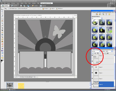
Step 1: I am going to start with the clipping masks. To work along with me, download the Sunshine Page Template and open up in Photoshop Elements. Here is a screen shot of the template below. I have indicated in red where the layers for the template are located. You can scroll down and see all of the layers to this template by clicking on that blue bar on the right hand side.
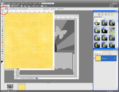
Step 2: For the next step, open up a desired piece of digital patterned paper. I indicated the move tool in red in the screen shot below. Click on that move tool and then put your cursor over the digital paper and drag it onto the sunshine template.
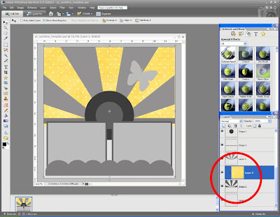
Step 3: Your paper should be part of the template now. On the layered palette to the bottom right again, you will be able to move that piece of paper up and down. Drag it until it is RIGHT ABOVE the darker rays layer (there are two sets of rays layers). Make sure the paper covers the whole area. Before creating the mask, make sure the layers palette has the PAPER layer highlighted (my layer is dark blue when highlighted). Next, hit CONTROL G. This will make the paper conform to the shape of the rays. Your palette layer should look like mine in the screen shot below.
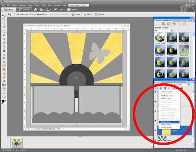
Step 4: Now you want to merge those two layered together. While the paper layer is still highlighted, right click on it. Go down to MERGE LAYERS. This will make the sunshine layered the paper layer one layer. The step should look like the screen shot below.
Step 4: Next, open up another piece of paper and drag it onto the template file just like you did in steps 1-3. This time layer it above the lighter rays layer. I have included a screen shot of this step below.
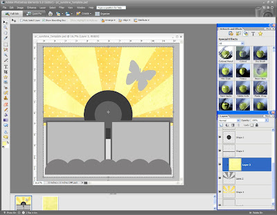
You should have two different colored rays on your page now. Repeat steps 1-3 for the background paper, the scalloped accent, and the circles.
Step 5: I am going to briefly show you how to put drop shadows on some of your accents. I started with the photo frames. In the screen shot image below I have circles that are listed #1-4. First , you must select the layer that you want to put a drop shadow on, so go ahead and click on that layer. Go the special effects bar on the right hand side and click on the “Apply Effects, Filers ….” (see #1 on screen shot). In the drop down bar, select ALL (see #2 on screen shot). You will need to scroll down to find the drop shadows. I selected LOW (see number #4). To adjust the depth, opacity and other things to do with your drop shadow, click on the star shape on that layer (see #4). A box will pop up and you can adjust just about anything.
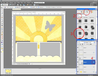
(I chose to delete one of the layers for my page. If you want to delete a layer simply right click on that layer and go down to DELETE LAYER.)
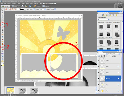
Step 6: I am going to show you how to keep the drop shadow look on the frame and insert a photo. I included the gray photo spots in case someone was interpreting my templates as a sketch. You are going to want to get rid of those gray sections. First you need to put drop shadows on both frames. So make sure step 5 is done on the frames. You are going to want to select the magic want tool located on the left hand side bar (see #1 on the screen shot). Once that is clicked, go the frame and click once over the gray section of the frame. You should see the area highlight with marching ants. Next go to the erase tool on the left side bar (see #2 on the screen shot). Go back to the image and move your cursor over the gray spot until it all gone (see #3 on screen shot)! This is an important step: go to marching ants and right click over the area and go down to DESELECT.
Step 7: Drag you photo and move it until it is right underneath the desired frame, so it looks like the screen shot below.
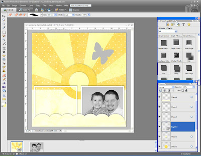
Step 8: Finish off your page as desired. I used a circular digital pathway to do my text. You can find it here. I also used a digital butterfly for my page. Make sure when you are done, save this file as a DIFFERENT name than the original. I usually save my image in both PSE and JPEG. See the screen shot below of the page being completed.
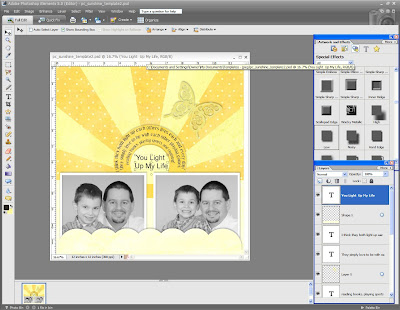
I used digital paper by Paislee Press at www.oscraps.com.
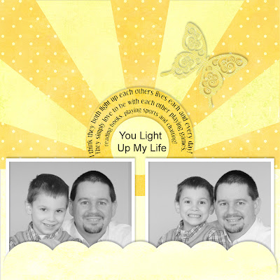
Here is my finished digital page!
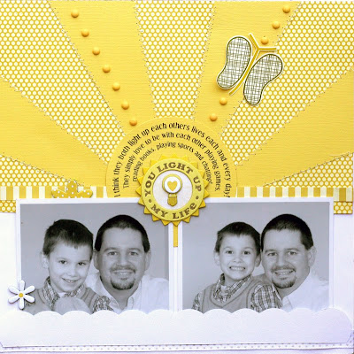
This is my original scrapbook page. They are pretty similar huh?


this is a FANTASTIC post, pam!!! :)
ReplyDeleteHi Pam, thank you for the greaet tutorial. I was successful in using your template. I can't wait to try more! I've only played around with digi scrapping these past couple of weeks. I've been 'old school' scrapping for ten years. I can't wait to learn more. Thank you for the awesome templates that'll help me on my way!!
ReplyDeleteAwesome post Pam!
ReplyDeleteThank you so much for this Freebie. I want to let you know that I posted a link to your blog in CBH Digital Scrapbooking Freebies, under the Page 7 post on Mar. 04, 2010. Thanks again.
ReplyDeleteJust a quick note to let you know that a link to this post will be placed on CraftCrave.com in the Tutorials category today [04 Mar 01:00pm GMT]. Thanks, Maria
ReplyDeleteThanks for keeping this tutorial online. I just viewed it and am so excited to use this technique.
ReplyDelete