Sunday, June 26, 2011

Digi Tip June 2011: More on Shadows

Can you believe that another month has come and gone? Here we are at the end of June already! Hi! Cathy here to share this month's Digi-tip. We are going to pick-up where we left off last month with shadowing tips. In last month's post, we covered some basics about creating shadows in Photoshop and Photoshop Elements, you can read that post here.

This month I'm going to share a few more advanced tips about shadowing. I really feel that good shadowing can make the difference between a good digital scrapbook page and a fabulous page. I also think it is a skill that takes patience and practice to learn. Let me admit to you that I am still learning and always practicing. It is one skill that I do not feel I will ever master. As the software evolves, we get more and easier tools available to helps us create more realistic shadows. So please, don't be afraid to try new things and practice, practice, practice!


Sometimes the item that you are creating a shadow for is not flat. So you would like to create a shadow that is not "flat", but that flows or maybe you'd like it to "lift" the item off the page a bit. Strings are a great example of this. In the image above you can see a string with the basic drop shadow that we learned about last month. It looks fine. But we can make it even better!


In Photoshop (the full version), you can move the shadow to it's own layer, giving you more control over how you manipulate it. To do so, In the layers panel for the particular layer, right click on the layer effects (make sure to click on the "fx" to open the effects for that layer if it is not already opened). A drop down menu will show. Click on "Create Layer". This will separate the shadow from the element, placing the shadow on it's own layer directly below the element's layer. You can also do this through the menu, simply select Layer> Layer Styles> Create Layer.
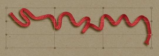

Now, being certain to make the shadow layer active, you can begin to edit it. Select the warp tool. Edit> Transform> Warp or by pressing ctrl+T and then select the warp icon (see the image below).

The element will be surrounded by the warp grid. You can alter the shape bu pulling and pushing on the warp grid. Use the mouse to click on any of the points (or cross grids) on the warp grid and drag to modify the shadow. Play with moving various parts until you have the shadow the way you would like it.

Since this also makes the string appear to be further away from the paper beneath it, I like to reduce the opacity of the shadow layer as well.


Above is a comparison of how the two different shadows look. You can see that the 2nd shadow has a bit more character.

Another way that you can edit the shadow is with the smudge tool. Once you have the shadow on it's own layer, select the smudge tool. Use a soft round brush set fairly larger than the area of the element you are adjusting. In my example it was set to 425 with strength set at 50. Use the smudge tool to pull the shadow slightly in the direction that you want.
Below you can see the examples.


  • The top most has the basic shadow
  • The middle shadow was made using the warp tool
  • The bottom shadow was made using the smudge tool

Have some fun using new tools and techniques to create shadows on your next project. As always, if you have any questions or suggestions for PS tips you'd like to see, please let me know.

Saturday, June 25, 2011

Thanks A Bunch Pop-Up Card

Hi it's Lisa here with a fun tutorial to share.  I have seen some truly amazing cards lately and here is my version/tutorial of my first pop-up slider card. Love it!

Instructions:
First, take a 6 x 12 inch cardstock of plain cardstock and a matching patterned paper.
Fold the 6 x 12 inch half...then cut out a 3 x 3 inch square in the center.
Next cut out a 4 inch wood grain paper or you can stamp it wood grain and cut out a 2.5 inch square out of the center of the wood. make two 1/4 inch wood panes.
Cut a piece of 3 x 3 inch transparency and place on the back of the window then add the window panes on top of that...like a sandwhich.
Add a 2 inch oval and scallop around with another piece of cardstock.
Embellish with ribbons for the curtains.


The inside I used Walk In My Garden Cricut Cartridge, I made 5 sets of the tulips and leftover scraps for the blue, yellow and white flower tops. The flower pot base is a 3 inch rectangle with a 1/2 inch cut off the top...also used Martha Stewart punch for the arches on the top of the flower pot. Extra tip: Don't forget to make the backside of the flower pot and colored flowers too. For a finished 3D effect when it pops up!


The patterned paper is 6 x 6 and BEFORE you tack it down cut out the slider part first.
There are some great tutorials out there on how to make the slider. Here is one by Dawn's Stamping Thoughts that is great: click here for link to video...thank you! I modified my measurements for my card...I cut mine at 2 inches and 4 inches and 3 inches high....basically, in the center of the card so that you could see the flowers through the window when the card is laying flat. The inside slider is the same green to match and I punched a hole in the bottom and added ribbon.
The kids are planning to sign the card on the slider part later....


Hope you enjoyed looking and try your first pop up slider card too! Super fun!

Friday, June 24, 2011

Friday Special: Reader's Pages!

Hello all and happy Friday! I am sharing two great pages by two different artists using Heather's beautiful sketch from last week called June Template Number One. You can see the sketch and download the template here.

Marlene created this page all about two friends. I love the sewn flag on the side. What a cool touch! And the design looks so good papers and embellishments! Her take on this sketch is great!!  You can see more of Marlene's pretty work at her gallery here: Scrap4brains .


The next page using that sketch is by April. This take on the sketch is fabulous as well. Take a look at the the mood created on the page by the papers and photo. So dreamy and cool. I also love the butterflies flying up to the top! You can see more April's neat work on her blog here: http://scrapperforever.blogspot.com/ .


I hope you will try to work with this sketch! If you do, please send it to me at scrappingpam73@yahoo.com .

Thursday, June 23, 2011

Heather's June Sketch Two

I created this template based on the layout I made for a blog hop on Jessica Sprague's website. I just realized when I sat down to write this post that I'm not allowed to share the layout until this Friday. Ooops! Thank goodness that Nancy, Vicky, and Dolores came through with example layouts for me to share! Thank you very much girls. Here is the the preview of the sketch/template.


This is Nancy's layout. She scrapped about her daughter running away. The layout is so pretty and her journaling totally tugs at my heart strings. Such a wonderful page!


Vicky made this lovely page featuring beautiful handmade flowers and gorgeous layered butterflies. What a pretty dog! I also love that she included a paw print as an embellishment.


Dolores used the digital template that will be available for download at the end of this of post. She scrapped adorable photos of a sweet dog she meet at her family reunion. I love the clusters of flowers she used and the pretty color combination.


If you want to download the layered digital template that I created in Photoshop Elements feel free to click the link below.

http://www.4shared.com/file/QpCWAodD/HL_JuneTemplateTwo.html

Wednesday, June 22, 2011

Designer Showcase: Wedding Layouts

June is such a popular month for brides and grooms. I got married in October but June would have been good too with the nice weather! Today I am sharing a few wedding layouts from the contributors as inspiration in case you just got married, are scrapping older wedding photos, or creating layouts about others who got married! Enjoy :)

Vicky created this pretty page about her wedding. The details, color, and everything are just perfect for any wedding photos. Check out this page!


Lisa also created a very glamorous page! Take a look at all of the neat flower, colors, and details for this wedding page! So pretty!


Heather went in a different route with a more graphic page. These circles are so neat on her page. I love the idea of a wedding page with circles- as I do those type a lot!


Here is another graphic wedding page by me :)

  I hope these pages give you some ideas to create those wedding layouts!!


Tuesday, June 21, 2011

Teacher Gift Ideas!

Its Sara hear with a little post to give you some quick and easy Teacher Gifts!  Its that time of year and school is wrapping up (for some it already has has) but these ideas could be used for daycare providers, camp counselors or next years teachers. 


I just adore the first idea with the very popular reusable cup!  Depending up on your cup will depend on how you decorate it. I simply used some scrap paper and ribbon to make a collar on the top (I used glue dots for adhesive).  Than I filled the cup with single serve packets of lemon aid and pink lemon aid.  To top it off I made this little banner that says
"Thank You for quenching my thirst for knowledge!" 

So easy!!!! 

Next is a left over Crystal Light container that I decorated with scrap paper and filled with Reese's Pieces!  Than I just added a little scalloped tag that says 
" I love you to pieces"

These are great little ideas to add to your bag of tricks for all sort of occasions! 

Happy Gift Giving!


Monday, June 20, 2011

Dress Pattern Flowers

Hi Everyone, Nancy here with a quick flower for you.

I started with some old dress pattern paper and a die for a simple flower (you can also use a punch but be sure to punch quite a few layers at a time.  Circles or scallops would also work.

I cut a bunch of these out.  You will need about 20 shapes for each flower.

Poke a hole in the center of the flowers.

Add a brad to hold the layers together.

Scrunch and play with the layers until you get the desired look.

And here is my finished project.

Thanks for looking