Thursday, February 28, 2013

Winners and Trend Over the Years

Here are the winner for the 1,000 post giveaway!!!!

1. The $50 gift certificateto sb.com goes to:


Congrats on 1,000 posts! I enjoy when you showcases sketches. I love sketches and will pin them on Pinterest for easy access.


2. The GCD Studios Paper Giveaway goes to:


My favorite post was from a while ago...remember the tutorial on how to make a frog out of ribbon? I loved that one!!


Congrats winners!! I will be contacting you OR you can contact me at scrappingpam73@yahoo.com to claim your prize!!

Wednesday, February 27, 2013

Designer Showcase: Washi Tape

If you're looking for our 1,000 Post Party and Give-away, you can scroll down two posts or click here.  Don't miss out on all the fun!!


Today's Designer Showcase might be a bit of a sticky topic. We're talking about Washi Tape!  Fun stuff to play with. If you haven't yet found this stuff, it's a low tack often translucent tape with colors, patterns and designs on it.  It makes for some very easy, and creative ways to add color, texture and heighten your design. I'm starting to see more of it showing up in hobby stores in the area.


Here is an amazing page designed by Marlene. She used some washi tape to add accent to the die cut border. When I first saw this page, I instantly fell in love. There is so much texture and shape to it. The paint,  inks, and stains are all so fun and add a great deal of masculine touch to the layout.  Check out how Marlene used so many shapes through her combination of patterned papers. It all makes this page a treat to behold.


Sarah used some tapes on this Daddy and Me page that she created. She used Tim Holtz tissue tape. You can see it behind the page title. She also used some tape to "hold down" her photo. Another great use for tape on a page.  Giving the tape a crumpled appearance helps to grunge up the page a bit and adds little shadows of interest.


This adorable card was designed by Cindy. There is so much to love on here.  The tape adds the really cute polka dot elements.  She also used it as a visual barrier and dividing point for the color block changes. I just love this design idea.  It really makes the card classy and sophisticated.


I have only recently gotten my hands on some washi tapes.  But already I can see so many great ideas for using them. Here is a truly, simple quick craft that you can do with your kids to dress up the house.  I simply wrapped the washi tape around some tea light candles.  It took about 30 seconds and now they look dressy enough to sit out on their own. Or add them to a glass votive for an even dressier look.


Gael has crafted this exquisite page using some washi tape in a unique way.  She has the herringbone tape as a border on either side of the photo and as the bow at the top! Isn't that adorable?  But that's not all!  She also used a green washi tape pleated across the middle and to cover the center (smallest) heart. And... yes there's more, she used a black alphabet washi tape to create her title! Wow!

Out in blog-land, I found some more great ideas for using washi tape that I thought I'd share here.


This is a composition book with washi tape run down the edge of the pages.  Easy way to dress up a journal.    I found this on the blog mom.run.craft.  


These are some pebble magnets made with washi tape on the back of them. You can see the tutorial on the blog Ishatar Olivera.


When I found this, I thought I'd hit the mother-load!! 100 ways to use washi tape!  This is on the blog  A Night Owl.  There are links to each of the 100 projects found on various blogs.


Tuesday, February 26, 2013

Where Do Lost Socks Go?

If you're looking for our 1,000 Post Party and Give-away, you can scroll down one post or click here.  Don't miss out on all the fun!!


In my house, we have this increasing set of socks that have lost their mates.  They have taken up real estate on my dresser. I wanted to find a more appropriate place for them to hang out while they wait for their match. So I created this missing sock board/sign to hang in my laundry room.


This started out as a plain unfinished wooden plaque.  I found some scrapbook paper that I really like. I'd say that it goes with my laundry room decor, but my laundry "room" isn't so much a room as it is the stairway landing to the basement! Not much "decor" going on there!  The paper is My Mind's Eye: Lost & Found Two - Sunshine: Memories "Sweet".  I also got some acrylic paint to match. I painted the board with 2 coats of the paint to be certain it was covered.

I then cut the paper to fit and rounded the corners. I inked the paper edges with Ranger Distress Ink Vintage Photo.  I also inked the edges of the wood to give it a more distressed and "old west" look. After all, it is a "wanted" sign!  I decoupaged the paper to the wood using some Mod Podge.


I cut the "WANTED" from brown vinyl using my Silhouette Cameo and adhered it to the sign.  I then gave everything a light coat of Mod Podge (hoping that helps to keep it in tip top shape for years to come!).

The clothes pins got a bit of the distress ink on the edges too. They are hot glued in place.  Now they hold the unmatched socks in need of a mate. Even the ones that are a bit worn and stained!  Talk about airing my dirty laundry! :)


Thursday, February 21, 2013

1000th Post Party...Gift Certificate & Paper Giveaway

Hey all it's Pam here!! Can you believe that it's our 1,000th post??? I am so excited by this milestone. When I started the blog I couldn't have imagined how far it could come or how many visitors we could get. We just got our 1,000,000th page view as well last week.  I remember when I did my very first post and I was so nervous.  Back then the blog was getting maybe 25 visitors a day but I still didn't know if people would like it or not. After inviting AMAZING contributors over the years to post alongside me, they blog grew and grew. Now we are up to almost 1500 blog followers. I feel very humbled by this :). I am also excited to share this post today with our newest co-owner, Cathy who has been such a great asset to the blog!! Today I am going to be sharing the most popular posts of all time, what are the contributors' favorite posts that they have done, and giving away two amazing giveaways. Here are the details:

Please comment in the comment section with your favorite post and why. Is it one of our wonderful techniques/tutorials, sketches, templates, designer showcase, or any other ideas you have seen? Do you know we have over 150 tutorials and 50 of them are of flowers where you can see the links here and see the images here on our Pinterest Board??  (If you are new to the blog, just pick your favorite from the ones listed below :) ) You will be in the running to get a $50 gift certificate from scrapbook.com and another person will win the paper pack Sunkissed, which is a brand new release by Heidi Sonboul (my dear friend) for GCD Studios. Here is a preview of the paper pack and a layout I created with it! This collection is soooo fun and I ADORE its bright colors and fun patterns like the calendar and swimmers. I know you will too!! Remember you have to leave a comment to be in the running!!! You have until Feb. 27 at midnight est to post a comment.


Ok, so onto my favorite post that I have created. There have been soooo many it is so hard to chose!! But I went over my posts I found my favorite one which is a two part Trend Report I did in April 2012. I included many trends in scrapbooking as well as fabulous examples by the contributors. You have to see this post, check part 1 and part 2. Before we get to Cathy... I am going to share the 10 most popular posts since the blog was started. This is so cool to see :)

1. Baby Dress Card and Template (with almost 22,000 views)
2. New Postage Stamp Template!
3. Another Use for Foam Dots
4. New Scrapbook Tutorial Master List 
5. Star Template
6. Handmade Smash Book
7. Flower Template!
8. A handmade Dahlia for your pages!
9. Thanksgiving Card Ideas!
10. Easy handmade pearl flourishes 
________

Cathy Dippolito
When Pam first invited me to become a contributor to the blog, I remember being really thrilled. Creating is one of my most favorite things to do. Teaching and sharing with others is at the top of my list too. So this was such a great fit for me.  Now working side-by-side with Pam and all the Contributing Artists is an integral part of who I am. I can't imagine not reading or posting on the blog each week.  I've gotten to meet so many talented people through Ideas For Scrapbookers. I really enjoy when you, our readers and followers share your ideas, projects, creativity and inspiration with us.  


As we look back and try to pick out our favorite post, it was too difficult for me to narrow it down to just one. My favorite tutorials that I have shared are the "Baby Shower Diaper Cake" and the "Dress Up a Tin Box". The diaper cake was such a fun project with lots of hope and joy built in for my niece as she waited for the arrival of her first child. The tin project had so many techniques and things that let you get your hands all inky and sticky as an artist. Those are some of my favorite types of projects, the ones that get our hands all dirty!


I also can't over look each and everyone of the Designer Showcase posts.  These posts are chock full of inspiration and ideas.  Every week the gals here at Ideas For Scrapbookers work hard to contribute unique, interesting and creative projects on each of the themes. I have learned so much from all that they share with us.  If you haven't already done so, check out the blog of Wednesday for the new Designer Showcase theme.  You can also view all the past DS posts here.
______
Dolores created the most beautiful tutorial for the blog a while back. She always creates really innovative and beautiful tutorials as well as fabulous templates. It was called the Dahlia tutorial.  This is what she had to say about why she picked this one,"It's my favorite first because it was an experiment and second because I was so happy with the result.  It's fun to stretch yourself and have a result that is so pleasing. When the final product exceeds your expectations that's great, it inspires you to try more new things." You can see her tutorial here.
______
Cindy has some super cool ideas for her posts, like stuff I would never think of.  Her favorite post is called Street Sign Scrapping which includes a neat idea to find maps with the family's first name on it and take photos with each person next to their signs. I adore this idea. I still need to do this. You can see the post in this link.
______

Marlene brings innovative ideas to the blog showing us how to do new things. Marlene's favorite post is her most recent one on even misting. She shows us how to get the same amount of mist all over the page. Check out her final product which is a cute layout and her post here.
______

Lesley Walker
Lesley posts contain neat techniques and pretty pages. In her favorite post, she uses Gesso and a stencil and the results are gorgeous. She also layers her page with lace and layered with soft and pretty flowers! You can check her favorite post here
______

Gael creates such really elegant pages. In her favorite posts she shares with us how she created her own flowers. They were inspired by a video by Gabrielle P. I can see why Gael's post is her favorite, it created such a pretty outcome!! You can see the post by going to this link.
______
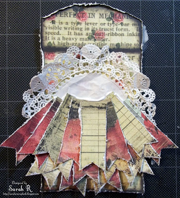
Sarah just started with us and her first post was called build-a-tag. She created the most beautiful bunch of banner pieces tied together which you can see here. I can't wait to see what she creates next!!


Thanks for joining us today to celebrate!! I hope you will be here when we celebrate 2,000 posts!!!! Thanks to the current, past contributors and guest contributors that have been such an integral part of the blog.

Wednesday, February 20, 2013

Designer Showcase: Hexagons

Welcome to this weeks Designer Showcase.  The theme this week is the very trendy and popular hexagon.  So sit back and relax while we share some projects including hexagons to inspire you to use this totally hip shape!


Sarah designed this amazing creation.  There are layers of hexagons on this!She stamped hexagons on the background with some awesome texture. Sarah cut hexagons from various patterned papers.Then on top of that, she fussy cut some hexagon printed paper! That title is so cute too, as is all the stamping and the mild distressing.


Lesley created this masterpiece. She used a Crafter's Workshop template to design the shapes. The papers that she used are Kaisercraft.  Lesley said that she likes to use hexagons, especially on a "boy" page. She uses them instead of flowers. What a great idea.  If you're looking for a way to take a girly page sketch and make a page for a boy, replace the flowers with hexagons!


This is a digi page that I created. I used a background template by Libby Pritchett and the kit is 12 months: May by Penny Stringmann.  I created this layout to feature these designers in a magazine article. I thought that use of the shapes allowed me to show off the various papers in the pack. But I also like that idea of so much variety on this particular page since it was a representation of me and my life up to that point.


Cindy's creative eye looked at this hexagon paper and saw a way to create an interesting border for her card design. I love how she used the hexagons to reflect a beehive.  The little doodled trail that she added after the bee sticker just pumps up the cuteness on this adorable card.


Here is another card made using hexagons. I was making this card for a friend that quilts.The cut through shapes of the hexagons reminds me of a quilt pattern. Which tied in perfectly with the sentiment!

We hope you've enjoyed these great ideas for incorporating hexagons on your next project!


Tuesday, February 19, 2013

1,000 Post Party on Friday!!

Hey all, it's Pam. You are invited to share our 1000th post with us on this Friday, Feb. 22. There will be fun facts about the blog and chance to win a GIFT certificate to a online store! Please come with us to celebrate!!

See you then!!
-Pam

Friday, February 15, 2013

Gift Card Holders

Cindy here, with a little tip for when you scrap about restaurants, stores, and other businesses.  When you make your purchase, check to see if they have any gift card holders.  Many businesses have them and are happy to give you one, even if you don't buy a gift card.

This layout is about one of my favorite fall traditions- taking my son to Baskin-Robbins in October for their Flavor of the Month, Trick-OREO-Treat. Check out the logo in the top left corner.  It came from a gift card holder.  I just cut it out and glued it on.  It's probably not acid-free, but since it's not touching any pictures, that doesn't bother me.  

 
Based on a sketch by Shannon White.

Have any of you used gift card holders on your layouts?  I'd love to see other examples!


Wednesday, February 13, 2013

Designer Showcase: Valentine's and Love

Tomorrow is Valentine's Day!!  A special day for love and romance.  We are sharing some Love and Valentine's projects here with you for this week's Designer Showcase.


Pam created this amazing page. The colors are so fresh and fun. I love how she used black & white photos.  Check out what Pam did with the chevrons in the background paper. She modified them to add more color and detail to her page. She cut out portions of the chevron print and slipped in other patterned papers. She created her own pattern paper!


Here's another page where Pam has used shapes to create a beautiful textured background for her layout. Pam took large blocks of patterned papers as mats behind the photos. She cut heart shapes from them and placed smaller heart shapes in coordinating patterns inside. Using strip of paper and ribbon, she create the look of dangling heart ornaments!


Ever have trouble balancing romantic elements on a masculine page? Sarah perfected it on this page that she created.  She used a dark background with lots of scruffy texture and rough stitches to give the page a masculine edge.  She added subtle pinks and reds through the ephemera and doilies that she layered.


Cindy created the two cards above. The quilled hearts she says is a good "beginner project".  I don't know, I'm very intimidated to try quilling. Cindy makes it look so elegant.

The second card, Cindy created for a Valentine card challenge that did not allow the use of hearts or the word love. Well, I think she definitely got the power of love going on that card! She used tone-on-tone flowers to create a very interesting design.


Here is a layout that really embraces romance. From the lovely Paris scenery, to the delicate hearts and lacy edges. Everything about this creation of Gael's speaks of love.  I love the way she did the two tone hearts behind the letters of the word "love" as well as across the top of the photo. The clusters of roses and dainty accents all add to the splendor of the page.  I'm really taken with one little detail on this page. The zipper pull! Such a neat adornment, especially with the little heart dangling from it. It makes me think that this couple is all zipped up in love!

Valentine's Day is not the only day for sharing love. We would like to remind you all that each and everyday we truly enjoy you following our blog, supporting and encouraging us. We hope that you continue to find inspiration for your creative journey from all of us here at Ideas For Scrapbookers. Your comments and talents are very much appreciated!  We hope that you have a wonderful Valentine's Day!


Tuesday, February 12, 2013

Just Paper/Stamps from my Stash

Hi it's Lesley here. I spotted a 'Close to the Heart' design that I liked and have based this layout on that.  The way I have done it is by using what I had in my stash, including digging out all my very old 'flower' stamps and cut around them rather than buying embellishments.  I even made the bow from a template I created myself and have included the dimensions for that in case you are interested in doing the same.  I loved the idea of the paper bow because it means I no longer have to worry about searching for matching ribbon.  To finish it off and keep the page free of added embellishment, I added Glossy Accents to the stamped flowers, and used Distress Markers along the outside edges of coloured paper strips.
 

A close up picture of the finished bow


The dimensions for creating the bow template are:
Cut a shape which measures, 4 1/2 cm across the middle, continue along keeping it at that depth for 7cm, then taper down till the end measurement is only 2cm.
The easiest way to do this is to draw a straight line downways on your paper which measures 4 1/2cm, then through the centre of that I drew another line which measured 14cm (7cm each side of centre). At the outside ends on the 14cm line I then drew a line which measured 1cm above and 1cm below end of the line.  That gives you your guide to taper down to the 2 ends which measure 2cm each.

Cut out around outside line and fold over in the middle which is the widest part.  You make 2 of these with the most narrow parts joining together in the centre as shown in following pictures.
 
 
 The centre strip measures 3cm across and 6cm down.  place this (printed side down) on table, then sit the 2 folded pieces with narrow part's touching each other, down on the centre of this strip and glue them to bottom strip as shown is attached picture.  Fold the edges of small strip over each other and again, glue in place.  Your bow when turned over, should look like the following picture.


All that's left to do then is to cut your 2 strips to form the tags of the bow.  These, like the bow, can of course be any measurement you wish depending on the size of the finished bow you desire, but my measurements for this particular one are: 1cm across the top part that sits under the bow, tapering out to 2cm at the end when you cut your V shape out, and the total length is 8cm.  

That is it, I do apologise for my lack of a template but hope the 'old style' measurement system helps you create your bow.


Monday, February 11, 2013

Even Misting Technique

Hi, Marlene here to show you another way to create your own background paper.  I finally ran into a method that does not lend itself to still photos so I (with lots of help from my son) created a video demo.


The last frame shows a background that I forgot to mention uses a 12 x 12 Crafter's Workshop template.  I stapled the template to the paper then chalked the dark spots on the birch trees (first with grey then a second application in black).   Next , I used my spray technique to apply Mr. Huey's Powder Blue color mist  to fill in the spaces between the trees.  The following picture is the finished product.  


 Here is the layout created with this technique.  Thanks for looking.

Friday, February 8, 2013

Build-a-Tag with Sarah

Hi There, Sarah here! I thought I'd share with you how I made this Cherub Tag - a perfect little addition to any Valentine's Day gift!
I used the February ScrapThat! kit, which features papers from Prima's "Romance Novel" collection to create this tag. One of the things I loved about the Prima "Romance Novel" papers was that they were made for fussy-cutting and layering. There are so many  wonderful small elements on the papers - such as the section of an envelope that I used as the base for my tag. Here's the step-by-step of how I built the tag:

1. Gather all your papers/embellishments. For the tag, I used the envelope base cut from the Bookplate page and a strip of paper cut from the Dear John page. I used paper and organza flowers, as well as white tulle, two different types of May Arts Pink Ribbon and Heart Ribbon Buckle and Smooch pearlized accent ink in Shabby Pink. I added a Prima Resin Cherub and a small round doily.
2. Cut a two-inch strip of paper into 3/4-inch wide strips and cut a V in one end of each strip to create the banner pieces.
3. Distress the edges of all the banner pieces, the tag and the doily. I used a craft-knife and edge-distresser for the tag/banner pieces and simply scrunched the doily.
4. Start assembling the tag. I started by placing the doily on the tag and then layered the banner pieces on top of each other, off-setting and raising each row above the previous one. 
5. Start embellishing! I rolled each of the banner elements upwards to add some more dimension to the tag.  I added the cherub as the focal point for the tag and the paper/organza flowers framing the cherub. I painted the inner petals of the paper flowers with the Smooch pearlized ink (unfortunately this doesn't show up all that well in the photo - but looks really pretty in real life). I also added in a couple of small 'corkscrews' I made from the stems that I cut off the paper flowers.
6. Add the tulle and ribbon. I cut the tulle so that the ends each had a nice V shape to mirror the V of the banner elements. I punched a hole at the top of the tag and looped the tulle through it. I threaded the two different pink ribbons through the ribbon buckle and then glued that over the hole where the tulle was attached to the tag.
That's it - the completed tag! Here is a close-up of the finished tag taken from a slight angle so you can see the dimension and embellishments a bit better.
I hope you enjoyed my little Build-a-Tag tutorial. Stop by my blog and leave me a comment if you decide to try this for yourself - I'd love to see what you do!

Materials Used:
Patterned Paper - Prima Romance Novel Collection - Dear John, and Bookplate; Prima - Ingvild Bolme - Resin Embellishments - Cherub; May Arts Curly Ribbon - Pink; May Arts Grosgrain Ribbon - Pink; May Arts ½” Heart Ribbon Buckle; IAR, Organza Beehive Blossom Flower, Pink; IAR, Babies Breath Flowers, Pink; Small White Doily (stash); White Tulle, Aleene's Tacky Glue, Glue Dots - Craft and Mini; Memory Tape Runner XL.