But where to find those fonts? And which fonts to use? If you are like me, this has been one thing that trips me up in getting my layouts done quickly. I can waste hours browsing through my fonts looking for just the right font.
Today I've got a bunch of great font examples to share. You can bookmark this post as a reference so you don't have to spend hours searching for the font that you want to use!
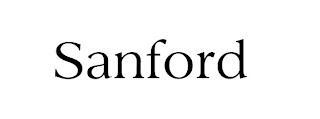
I've created each of the previews of the fonts using that font at 24 points. This will help you to be able to compare their styles and sizes. Each preview is linked to the site where you can download that font.
Let's start off with some great fonts for titles.
Now that you've got your title font selected, it's time to select a journaling font. While you can be quite fancy with your title font, typically you will want your journaling font to be more simple and clear. This will help to make it easy to read, even at a small size. I've previewed these fonts in 24 point to make them easy to see. Each font image is linked to the site for download.
Century Gothic font typically comes with Microsoft and Adobe software
Now that's a whole lot of fonts to digest! There are lots more out there too. A simple search for "free scrapbooking fonts" will turn up a lot more fonts that you may like. If you have a go to font that you like for your titles or journaling, we'd like to know about it. Please leave a comment on this post with what you're favorite fonts are.


Thanks for this post! I downloaded a few of those fonts :)
ReplyDeleteLinda
http://lasteve1.blogspot.com
Wow- cool! I almost never use fonts (stickers for titles and my good-ole-handwriting for journaling), but when I do, I have a hard time finding the right one amongst the few that I have. Great list!
ReplyDeleteThanks Cathy! I'm a self proclaimed fontaholic and have way too many to mention, but not a lot of the ones you listed, so I have to go download some.
ReplyDeleteI thought I'd give you a list of some of the ones I like.
For titles:
28 DAYS LATER (http://www.dafont.com/28-days-later.font)
Sloop Script Two (http://www.fonts101.com/search/sloop+script.aspx)
Kingthings Peek’n’meex (http://www.dafont.com/kingthings-piquenme.font)
For journalling my absolute favourite is Marker Fine Point, but the other two are great too:
Marker Fine Point (http://www.urbanfonts.com/fonts/Marker_Fine_Point.htm)
Enviro (http://www.ufonts.com/fonts/enviro.html)
Fabulous 50s (http://www.fontcubes.com/Fabulous-50s.font)
I love ding bats too and sometimes include them in my journalling (on paper layouts). This flower one is cute, but there are lots of others. You can usually find one to match what you're doing too. I was doing a layout about the Dutch Folk Dancing group that I belonged to and even found one with little Dutch people!
Saru’s Flower Ding (Saru’s flower ding - http://www.dafont.com/sarus-flower-ding.font)
Dutchmen (http://desktoppub.about.com/library/fonts/db/uc_dutchmen.htm)
Thanks Francine! These are great fonts and dingbats!
ReplyDeleteAn eye catching blog. Thanks for decorating it.
ReplyDeleteLetter templates
I am a total font-a-holic. At last count I had over 800 fonts. I hate to admit it but I had to download quite a few from this list too.
ReplyDeleteFrancine,
I really love that marker font. Thanks for sharing!!!