Thursday, June 14, 2012

A Challenge by Color

Hi everyone!  Nancy here today and I am so excited to share with you that Ideas for Scrapbookers is hosting a color challenge sponsored by The Sampler Kit Club.  Here is your color inspiration.

Bits of Gold, Purple, and Green with maybe a little kraft thrown in for fun.   

Here are few samples from the Sampler kit club design team using the June kit, Walking on Sunshine.
and me  Nancy Keslin

You don't need to have the kit to play along.  Just take inspiration from the photo and show us what you've got by putting a link in the comments to your project.  You have until June 30th to play.  Winner will be selected randomly from all submissions and will receive a prize pack from The Sampler.
So, are you up for the challenge?  

Hugs.

Nancy


Wednesday, June 13, 2012

Designer Showcase: Dad Themed Pages

Hi all! It is Father's day in the US this week and so we are showcasing dad based layouts. Remember you still have time to create a special layout or card for that dad/granddad/etc in your life!

Vicky created this layout about her husband. This could be a great page idea for the photos you take on Father's Day. Check out how many cool things Vicky did on her page. From the chicken wire to the curled on folded paper, she really did a great job on this page. I also like the masculine color palette for her photo.


Cindy created the next two pages. This first page is so adorable and make me say, "awww." The photos share the close relationship between dad and son. Notice the brown monotone look and the green outline paper. That green really brings out the photos!
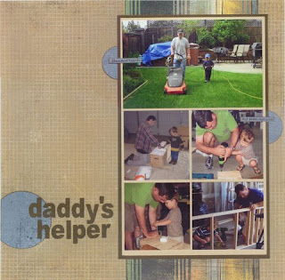
Cindy's next page features more photos of dad and son. These are show us how her son is being daddy's little helper. The circles add a visual triangle while the vertical strips help bring focus to the main photo block.


Here is one I created in which I scrapbooked my son and husband together. I used hearts to signify the love between them. My husband, Kevin is such a good father, I wanted to capture that!!

I hope your family has a great Father's Day!!

Monday, June 11, 2012

A Boy Page Idea and Sketch

Hey everyone! It's Pam here sharing a boy layout and a sketch with you. My page today is based on my energetic boy who loves to jump, run, and do Kung Fu.

To create movement on my pages I used lots of circles, buttons and cut out flower shapes. I really wanted that misting look. I have never actually misted but now that I see all of the neat projects with mist, I want to try it. Instead I used a standard hole puncher and used the negative punches as accents on my page. That gave it that "mist" look I was going for.

All products are from GCD Studios Splendor Collection

I also created a sketch in case you would like to create a layout similar to mine. I hope you enjoy!


Friday, June 8, 2012

Reader's Pages

It's Pam here on this sunny Friday sharing a couple of great reader's page using recent templates/sketches from the blog.

The first page was done by Kelly H. and it is using Dolores' template that resembles a quilt. You can download that template for free here. Kelly's page is really pretty with the color scheme and embellishments she used. I simply adore that purple frame for the photos. For a neat place to do the journaling, she chose underneath the bottom triangle! Here are details on the products she used to create her page:
Tami Miller Designs - Best Friends Forever 
Font: My Font Isn't Funky Enough.


The next page was created by Gloria M. and it features the sketch I created for the GCD Studios magazine. You can see that sketch here. Gloria's page is bright and cheery! I just love the way she used the sketch for those photo and paper designs she chose. The green, yellow, and other colors really bring out the photos and draw attention to those two cuties. Also notice how she created a visual triangle with her title, flower and butterfly! To see more of Gloria's beautiful work you can click here to see her flickr gallery.


Thanks so much Gloria and Kelly for sharing your pages with us. 
Have a reader's page you would like to share? Email me at scrappingpam73@yahoo.com and I will feature you!


Thursday, June 7, 2012

Using Silhouette Print & Cut to Create Cards

Happy Thursday to you!  Cathy here. I'm going to be showing you a card I made using the print & cut feature of the Silhouette Cameo.  This works on the Silhouette SD as well.  I've only had my Cameo for a short while and I am falling in love with it deeper and deeper every time I use it!

One of the best features to it is that you can "print & cut" just about anything! OK - well that's one of the features I like best!!  Today I'm going to show how to use digital papers with Silhouette shapes to create a spectacular Father's Day card.

The digi papers that I am using are from the designer Wishing well Creations.
P365: Solids (Volume 2)

and Back to Basics Paper

These 2 packs of paper are some of my favorite "go to" supplies in my stash, especially for hybrid crafting.

Using the Silhouette software, set up a file and open the shapes needed to create your card. Resize if needed to fit the size card you are making. For this card I used shapes:

tool_bench_C01154_17986 by SnapDragon Snippettes
simple_tools_C01152_17986 by SnapDragon Snippettes
simple_tools_C01153_17986 by SnapDragon Snippettes
2_label_shapes_C00974_20509 by Lori Whitlock

Turn on the registration marks since you will be printing and cutting. Be certain that your design is not touching the hash marked area around the registration marks.  Those marks need to be clear so that the Silhouette laser can read them to know where to line up the cut with the printed items.  Here is what my design looks like at this point:


Now comes the really cool, fun part.  You can use your digital papers to "color" or fill the shapes that you cut.  You don't even have to open the paper file. Simply locate the paper that you want to use on your hard drive (using Windows Explorer or "my computer"). Click on it with your mouse to make it active, now drag the paper file onto the Silhouette workspace and hover over the shape that you want to fill. When you see the shape fill in with the paper, release the mouse. That's it. Easy-peasy, huh? Here is what it looks like as I started to fill in the shapes with digital papers:


Continue to fill each shape with the papers of your choice. You can even use digital stamps to add a sentiment to your card. The "Happy Father's Day" is a .png file from a set of sentiments by Krisi's Kreations (they have recently been retired).  Here is what my ready to print and cut design looks like:


Now in your Silhouette software you select "Send to Silhouette". It will ask if you want to print it, say yes. Select the appropriate printer and set the print properties (paper size, type etc). Print out the design.  The registration marks will print in the 3 corners of the paper.  Place the paper on the carrier mat as shown in the Silhouette software, and load it into your Silhouette.  In the software, press "continue to cut" and select to "detect registration marks automatically".  The machine will move the paper through and the head will read the registration marks.  Once this process is completed successfully, be certain your cut settings are appropriate for the type of paper you are using, and click "cut".  

You can also set up a file in the Silhouette software to cut the base for the card.  Now you will have all the pieces you need to assemble your card, and you didn't have to worry about having the right color of cardstock on hand! Simply use your digi stash and create "hybrid" instead!


I used some silver inks to enhance the tools. I distressed the tool bench with some brown and orange inks, and used brads to "hang" the tools on the pegboard.

I hope this helps you make even better use of your Silhouette cutting machine!


Wednesday, June 6, 2012

Designer Showcase: Outdoor/Nature

Hey all, it's Pam again! Do you love the outdoors? I sure do. I have so many photos of the outdoors and it is taking up a lot of memory on my computer! LOL. Today, I am sharing contributor pages of the outdoors which inspire me (and I hope you too) with lots of ideas on how to scrap those outdoor photos.

Dolores is sharing out first batch of pages. This first page is bursting with nature. From those beautiful mountain photos to the background leaves and flower, you really feel like you want to go there and enjoy that nature walk as well.

Dolores' second page features kayaking in the clear waters of Colorado, She used a nice design to feature these photo along with colors on her page which accented those photos nicely.

On Dolores' third page, she shares a gorgeous beach scene with us. I feel like I am almost there with the white wood paper and beach like accents. This is a gorgeous beach themed digital page.


This next page is by Vicky. It features a outdoor photo with lots of great accent and curled corner. Notice how well the frame does at highlighting the photo. This is a sweet way to showcase this outdoor page about brothers.


Cathy created our next three pages. This first page features a cool technique which is dipping leaves in paint to create the background. That is one cool idea. She also did a great job of showcasing so many photos without looking crowded.

On this next page, Cathy shares some adorable photo with her son and cows. I just love all of the farm themed digital items she used on her page like the barn, chicken wire, a fence, and many animals which are digital felties. This turned out so adorable!

Cathy's third page is all letter boxing which looks like a blast. She showcased the main photo in a decorated frame and put the rest of the photo below the wood textured title. I like all of the nature items coming out from under the photos.


Cindy page here tells a story about her son who had allergic reaction which required them to stop camping earlier than they expected. Poor guy. She wanted to include as many photo as she could of them before the left. She did a great job of doing that. It looks like they had so much fun while they were there.

Cindy's next page shows us that you don't have to journal every time. Sometimes the photos speak for themselves and do a great job with the story telling. Cindy did a nice job of blocking her design and using the perfect colors which complimented her page.


Nancy's page features photos of the solar eclipse and her family watching as it occured. She also included actual photos of he eclipse which is such a cool idea! I like how she put a few photos of the bottom of her family and the sun photos on the top! Nice! I am glad I got see her experience of this.


Lesley scrapped the last three photos. Her first page was inspired by my "beach template". Notice how cool it is with that paper which resembles water coming down, love that. She put fish and a wave on the paper which makes it look even cooler.  She showcases adorable photos of her grandson enjoying the beach front.

On her next page, Lesley captures the beautiful mountains and the snow capped trees. The white background is just perfect for this page as it looks like real snow falling. She also accented her page with a burgundy deer and title.

On Lesley's last page, she shows us the nice view of the town she lives in. I must say I would love to live there, it looks so peaceful. She accented her page with lots of beachy items like a neat, shells, birds, and a beach color palette. She did a great job of scrapbooking her town!

Thanks for visiting the blog today. Hope this inspired you!


Tuesday, June 5, 2012

Scallops from Circles - A Fun Template!

Hi, Dolores here today to share putting some nice big scallops into your layouts.  Building layers on a page is easy when you use basic shapes and the circle shape can make beautiful scallops on any page.  I joined a few circles together to build some layered scallops on this page.  Here is my layout.


This cute little baby is the daughter of a friend and she is the happiest little girl.  It's a joy to do layouts with her pictures.  I created this page with a kit from Penny Springmann called Unwritten.  Here is the sketch of the page.


The layered scallops are simple joined circles.  The basic shapes are below.
The page used 2 pieces cut our of Part 1 and one piece cut out of Part 2.  Just stack the Part 1 pieces on the bottom and place Part 2 on top.  That's all there is to it. 

Don't forget to try rotating this sketch/template for an entirely different look.  I rotated the template  90 degrees clockwise and modified my photo frame to create the page below.


I didn't want to use 2 pictures here, so I moved my title to the lower left corner.  A template is just a starting point for all your creativity, so change it up to suit your needs!  This page was created with a beautiful kit called Indigo Nights by Jennifer Labre and Studio Flergs.  I just love the colors!

For our digital scrapbookers you can download the template from one of the two file sharing sites below:

4Shared:  ds-template-20.psd
MediaFrie:  ds-template-20.psd

Thanks for stopping by.  Hope you enjoy the sketch/template!