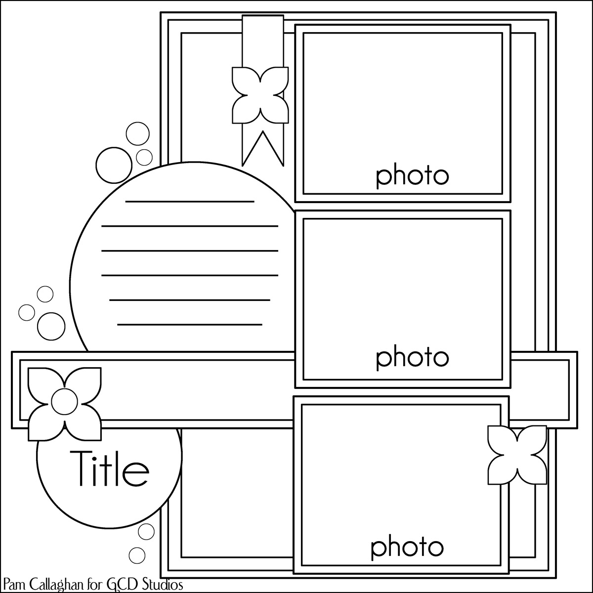
Hi all. Pam with you today sharing a new sketch and a few takes of it. I am totally BLOWN AWAY by the pages that the contributors created for the sketch. Each of their takes on sketch are so different and really inspire to me create new pages! First let me share with you the sketch! It is pretty simple with three photos and a few extra embellishments to accent the page.
Lesley is up first with a breathtaking layout using the sketch. This has to be my all time favorite layout by Lesley. I just adore everything about it from the sweet film strips of her granddaughter to the accents of pink, blue and cream. This could not be any sweeter! You can see she stuck to the original sketch except added photos and paper to the middle strip. Amazing!
Gael's page is up next! Her page is one word: strikingly beautiful. There are many things to notice and love about this page such as the collage of embellishments on the top and the unique color scheme which matches the photo to a T! For her take on the sketch she kept the original design, but took away the top photos and added embellishments instead. I couldn't imagine this photo scrapped better!
Cindy is up next with her page! Again, this is probably my new favorite page by Cindy! I just love how she documented so many things in this page having to with their life. The photo coming off the side just looks great and I love the border of pink around the photo blocks. Her style is so clean it all comes together so well. You will notice she flipped the sketch to the right 90 degrees, added two more photos, and adjusted the embellishments to work for her page! :)
Sharon created our last page today. Again I am totally wowed! The colors, patterns and design work are designed so well I just can't stop staring at the details like the vintage photos, bright pops of colors, and the beautiful die cut title. I just love how she made it her own!! Looking at her page compared the sketch, you will notice she flipped this 180 degrees. She has her one big photo on the bottom accented by the other photos (she used three). The three photos on the top really bring your eyes downward to that great castle photo. Love this!
Whatcha think? Do you like these as much as me :D . If you use the sketch and want to share with the readers here, please send it to me at scrappingpam73@yahoo.com .
Showing posts with label Sketches. Show all posts
Thursday, February 27, 2014
Saturday, October 20, 2012
Fall Page and Sketch
Hi, this is Pam sharing a page and sketch with you!! Fall is once again upon us! We adore our annual trip to the pumpkin
farm to pick out our own pumpkins. We always have a blast when we are
there! My layout reflects the great fall colors that day! On my page I
showcased my photos in a neat way and later on I will share with you my
sketch so you can use it as well. First, was choosing my papers. I
found some great fall colors in the Splendor Collection that would go
perfectly with my page. I also chose some background cardstocks to
match. To create my background I used a circle cutter and also used that
same cutter for my smaller circles. Adding touches like banners and
pumpkins really enhanced my page.
Supplies: GCD Splendor Collection, Bazzill Basics cardstock, My Mind Eye cardstock and banner, Chic Tags embellishments, Jolee's Boutique stickers, American Crafts thickers.
Here is the sketch which goes along with my page. I hope you enjoy this and are able to to get some inspiration from it!
Have a great day!
Supplies: GCD Splendor Collection, Bazzill Basics cardstock, My Mind Eye cardstock and banner, Chic Tags embellishments, Jolee's Boutique stickers, American Crafts thickers.
Here is the sketch which goes along with my page. I hope you enjoy this and are able to to get some inspiration from it!
Have a great day!
Thursday, September 20, 2012
Working with Patterned Paper + Sketch
Hey all, it's Pam here with a sketch and two examples of using patterned papers in interesting ways. I love to use strong design in my layouts as you will see below. In this first example, I created an interesting number page along with lots of color. My dog is the center of the page. She is an adored pet and I wanted to create a celebration page with her at the age of five. I chose patterned paper that was mostly from the Country Charm collection. All of the circle cutting and fussy cutting was done with a kraft knife. I don't own a big die cut machine, so I must do everything by hand, which I actually like. As you can see each patterned paper is cut to fit into different circles and it actually does a good job of drawing your eyes to the main two photos.
Supplies: GCD Studios Country Charm, Flower Child Collections, American Crafts Thickers, Making Memories flower, October Afternoon sticker.
My second example is my son's first day of school for fourth grade. Here I spread out the patterned papers into squares and added them to my page. I purposely planned my photos like that so they would stand out the most. With bright colors surrounding them, they stood out quite well. I alternated with papers and patterns to add lots of interest to the page. For instance notice how the blue patterned paper on the bottom ties into drawing your eyes down the page. Below my page is the sketch. I hope you enjoy and use this sketch for your upcoming projects!
Supplies: GCD Studios Country Charm, Flower Girl, Sweet Tooth, Bonjour Collections, American Crafts Thickers, Jenni Bowlin Stickers, October Afternoon embellishments, Chic Tags Circle Tag, My Minds Eye Paper, Bazzill Basics Kraft Cardstock.
Have a great day!!
Supplies: GCD Studios Country Charm, Flower Child Collections, American Crafts Thickers, Making Memories flower, October Afternoon sticker.
My second example is my son's first day of school for fourth grade. Here I spread out the patterned papers into squares and added them to my page. I purposely planned my photos like that so they would stand out the most. With bright colors surrounding them, they stood out quite well. I alternated with papers and patterns to add lots of interest to the page. For instance notice how the blue patterned paper on the bottom ties into drawing your eyes down the page. Below my page is the sketch. I hope you enjoy and use this sketch for your upcoming projects!
Supplies: GCD Studios Country Charm, Flower Girl, Sweet Tooth, Bonjour Collections, American Crafts Thickers, Jenni Bowlin Stickers, October Afternoon embellishments, Chic Tags Circle Tag, My Minds Eye Paper, Bazzill Basics Kraft Cardstock.
Have a great day!!
Labels:
Design Tip,
Made by Pam,
Project Ideas,
Sketch,
Sketches
Tuesday, September 4, 2012
Tuesday Sketch
Good Tuesday! It's Pam again today with another sketch and layout. I created this for the GCD Studios PaperCut Magazine which will be posted very soon! My sketch is a pretty fun one, I most admit, and so easy to replicate on paper. This layout took me less than an hour, you should give a try!
The photos I used were from my son on a school field trip where he was horseback riding. I kept a rustic look to my page by using colors which matched the photos perfectly. The main paper collections I used were a combination of GCD's Splendor and Country Charm. I accented my page with some punched out stars, stickers, and a cream banner. The background paper added to the outdoor feel along with the title stickers.
Have a super day!
The photos I used were from my son on a school field trip where he was horseback riding. I kept a rustic look to my page by using colors which matched the photos perfectly. The main paper collections I used were a combination of GCD's Splendor and Country Charm. I accented my page with some punched out stars, stickers, and a cream banner. The background paper added to the outdoor feel along with the title stickers.
Have a super day!
Tuesday, August 28, 2012
Bird Watcher and a Sketch :)
I really like creating happy/bright colored layouts. I also love
photography, so mixing the two is even better. Today I am sharing a page
and sketch featuring some adorable birds that I took at the zoo. The
local zoo has a great bird exhibit and I was able to get natural photos
of birds from all over the world. I especially like taking photos of
brightly colored birds as you will see below. I used my telephoto lens
with my Canon Rebel to take these snapshots. My layout consists of four
photos: three photos of birds and one photo of my son, the bird watcher.
The page features all of the main photos together and the last photo by
itself to give emphasis to it (my son's expression is priceless). I
also designed the colors of the page so the bird photos would pop over
the yellow background. Going along with the "bright" theme I used a sun
accent and a couple of clouds to give it that outdoor look. All of my
papers are from the GCD Flower Child Collection. Take a peek at my page!
Here is a sketch of my page. Feel free to flip it, alter it, whatever you like to suit your page!
Hope you have fun with the sketch!!
Here is a sketch of my page. Feel free to flip it, alter it, whatever you like to suit your page!
Hope you have fun with the sketch!!
Monday, August 13, 2012
Old Photos and A New Sketch
Hi, Marlene here. Last February, my daughter
and I had the opportunity to go through a box of old photos at my dad's
house. My daughter latched onto this old Poloroid of her
grandparents and brought it home. It has been shuffled around ever
since. The pose is so uncharacteristic of them that I finally decided it
deserved some special treatment. Combined with a photo of the house they
had purchased at the time the picture was taken, it was perfect for the sketch
that Pam posted here August 6th.
Monday, August 6, 2012
Monday Sketch
Hey everyone! It's Pam here on this sunny Monday (well it's sunny here). I have a new sketch to share and also the newest issue of Papercut Magazine by GCD Studios. My sketch is a super easy sketch. It was loosely inspired by an design I saw on pinterest (I think?). The design is also inspired by one of my previous sketches you can see here. I just shrunk down the photos and circles. My sketch also features cool with strips around photos. Here is my sketch!
Her is my take on the sketch. I altered it a bit. While I kept the basics the same with the rounded corners and two photos on the layout, I changed a few details about my page. I put the title in a different spot, used much smaller circles, and changed the strips of paper a bit. Rather than using flowers, I chose to use fun clouds to accent my page.
Here is the newest issue to Papercut Magazine. There are lots of neat projects to see in there. You will also see my sketch and two other projects using it! Don't forget to leave a comment... they are giving away a beautiful collection over there to one person who comments. HERE IS LINK.
Her is my take on the sketch. I altered it a bit. While I kept the basics the same with the rounded corners and two photos on the layout, I changed a few details about my page. I put the title in a different spot, used much smaller circles, and changed the strips of paper a bit. Rather than using flowers, I chose to use fun clouds to accent my page.
Here is the newest issue to Papercut Magazine. There are lots of neat projects to see in there. You will also see my sketch and two other projects using it! Don't forget to leave a comment... they are giving away a beautiful collection over there to one person who comments. HERE IS LINK.
Sunday, July 22, 2012
Layout With Circles + Sketch
Hello everyone, it's Pam here sharing layout and sketch for you.
These are photo from my son's 10th birthday! This was so
much fun to do. I envisioned large balloons floating around my page and
some of them filled with photos of my son. I chose circles because they
look almost exactly like balloons and they are easier to work with.
All of my cutting was done with an exacto knife and clear circle cutter
not an electronic die cut. The paper I chose were just perfect for my
page. There were so bright and fun and really made my black and white
photo stand out over the brown background paper. Here is my page.
The papers I used from the GCD Studios collections are: Bonjour, Sweet Tooth, Flower Child and Country charm. My embellishments are from MME and Fancy Pants. I created this sketch to go along with my page. Feel free to use it, alter it, flip it, or gain inspiration from it. :)
Hope you have fun with the sketch!!
The papers I used from the GCD Studios collections are: Bonjour, Sweet Tooth, Flower Child and Country charm. My embellishments are from MME and Fancy Pants. I created this sketch to go along with my page. Feel free to use it, alter it, flip it, or gain inspiration from it. :)
Hope you have fun with the sketch!!
Labels:
Made by Pam,
Project Ideas,
Sketch,
Sketches
Friday, July 20, 2012
My Layout Based on a Sketch
Hi, it’s Gael here today and I’ve done a layout based on the following sketch by Pam.
I loved the look of this sketch when I saw it and knew I wanted to try using it.
I started by white washing the green background paper, by painting it lightly with white paint, just to soften it slightly.
I then rolled the edges of the green paper to give it some dimension.
I used a border punch on both the pink and white papers and overlapped them as the border behind the photos.
The fancy circle shapes are all cut out with a die cut on the cuttlebug.
The
Hall of Mirrors image is one I downloaded from one of my favourite
websites – the graphics fairy. I added the text to the image in
photoshop and then printed in onto card at 75% the original size.
I then cut around the image and inked the edges and added some bling to the frame.
The butterflies are from an Australian company called Collections.
Thursday, July 12, 2012
Pier 39
Hi, this is Lesley getting back into my many holiday pics and these
photos are from a place I really loved 'Pier 39' at Fisherman's Wharf,
San Francisco. I actually used one of Pams recent sketches which she used for some
pictures of her son Sean, for this layout and it gave me the perfect
scope to show off the pics to their best advantage.
I've used Bo Bunny paper and Prima resist butterflies which I have coloured with Pan Pastels which reveals their lovely patten which you cannot see until after the colouring is done. The title was cut using the Cricut, and the circles using the Martha Stewart circle tool which I love.
Labels:
Lesley,
Project Ideas,
Sketch,
Sketches
Monday, July 9, 2012
Sketch Today
Hey everyone, it's Pam here! I love creating sketches along with layouts. My design team position at GCD Studios allows me to make sketches for their blog and magazine. The sketch used in the magazine is either used as is, altered, or flipped by three different scrapbookers. This time I went with altering the sketch. Here is the sketch for July. You can see PaperCut's July Issue here. It is a great issue!! DON'T FORGET TO LEAVE A COMMENT at the GCD PaperCut post.. they are giving away a collection to 1 person!
Here is my layout which is altering the sketch.
I altered the design of the layout for my interpretation of the sketch.
I chose to change the circles to layered flowers and bring the up the
from the bottom just as the sketch. My photos also were flip flopped
with the largest photo to the left instead of on the right. I stitched
my title on the bottom and added a few pretty butterflies to my page.
Have a nice Monday :)
Tuesday, June 26, 2012
A template with vertical Waves!
Hi, Dolores here today to share a new template with some fun vertical waves. I like the look of movement on many of my pages so waves are often in the mix when I design a page. I often like to break up the background on a page and dividing the page with waves does a nice job of accomplishing that look. Here is my layout.
I created this page with a lovely kit by Kim Broedelet called Mulberry Fields. I love these rich colors paired with the beautiful pastel and earth tones. Below is my sketch for this page.
For our digital scrapbookers you can download the template I created in Photoshop from either of the two file sharing sites below.
4Shared: ds-template-23.psd
MediaFire: ds-template-23.psd
Hope you enjoy the sketch and template. I'd love to see some of your creations!
Labels:
Digital Free Items,
digital template,
Dolores,
Freebie,
Sketches,
templates
Tuesday, June 19, 2012
New Sketch and Template with Arrows!
Hi, this is Dolores and I have a sketch and template to share today the uses large arrows to accent your page. The arrows give the background some interest and allow you to use multiple colors or patterned paper with ease. I have two layouts to share using the template. First is a vintage looking layout about the special things I recall of my Grandmother, thus my title "My Wish for Vintage Charm."
The arrow shapes here are reminiscent of quilt pieces and the intricate stitching my Grandmother did to create them. I used a lovely kit by Sherwood Studio to create this page called Thriftique. My second layout is a complete turnaround from the feminine to the masculine. Here is a page with a picture of my husband hiking.
I rotated the template 90 degrees counter clockwise and got a whole different look. Now use your imagination for a moment, don't those arrow shapes remind you of tire tracks from an off road vehicle. This page was created using two coordinating kits from Sherwood Studio, they are Colorado Springtime and Colorado Springtime in the Canyon. Living in Colorado and loving the outdoors I couldn't resist these two. Here is the sketch of my page.
The template I created in PhotoShop can be downloaded at either of the two file sharing sites below.
4Shared: ds-template-21.psd
MediaFire: ds-template-21.psd
Have a great time scrapping those layouts. Hope you enjoy the template!
Labels:
Digital,
Digital Free Items,
digital template,
Dolores,
Sketches,
templates
Monday, June 11, 2012
A Boy Page Idea and Sketch
Hey everyone! It's Pam here sharing a boy layout and a sketch with you. My page today is based on my energetic boy who loves to jump, run, and do Kung Fu.
To create movement on my pages I used lots of circles, buttons and cut out flower shapes. I really wanted that misting look. I have never actually misted but now that I see all of the neat projects with mist, I want to try it. Instead I used a standard hole puncher and used the negative punches as accents on my page. That gave it that "mist" look I was going for.
I also created a sketch in case you would like to create a layout similar to mine. I hope you enjoy!
To create movement on my pages I used lots of circles, buttons and cut out flower shapes. I really wanted that misting look. I have never actually misted but now that I see all of the neat projects with mist, I want to try it. Instead I used a standard hole puncher and used the negative punches as accents on my page. That gave it that "mist" look I was going for.
All products are from GCD Studios Splendor Collection
I also created a sketch in case you would like to create a layout similar to mine. I hope you enjoy!
Monday, June 4, 2012
Versatile Sketch and Layout
Hey everyone! It's Pam again!
I love GCD Studios as their products are so easy to work with. I am lucky enough to get to create sketches for their site and magazine. If you haven't seen the magazine called PaperCut,you need to check it out. It is free, online, and LOADED with ideas. Here is the link.
You can also see it here:
This month I created a fun vertical sketch for four photos. My task for the magazine was to "flip it". Here is original sketch.
On my page, I flipped it 90 degrees to the left. You can can see that I used the same general design except for I added a file folder background and changed up the title and journaling. That is what I love about sketches. You can change so much from an original idea! Here is a design tip for my page: don't be afraid to use lots of bright color and patterns with brightly colored photos. As long as you separate them a bit, you will see they actually bring out he colors in each photo.
Hope you like this sketch and are able to use it!
I love GCD Studios as their products are so easy to work with. I am lucky enough to get to create sketches for their site and magazine. If you haven't seen the magazine called PaperCut,you need to check it out. It is free, online, and LOADED with ideas. Here is the link.
You can also see it here:
This month I created a fun vertical sketch for four photos. My task for the magazine was to "flip it". Here is original sketch.
On my page, I flipped it 90 degrees to the left. You can can see that I used the same general design except for I added a file folder background and changed up the title and journaling. That is what I love about sketches. You can change so much from an original idea! Here is a design tip for my page: don't be afraid to use lots of bright color and patterns with brightly colored photos. As long as you separate them a bit, you will see they actually bring out he colors in each photo.
Hope you like this sketch and are able to use it!
Labels:
Made by Pam,
Multiple photos,
Project Ideas,
Sketch,
Sketches
Subscribe to:
Posts (Atom)