Showing posts with label Sheila Burns. Show all posts

Monday, July 29, 2013

An idea for storing ribbon~

Hi there---Sheila here today to show you an idea for storing ribbon.  I have WAAAAAYYY too much ribbon in my life.  It was usually in a jumbled mess and I would just forget I had it.

Meanwhile, about ten years ago, I was fortunate enough to stumble on a sewing kit in a thrift store.  It was quite old, so none of the thread was good.  I unwound it all and revealed gorgeous old wooden spools.  Now mind you, this was before Pinterest, so those spools, though I loved them, stayed in a box for years! 

One day, my unused spool collection and jumbled ribbon collection came together in a fabulous way---
 All I did was thread a small length of twine through a wooden spool.  You wind your ribbon around the spool, and tie the thread in a knot over the ribbon's end.  It keeps the ribbon down.

Here is how it looks from the side:

Now, you may be thinking to yourself, that's all well and good, but I don't have a spool collection.  If not, a straw works just as well.  Just cut it to length, and thread the twine through it, like I did below.

It is still super easy to pull the ribbon you need out from under the twine.
Here is the basket I keep out in my craft room. Some ribbon is wound around spools, some straws, and some clothespins.  I think it looks so pretty!

Thank for stopping by today to see how I store my ribbon!  I'd love to see how you store yours!
VISIT THE CONTRIBUTOR'S BLOGS/GALLERIES
Cathy Dippolito
Dolores Schaeffer
Cindy deRosier
Marlene Murphy
Lesley Walker
Gael Spence
Sarah Routledge
Sharon Fritchman
Tanya Ham
Sheila Burns
Pam Callaghan


Monday, July 22, 2013

How I store my clear stamps!

Hi there! 
Sheila here today----and I have to confess, I am an organization junkie.  I find it almost as fun to organize my crafting supplies as I do to use them.  It's true.  The only problem is, I organize and reorganize so often, sometimes I forget where I've put things...so when I find a system that sticks for a little while, I figure it might be a good one to share.  Today, I wanted to show you how I store my clear stamps.  I don't have a TON of clear stamps, so this works well for me.  And, I always have it handy on my desk, so I am more encouraged to use my stamps. 

First, grab a regular three ring binder.  I had one laying around...love it when I can use stuff I already have.  Cut the front cover completely off with your craft knife (I used my daughter's binder for demonstration purposes, but for this project, you want at least a two inch binder).
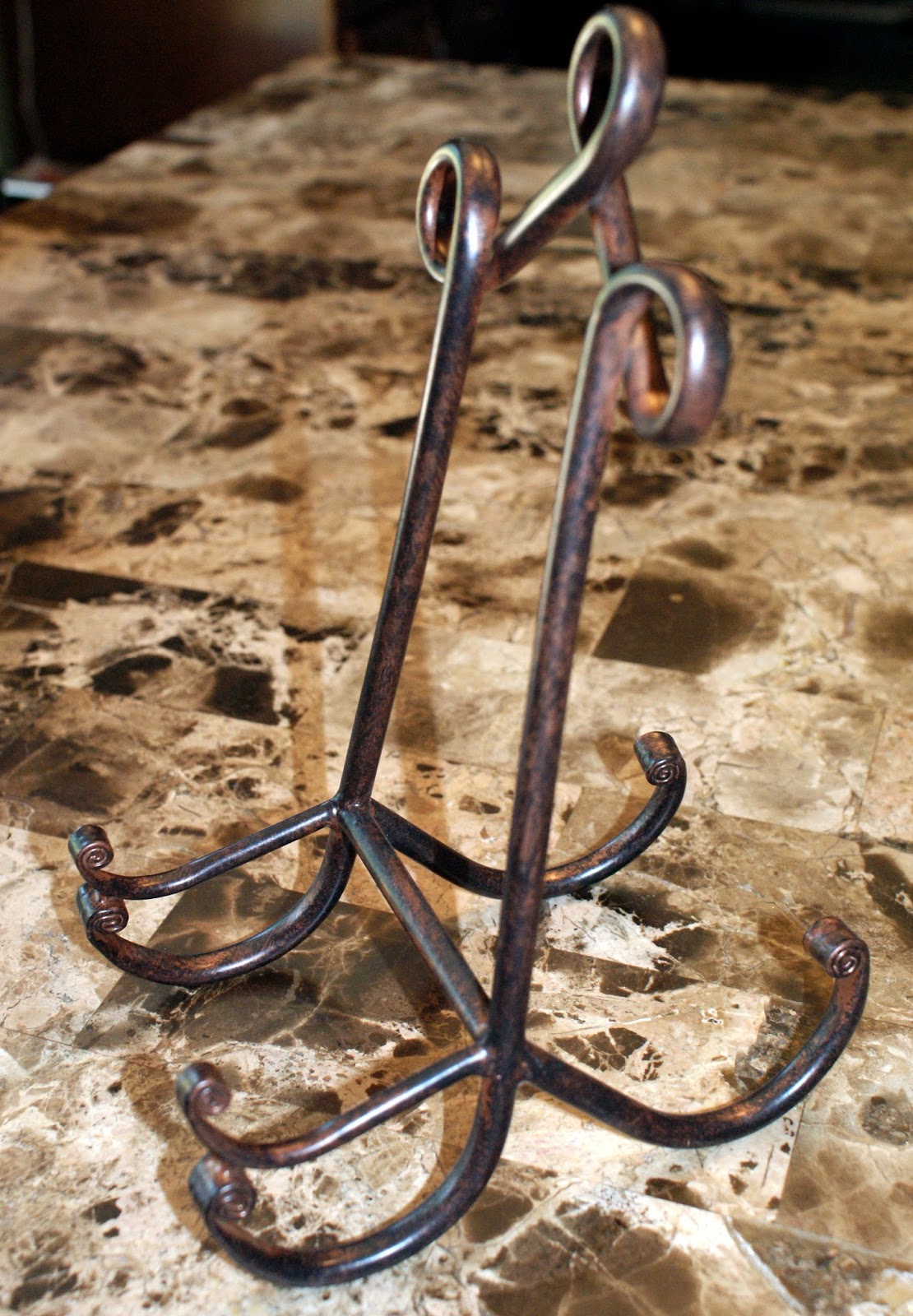
Then, find a plate holder/easel.  I purchased this from Michael's.  I think I paid $7 for it.

I don't really have pictures for this next part, but I think it is pretty easy to get.  You need some transparencies (available at Walmart or Office Depot---however, my school was throwing away a bunch because they no longer worked in the copier---I snagged two full boxes!)  Put the transparency on top of a piece of cardstock, whatever color you wish, and punch them together in a three hold punch.
Then, put your clear stamps on the transparency.  They stick perfectly.  The cardstock is so that you can attach the insert that came with the stamps that shows the images.

 Here is how mine looks:


I am able to put the manufacturer of the stamp right with it for my own reference.
Here's a shot below of some stamps that I didn't have an insert for---so I just stamped the images myself on the cardstock! 

It seems to work fine flipping pages over too---here is how it looks from the side.
Just make sure the bottom of your plate holder is wide enough to hold the thickness of your binder.

Hope you liked this cheap and easy idea...I'd love to know how you organize your stuff---I'll be back next Monday with another organization idea :)
VISIT THE CONTRIBUTOR'S BLOGS/GALLERIES
Cathy Dippolito
Dolores Schaeffer
Cindy deRosier
Marlene Murphy
Lesley Walker
Gael Spence
Sarah Routledge
Sharon Fritchman
Tanya Ham
Sheila Burns
Pam Callaghan


Wednesday, July 17, 2013

Designer Showcase: Non-layout projects

Hi everyone. Pam here again for a non-layout edition of designer showcase. I know we feature lots of pages here and I thought is would be nice to have a post again with just projects (altered, home decor etc). Let's see what the contributors have in store for us ;) ;)


Wow. Lesley created this mixed- media canvas. I can't help thinking this would look so good in my scrap room. *wink wink . So many cool things to look out here. Let's hear how Lesley made this, "Started with putting a coast of Gesso over the entire surface, when dry I've used some of the metallic based paints I purchased when doing the class with Finnibair, they are really shimmery and beautiful, then applied water and let some of it run.  A bit of stamping, some lace and very fine tulle, then more paint.  Finished with one of my fav things to do at the moment and thats playing with my Julie Nutting Prima doll stamps, then added a couple of die cuts to finish it off."


Here is a super cool project Sharon made for Halloween a few years ago. This is so creative with the boo coming from the chimney and all of the "spooky" elements. I also love the polka dots throughout the project!


I adore what Sheila made here. How many if us having a ton of crayons sitting around not being used. What a great way to make art out of these crayons!!! Sheila got her idea from pinterest and did a great job making it her own ;).


Tanya created our last project.This would be great as home decor don't you think??? Love her creativity here. This is what Tanya said about her project," I saw this saying in the Silhouette Store awhile back, and thought it would be a perfect addition to the decor in my in-laws new lake cabin.  My FIL is an avid fisherman, and I found an adorable SVG shape to use with the saying.  I cut the saying out of brown adhesive vinyl, and it went on the background paper so easily!  I used lots of complimentary colors from a DCWV stack to paper-piece the fisherman.  I put it all together in an 8x8 frame.  They loved it, and it is now at the cabin!"


I hope you loved these projects as much as me today!!!!

Wednesday, July 10, 2013

Designer Showcase:Summer!!

Hi all, Pam here. Summer is full spring here! Today we are sharing summer projects to inspire you with those summer photos you will be taking....

Up first is an adorable project by Sheila. She made this for a teacher and it turned out so cute. Check out that orange wedge and bunch of cherries! Love it for summer!!


These next fabulous page is by Gael. I love many things about this page... from the colors to the design. This is what Gael said about her page, "This design for this layout was inspired by a beautiful layout by Steph Devlin where she used the balloons and bird from the My Minds Eye range of papers.  As I had these in my stash and I thought they had a wonderful whimsical summery feel to them I decided to try and incorporate them into my layout.  The end result is very different to Steph’s beautiful layout but was a lot of fun creating.  I used a Kaisercraft overlay which I coloured to create the flower border with the bike.  I also included some diecuts, layering and a few flowers."


Tanya created this next fun page. Check out how festive and cool this design is! I adore all of the banners, tags and fabulous photos. The perfect 4th page.


Lesley created this "oh so cute page". These photos go just perfect with all of the elements on the page. Check out the fabulous embellishments on the bottom! Love it! Here is more info on Lesley's page,"Summer, the best time of the year and to a lot it means being able to get to the beach and have fun.   This layout is exactly that, my grandson when he visited from America found great enjoyment on one of our local beaches, experiencing the waves and sand play, this was a fun layout to do and loved bringing all the colour into it which again mean summer to me."

I hope you have enjoyed these pages for summer today!

Friday, June 21, 2013

Welcome to the Summer Blog Hop!

Summer is here!  To celebrate, Ideas for Scrapbookers is holding a Summer Blog Hop!


Contributor/Owner Cathy and five of our Contributing Artists will each be sharing a fun project with you, all inspired by summer!  There are several opportunities for prizes along the way, so keep your eyes open for those. When you are done, return here and tell us what inspired you along the way!

Cindy: cindyderosier.com
Sharon: thatgirlfritchey.blogspot.com
Tanya: tanyaham.blogspot.com
Sheila: parttimepretties.blogspot.com
Sarah: sarahs-scrapbook.blogspot.com
Cathy: scrappycath.blogspot.com


Now hop along to your first stop, Cindy deRosier: My Creative Life!


Wednesday, June 19, 2013

Designer Showcase: Using Less Than Perfect Photos

Happy Wednesday! Pam again sharing this weeks theme of using those bad quality photos or even ones that are less perfect than what you what normally use. I struggle big time with this. After I take a photo that is blurry I want to delete it right away. I am starting to keep some of them because I love how they look and hope to scrap them in the near future. This is hard for my because I am a perfectionist. You too should be keeping those less than perfect photos and scrapping them. I am going to share some ideas on how to scrap those photos!

First up is my layout, I thought I would share it because I just talked about my issues with using less than perfect photos. This layout shares some slightly blurry photos. We took these on a field trip and when I viewed them at home I realized they were really dark. I went to lighten them and I lost a lot of resolution (and it blurred a bit too).  I went with a sort of throw together kind of page with random stuff put everywhere on page (whimsical look) that I didn't plan out to do with some blurry star paper on the top to match. I love how this turned out.
BRIGHT IDEA #1: If you have blurry overexposed photos go with a whimsical feel to your page and it will look like it fits right in!


Vintage photos can be of poor quality just because they are so old. You need to scrap these anyways, just like Sheila did!! Check out how she made this work perfectly with those papers and embellishments which fit the theme so well.
BRIGHT IDEA #2: Use vintage products for your vintage photos and it will look amazing. Those photos will look like they were made for those papers!


Tanya created our next page. As you can see her page featured underexposed photos. This is what Tanya had to say about it, "The terrible pic was taken on our 7th Anniversary, in a hotel room mirror.  We had spent the weekend at my 20th HS reunion, and were rushing to get packed up and head to the airport.  It was the only picture we had from that day, and it was definitely terrible! :)  I used muted tones and raw chipboard, I thought it went with the odd coloring in how it came out."
BRIGHT IDEAS #3: If you have only one photo from a special event scrap it and tell the story.  Match the tones of the photo to the elements an you have a page that works and looks great!


Our last layout is by Sharon! She actually extracted her photo from the background and attached it directly to her page. Check out how great this looks because she sat the photo on the page like it was meant to be there. Really like this idea!
BRIGHT IDEA #4: If you photo background is so distracting, cut out your subject and it add it to a page where it meant like it was supposed to be, like sitting on books!


Have a great day and find sometime to scrap today!!

VISIT THE CONTRIBUTOR'S BLOGS/GALLERIES
Cathy Dippolito
Dolores Schaeffer
Cindy deRosier
Marlene Murphy
Lesley Walker
Gael Spence
Sarah Routledge
Sharon Fritchman
Tanya Ham
Sheila Burns
Pam Callaghan


Wednesday, June 12, 2013

Designer Showcase: Black and White Photos

Hey all, Pam here again with a designer showcase on black and white photos. I know with scrapbooking, it is hard to know whether to use color or to use black and white photos. Some people don't like to use black and white photos much at all. I like using the them as often as needed.. why? Because they can convey a mood to your page. I will explain what I mean below!


Here is a page by Sharon and her daughter playing the piano. As you will see this layout does a great job of focusing right on the photo and creating an "artistic" mood for the page. Check out the long piano extending along the page. The same photo could have been done in color, but wouldn't have had the same efffect.
BRIGHT IDEA #1: Extend your photo out just like Sharon did for a dramatic effect!


Our next page is by Sheila. This is such a neat page b/c it sort of reminds me a classic photo of a girl with earring. Sheila also used a vintage looking sticker on the side of photo along with some floral paper. The mood of this page was done by using all of the elements together along with black and white photo.
BRIGHT IDEA #2: Use embellishments you wish to match the mood on the page along with those black and white photos.


Gael used the black and white photo to create a dreamy like page along with all of the elements on the page. She clustered flowers, used vintage stickers and some pretty border punches. That photo does an an excellent job of giving the page it's unique look.
BRIGHT IDEA #3:  Use black and white photos with lights color such as pinks and peaches to really make it pop.


Have a great day and find sometime to scrap today!!

VISIT THE CONTRIBUTOR'S BLOGS/GALLERIES
Cathy Dippolito
Dolores Schaeffer
Cindy deRosier
Marlene Murphy
Lesley Walker
Gael Spence
Sarah Routledge
Sharon Fritchman
Tanya Ham
Sheila Burns
Pam Callaghan


Monday, June 10, 2013

Quick Polaroid Tutorial!

Happy Monday, everyone.  Sheila here with a super fast Polaroid tutorial! 
I love the look of Polaroids, because I actually used them.  For real.  The first time they came out.
So now, they seem to be all the rage again.  I was lucky enough to score a non-working Polaroid recently at an auction, which I spray painted and now display in my craft room.

 Love how that looks...before it became a work of art :) I emptied all the film out.
Having this was amazing, because I had the real measurements of a Polaroid photo.
And that is really all this tutorial is---measurements.

SO you will need a picture, some white cardstock, a ruler, a trimmer, and it really helps if you have one of those cutting mats with measured squares on them.
Step one is to trim the photo you want to use.  The REAL measurement is3 1/8 inches.  But that 1/8 irritated me, so I trimmed my photo to a 3X3 square.

Then, place your 3 x 3 photo in the corner of your cardstock.  The measurement around the photo is 1/4 " white, so that is EASY.  The reason I like the cutting mat is that is divided into quarter inches, so I am able to position my photo just right.

Now, glue that baby down. Trim the cardstock on the other side of your photo to 1/4 ".   The bottom of a Polaroid, of course,  is much wider than 1/4 inch, which gives it its distinct look.  Instead of measuring that bottom, I just took a side measurement.  A Polaroid is 4 1/4" long.  Measure and make that cut with your trimmer.
And there you have it!   SO much easier to put your photo on top of the cardstock than to try to make a little window to put your picture behind (which is what this woman of little brain tried to do first).

So remember:
Picture:  3 1/8"
1/4" of white cardstock border on three sides
Side length of the cardstock:  4 1/4"

As an added bonus, these look great with the vintage look photos everyone is printing from instagram :)

Here is a layout I recently did with Polaroids...

My husband was out in the driveway pitching to my daughter IN THE SNOW!  I hope you give this trend a try----it is really easy and FUN!

Thanks for stopping by today:)

VISIT THE CONTRIBUTOR'S BLOGS/GALLERIES
Cathy Dippolito
Dolores Schaeffer
Cindy deRosier
Marlene Murphy
Lesley Walker
Gael Spence
Sarah Routledge
Sharon Fritchman
Tanya Ham
Sheila Burns
Pam Callaghan


Tuesday, May 28, 2013

Trend Report 2013 - Part 3

Hey all. Pam bringing you the last installment of the trend report! I hope you have enjoyed seeing the past two posts. You can see Part 1 here  and Part 2 here. Today I will be bringing you more trends, some new, some old, and some well, not blue. LOL


DIE CUTS
Ok, so as you know die cuts and die machines have been around for a while. The past few years I have seen more and more people invest in die cut machines, like me. So, this trend is one that will never die and I hope to see more and more of it! :) Let's see some examples!

"Simple Pleasures" by Gael Spence

"Enjoy" by Sheila Burns

"Love" by Lesley Walker

"Enjoy Today" by Cindy deRosier

"Travel" by Tanya Ham

"The Duffers" by Marlene Murphy


RESIN MOLDS
This may not be a totally new trend, but it is one that is popular with scrappers right now. There are these cool molds that you can pour resin into and form neat embellishments. I haven't tried this yet, but I think it looks very cool. Let's see some examples!

"Into the Woods" by Sharon Fritchman

"This way to Serenity" by Sharon Fritchman

"Love" by Gael Spence


THICK FRAMED GLASSES
I think this trend is so cool. We are seeing more glasses pop up on papers and embellishments lately! Even die cuts! Want to create a layout with glasses, let's see Marlene's example below.

"Specs" by Marlene Murphy


DENIM
Denim is a great trend because it incorporates fashion into scrapping. Who doesn't love denim jeans? I think this is great that it has entered the scrap scene. Let's see two examples by Sharon on how to make this trend work on your pages.

"Around the Fire" by Sharon Fritchman

"Summer Camp" by Sharon Fritchman


AROUND THE EDGE PUNCHES
I love punches. I have spent so much money on this trend. Around the edge punches have been around for a few years, but are still super popular. How cool is it to add dimension and detail to your pages by just punching a bit. I love punches that go all the way around!! Let's see some examples.

layout by Lesley Walker

"Friend For Life" by Lesley Walker

"Friends" by Sharon Fritchman

"Sisters" by Marlene Murphy


SOFT COLOR PALETTE
Who doesn't love a page with a soft color palette. I feel like I have seen more and more of this trend. It isn't just for babies and puppies anymore. It works for so many themes. Let's see how!!

"Sisters" by Sharon Fritchman

"Follow Your Heart" by Tanya Ham

"My Dreams for You" by Sheila Burns

"Chenonceau Castle" by Gael Spence

"Love Always" by Dolores Schaeffer


METAL RIMMED BRADS
I have gone ga-ga over metal rimmed brads! I just love the look of them and you can create visual triangles with them and such.  I love how the metal rim causes them to pop more.  Check this out!

"Spring" by Pam Callaghan

"Easter Egg Drop" by Pam Callaghan

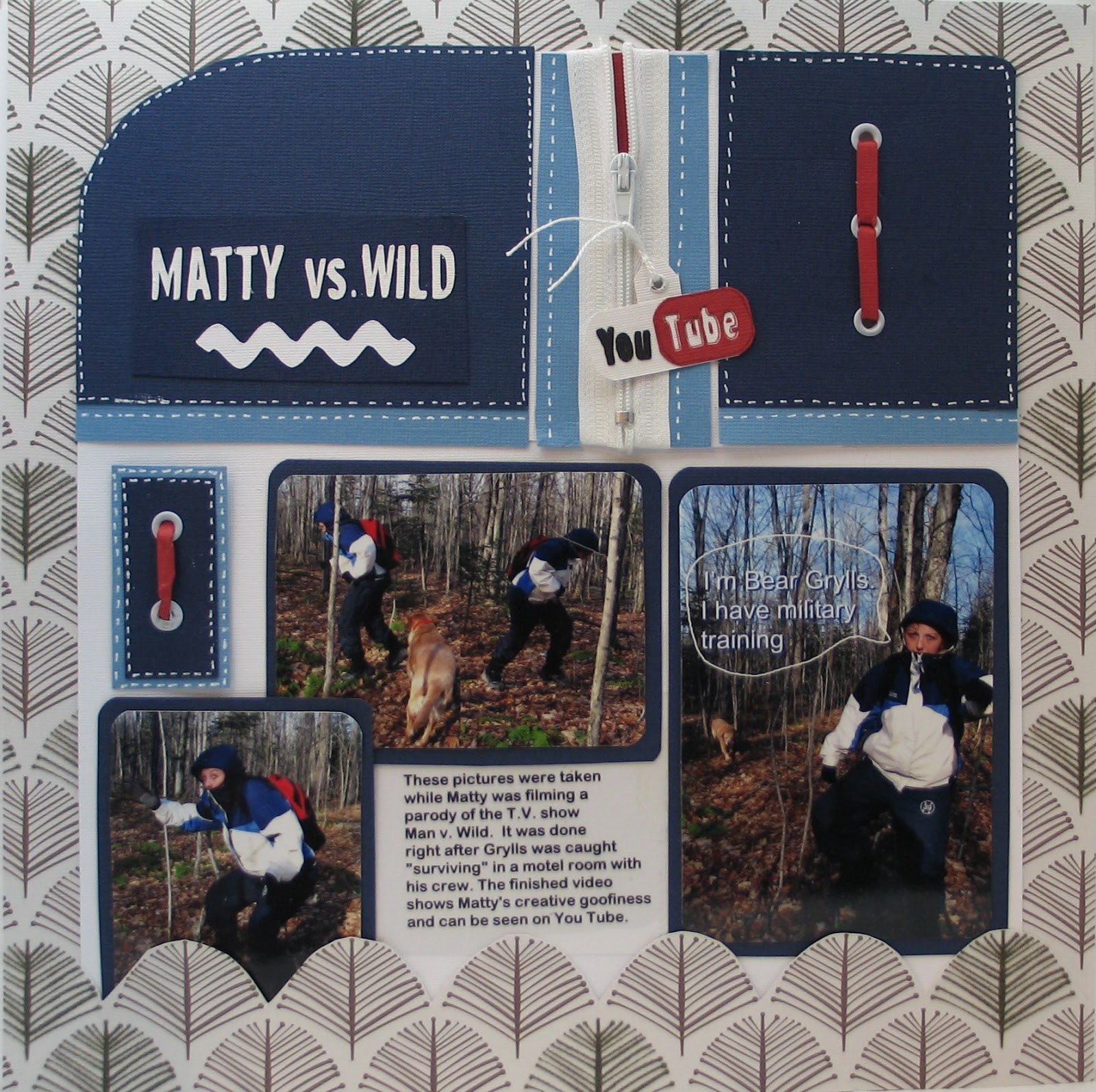
"Matty Vs Wild" by Marlene Murphy

"Just Breathe" by Sharon Fritchman


NEUTRAL BACKGROUND ON LAYOUT
More and more I am seeing a neutral background on layouts. Sometimes it is white, but it can also be off-white, cream, craft, or a soft pink! I know this trend has been around for sometime, but I really wanted to highlight it. :)

"First Day of First Grade" by Cindy deRosier

"Lucky to Have Great Pets" by Dolores Schaeffer

"Together" by Gael Spence

"Anne" by Sharon Fritchman

"Cherished" by Pam Callaghan


USING NEGATIVE DIE CUT SPACE
The last trend, I am highlighting, is one I have seen explode over the past few years! I think it is because die cutting is so easy with machines now. What I mean by negative die cut space is using the space that is cut out and filling it with paper, cardstock or photos in back. This is one trend I hope never goes away!!

"January 2013" by Pam Callaghan

"Hey There Little Guy" by Lesley Walker

"Home" by Gael Spence

"Arm in Arm" by Sharon Frtichman

I hope you have enjoyed this three part trend report! Does this inspire you to create new pages?

VISIT THE CONTRIBUTOR'S BLOGS/GALLERIES
Cathy Dippolito
Dolores Schaeffer
Cindy deRosier
Marlene Murphy
Lesley Walker
Gael Spence
Sarah Routledge
Sharon Fritchman
Tanya Ham
Sheila Burns
Pam Callaghan