Showing posts with label Nancy. Show all posts

Wednesday, August 22, 2012

Designer Showcase: Camping

Happy Wednesday!  It's Cathy here to share this weeks Designer Showcase.  Our theme this week is camping.  Many families spend their vacation time camping, some squeeze in a camping trip on weekends.  When my boys were younger, we would camp out in the back yard. Sometimes even in the living room when it was too rainy.  Whether it's a full blown camping vacation, or a night spent in a homemade fort in the family room, there's always fun memories to capture when you've been camping. So make up a batch of  S'mores and let's take a look at some of the pages that the Contributing Artists have shared.


Cindy gets us started with this amazing 2-pager.  By keeping her embellishments to a minimum, she is able to fit 12 photos on her layout.  I love the way she journaled right down the middle of the page!  The color choices that she made really fit with the woodsy feel of camping.  Cindy used a stamp to create the background. Great way to add interest to cardstock.


In this second page that Cindy shares with us, she really took a different perspective.  She turned the camera over to her son who was 4 years old at the time.  Check out the things that he took photos of and the angles that he got. Very different than we adults might do.  Cindy cropped the photos all to the same size and was able to fit 16 on her page, along with a title and journaling below.  I love this idea of capturing the memories from your child's eyes.


Marlene created this beautiful 2-pager.  Her blocking of the papers and photos adds so much detail to the page. I really like that she included different papers along the top and side, yet continued the pattern of the cars across the bottom of the page. It really gives the feeling of motion, especially with the large photo of the road on the right.  I also like the matting of red and little touches of red in the papers and embellishments, it really brings out the color of the trees.  Those gorgeous pine cones were created by Marlene. She cut them from wood veneer using the Cricut. Then she wood burned them to add the shadowing detail.  How creative!


This awesome layout is by Nancy.  The first thing that grabbed me was how her design pulled me right through the various photos on the 2 pages, as if I was hiking along with them.  A few things that give the layout that flow and sense of motion are the paper hinge pointing in from the left side and the zig-zag paper running across the 2 pages. Those zigs and zags also give the feeling of a mountain range.  The large yellow matting under the center photo really makes it shine.  Looks like it was a perfect day for a hike.


Gael shares this beautiful page with us.  There is so much detail on the page that I could see this framed on a wall to enjoy.  Gael created a wonderful vine of flowers and foliage that creates a 3/4 frame around her photo. It makes it feel as if the environment of the photo has grown out on to the page.  She balances it with the floral border punch and title area on the left side.  Another little detail to take note of is how she has included some extra word art in with the title, very clever.

I hope you've enjoyed taking this little camping trip with us.


Wednesday, July 4, 2012

Designer Showcase: Red, White and Blue

Happy Birthday America!  To celebrate, our Designer Showcase this week has the theme red, white and blue!! It's Cathy here to share all the wonderful creations with you, so let's get started!


First up today are 2 really wonderful pages from one of our brand new contributors!  Anupama created this page all about a birthday.  I really like how edgy her page is. It is filled with texture and dimension. It looks and feels intriguing!


On this second page of Anupama's she framed her photo beautifully using a wonderful masking technique.  I love how she has brought out the gorgeous blue color of the water in her photo by framing it in red, and then adding blue accents to her page.


Marlene shares a totally red, white and blue page. She has taken a treasured photo and dressed up patriot style.  That multi-pointed star mat, made of the star paper, is perfect for this!  Marlene also use a really neat little trick to balance her page, she used offsetting strips of light blue paper in the upper left and lower right of her page. Neat idea!


Next up are two pages by me.  This one was done using Pam's 4th of July template.  You can grab it right here. I changed it up just a bit to fit in more photos. Such a great template design for capturing your July 4th celebrations. 


This is one of the very first digital pages that I ever made.  I enhanced the photo to leave color in the flag to make it stand out. I used some brushes to create the look of fireworks behind my title.


Nancy has shared this beautiful page with us. There is so much to love on this page. Nancy has done a great job of using a design triangle to create a layout that gives focus to her photo, while keeping your eye moving about her page so you don't miss a single detail!  I really like the clusters of flowers. Most of all, I like how Nancy has balanced the cuteness and maturity on this page. Reflects the emotions of her daughter growing up!


Wow, that's what first came to mind when I saw Lesley's page about the Vietnam Veterans Memorial.  Her photos have captured the emotions of the memorial.  I like how she stacked the photos, starting with the top one that has information about the memorial, then the statue of soldiers, and then the very poignant photo of the memorial with the reflection of visitors in it. Very moving. Her choices of patriotic papers and embellishments really adds to the powerful feeling of the page. She continued the color scheme in the mats of her photo to tie the look together.


July 4th and summertime are filled with great celebrations, picnics, barbecues, and family get-togethers. All events that have lots of photos to go with them. Cindy has shared 3 layouts with different ways to showcase all those great photos. In the top page, Cindy has done a great job of blocking her photos, I love how she does that! The thin red frame around the larger block is really eye catching. I also really like her added word art pieces.  The double pager also uses that great blocking technique. On this one, Cindy let her title block and journal block extend beyond the boundaries. Very nice way to spice up her page.  In Cindy's 3rd page, she has some great photos that she set slightly of kilter and then added some varied strips of paper beneath. A neat way to show off that handsome guy!


Oh my goodness!  Dolores brings on the cute charm with this page. What a darling photo of her dog all ready for the holiday!  I love the layout of this page. The vertical design takes your eye right to that awesome photo and then allows it to float down the page taking in all the elements and details.  I like how Dolores stacked circles and stars behind the photo too and then repeated that in a smaller version at the bottom of the page behind the word art.  I wonder how long the dog stayed with the flag in it's mouth? It looks so content, and ready to cheer on a parade!


I hope you've enjoyed these samples of using a classic red, white and blue color scheme.  


Thursday, June 21, 2012

Distress Stains - Marbling

Hi everyone, Nancy here today to share with you another technique using your Tim Holtz Distress Stains. (warning, tutorial = photo heavy, hee hee)  But I promise, it is easy to do.

Begin by selecting a few distress stain colors to work with, and of course a tag.
 Apply the distress stains to your craft mat.
 Run the tag over the stain.

Here you see the tag after its quick trip over the mat.
 You can use a heat tool to dry the tag.
 Spritz the tag lightly with water to allow the stains to move and blend.
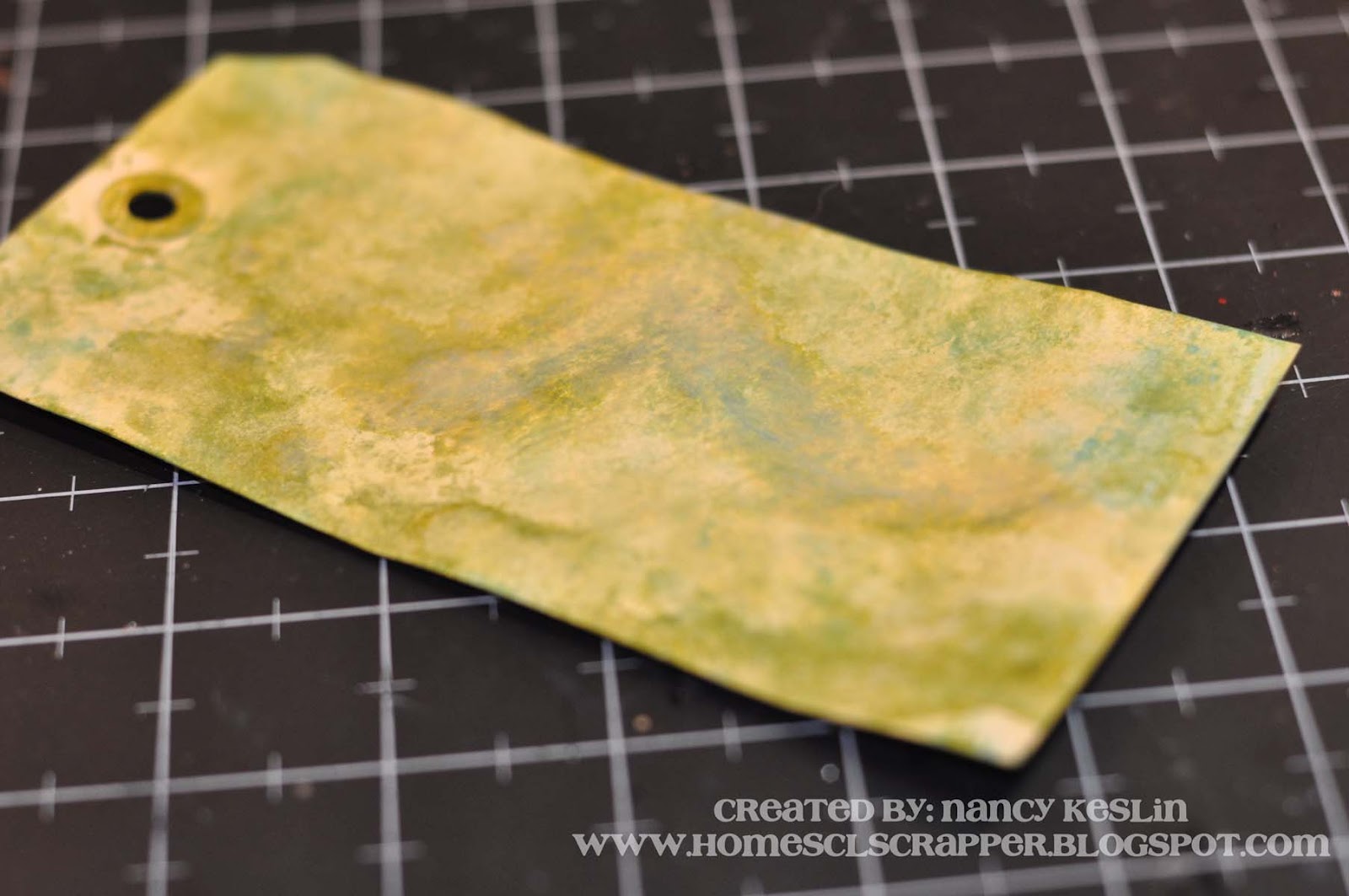
 And here is the finished tag.
I added a Prima Trinket as well as some shrink art I had made in a previous tutorial that you can see here.
I hope you enjoy playing with your Distress Stains as much as I do.

Hugs.

Nancy

Wednesday, June 20, 2012

Designer Showcase: Dimension/Texture without Bulk

Happy Wednesday!  It's Cathy here with you today to bring you this weeks Designer Showcase. Do you love to add texture to your layouts? But not like all the bulk that goes with it?  We've got a few ideas to share with you that add yummy texture, but keep your layouts on the then side, able to fit nicely in your albums.


Cindy created this really sweet page with some neat tricks to give it dimension. She used tone-on-tone to add dimension to the circles, banner, star and journaling. Gives a really nice deep look without the bulk. Nice, huh?


Check out this two pager. Cindy created a really deep look and gave lots of texture to this page by using a few well coordinated colors. She repeated the pattern at both ends of the page which gives both the look of depth, as well as the feel of texture. There is some hand stitching that really gives nice texture too.  Cindy calls herself a "bulk-phobe" (so cute!), she loves the look of dimension, but not the hassle of bulky layouts. So she finds lots of ways to trim down her layouts. The title on this one is made from chipboard letters. But, Cindy peeled off the bottom layers of them to make them thinner.  So cool!


Doesn't this page by Nancy look so rich and deep? It makes me just want to reach out and touch it! Nancy has some buttons and brads on her page, which area always a great way to add dimension to a page.  The real depth to this page is accomplished through the layering of the papers.  The patterns and colors play together nicely, and the really cool part is the bit of shape that Nancy added to them, She trimmed a pennant edge to the papers. Great way to add detail, dimension and texture to a layout, while still keeping it skinny!


If you've been following our blog, you know that Vicky is well known for you bulky textured dimensional beauties. She even came up with a layout that has lots of detail and texture without a lot of bulk.  Vicky used doilies as the background of your design. They add so much to the page. She also used some thin chipboard and die cuts too. By repeating the pattern of the doilies on teh page, Vicky has created dimension and texture and set up a visual stimulating page!


Lesley has some great techniques for for making your page textures without bulk.  She used a punch to create a border which gives the page intricate detail and texture. She added another border on the left side of the photo mat and ran that through her Cuttlebug to emboss it to give added dimension. Lesley added great dimension and detail to her background paper. It started out white, then she blended Pan Pastels and added some Glimmer Mist. What a great way to add the feel of texture without any bulk.  The title and verson on her page were added using stamps - another great way to add the look of layers and dimension as well as the feel of varying textures with no bulk at all!


Another tip that Lesley shared is that although this page appears to be 5 layers of paper, she actually cut away the hidden parts of paper behind each layer. Making her finish page only 1 paper of thickness!  Clever idea!  Plus you can then use those scraps for other projects!


Sometimes you might have a piece of memorabilia that you want to add that is bulky.  Like I did on this page. I wanted to include the cozy wrap from my coffee.  To keep the page from being too bulky, I carefully pulled apart the cozy and spread it across the page as a large element.  I also included a used gift card. By not layering my elements too much on top of each other, I was able to keep the page from getting too bulky. Ohhh, I used to love coffee. I gave it up cold-turkey 18 months ago.  Glad I made this page before I quit that habit!


Another way to keep your pages skinny is to make hybrid pages. By hybrid, I mean a combination of digital and traditional paper scrapping. That's how I created this page.  The background of this page was created digitally. It includes the large photo at the top merged on to the digital paper on the bottom with the honeycombs, "paint" spray, journaling, smaller photo and date.  I then printed that out as one piece of paper. I layered that on a 12x12 Kraft paper.   The only "bulk" to this page is the pocket that I created for the lower right corner. I again designed that digitally and printed it so it is one piece of paper. I then glued 3 sides of it to the lower layer. I was able to stuff our tickets and wrist bands from this great exhibit into the pocket and still was able to place this layout inside a sleeve in my album. Sorry the photo is so wobbly. I was laid up following surgery when I finished this and actually took the photo while it was laying on my lap!


We would be remiss if we didn't mention digital scrapping as a way to accomplish dimension, and texture without bulk. I created this layout completely digitally.  I created a lot of layers on this page and used elements that have the look of rich grungy, and sharp textures.  The secret to getting this look digitally is playing with shadows.

We hope we've given you a few ideas on how to help your pages lose the bulk, but not the look!


Wednesday, June 6, 2012

Designer Showcase: Outdoor/Nature

Hey all, it's Pam again! Do you love the outdoors? I sure do. I have so many photos of the outdoors and it is taking up a lot of memory on my computer! LOL. Today, I am sharing contributor pages of the outdoors which inspire me (and I hope you too) with lots of ideas on how to scrap those outdoor photos.

Dolores is sharing out first batch of pages. This first page is bursting with nature. From those beautiful mountain photos to the background leaves and flower, you really feel like you want to go there and enjoy that nature walk as well.

Dolores' second page features kayaking in the clear waters of Colorado, She used a nice design to feature these photo along with colors on her page which accented those photos nicely.

On Dolores' third page, she shares a gorgeous beach scene with us. I feel like I am almost there with the white wood paper and beach like accents. This is a gorgeous beach themed digital page.


This next page is by Vicky. It features a outdoor photo with lots of great accent and curled corner. Notice how well the frame does at highlighting the photo. This is a sweet way to showcase this outdoor page about brothers.


Cathy created our next three pages. This first page features a cool technique which is dipping leaves in paint to create the background. That is one cool idea. She also did a great job of showcasing so many photos without looking crowded.

On this next page, Cathy shares some adorable photo with her son and cows. I just love all of the farm themed digital items she used on her page like the barn, chicken wire, a fence, and many animals which are digital felties. This turned out so adorable!

Cathy's third page is all letter boxing which looks like a blast. She showcased the main photo in a decorated frame and put the rest of the photo below the wood textured title. I like all of the nature items coming out from under the photos.


Cindy page here tells a story about her son who had allergic reaction which required them to stop camping earlier than they expected. Poor guy. She wanted to include as many photo as she could of them before the left. She did a great job of doing that. It looks like they had so much fun while they were there.

Cindy's next page shows us that you don't have to journal every time. Sometimes the photos speak for themselves and do a great job with the story telling. Cindy did a nice job of blocking her design and using the perfect colors which complimented her page.


Nancy's page features photos of the solar eclipse and her family watching as it occured. She also included actual photos of he eclipse which is such a cool idea! I like how she put a few photos of the bottom of her family and the sun photos on the top! Nice! I am glad I got see her experience of this.


Lesley scrapped the last three photos. Her first page was inspired by my "beach template". Notice how cool it is with that paper which resembles water coming down, love that. She put fish and a wave on the paper which makes it look even cooler.  She showcases adorable photos of her grandson enjoying the beach front.

On her next page, Lesley captures the beautiful mountains and the snow capped trees. The white background is just perfect for this page as it looks like real snow falling. She also accented her page with a burgundy deer and title.

On Lesley's last page, she shows us the nice view of the town she lives in. I must say I would love to live there, it looks so peaceful. She accented her page with lots of beachy items like a neat, shells, birds, and a beach color palette. She did a great job of scrapbooking her town!

Thanks for visiting the blog today. Hope this inspired you!


Monday, May 7, 2012

Tea Anyone?

Hi everyone, Nancy here today to share with you a little tea set I made for my daughter.   It took me quite a while and a number of attempts to get the right shape and size, but I think I finally did it.  The look of the Prima papers with lots of yummy trims and a sweet little Prima flower really made the "pot" come to life; and the addition of a huge bloom with a bit more lace for the lid completed the look.

Needless to say, my youngest is very happy with her little doll tea set and is looking forward to lots of parties with her friends and their dolls soon.
Here is the link for the teapot and cups template if you would like to try your hand at them.  I am kinda an old fashioned girl in this respect...my templates were made by hand with a ruler, pencil, and paper, so my good friend Heather attempted to clean up my chicken scratch and digitize the parts for me so that you could have a template!  Huge shout out for her help!!!!!  You will need two of the spout pieces if you want it to have more dimension.  I painted the underside of my papers with a bit of gold paint and then glittered for a more finished look.

Have fun with your creations today.

Hugs.

Nancy