Thursday, January 19, 2012

Embossed Goodie Demo

I have a love for paper bags! Yup, the kind you get at the grocery store or pack your kids lunch in.  The come in a verity of sizes and their kraft color makes them usable for EVERYTHING! 

Today I am going to show you a few things you can do with your paper bag to make them in to something fun! The bag I am making happens to be for Valentines Day - one of my little loves will get this bag filled with sweet treats.

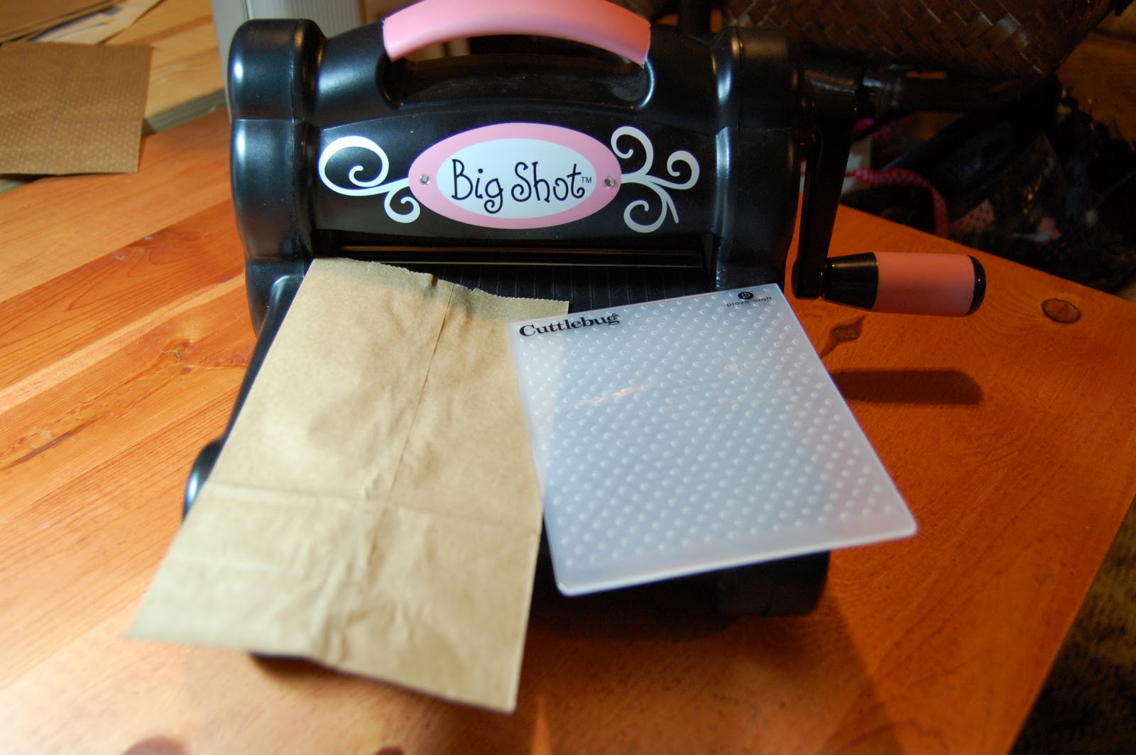
First thing I love doing to my bags is embossing them! Use can use a verity of embossing machines, for my demo I am using my Sizzix Big Shot with the polk-a-dot embossing plate.

Put your bag bottom in the crease of the embossing plate. The bag is taller than the embossing plate so we want to be sure to emboss from the bottom up.

Once you have embossed the bag use you trimmer and cut off the un-embossed part of the bag. 
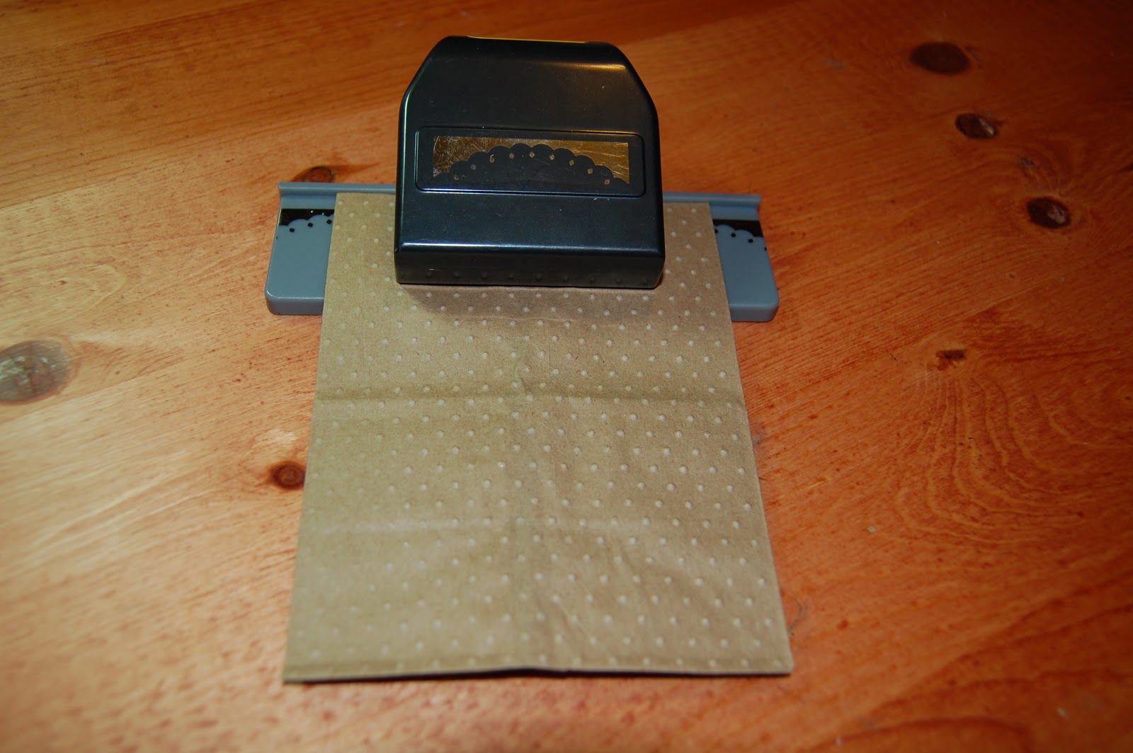
Next gather your favorite boarder punch so that we can enhance the top of our bag. NOTE - keep the top part of the bag you cut off that is not embossed- we will use this!

Start your punch in the center of the top of your bag and then work your way to each side. Be sure your bag is still closed so that you get the punch on both sides of the bag.

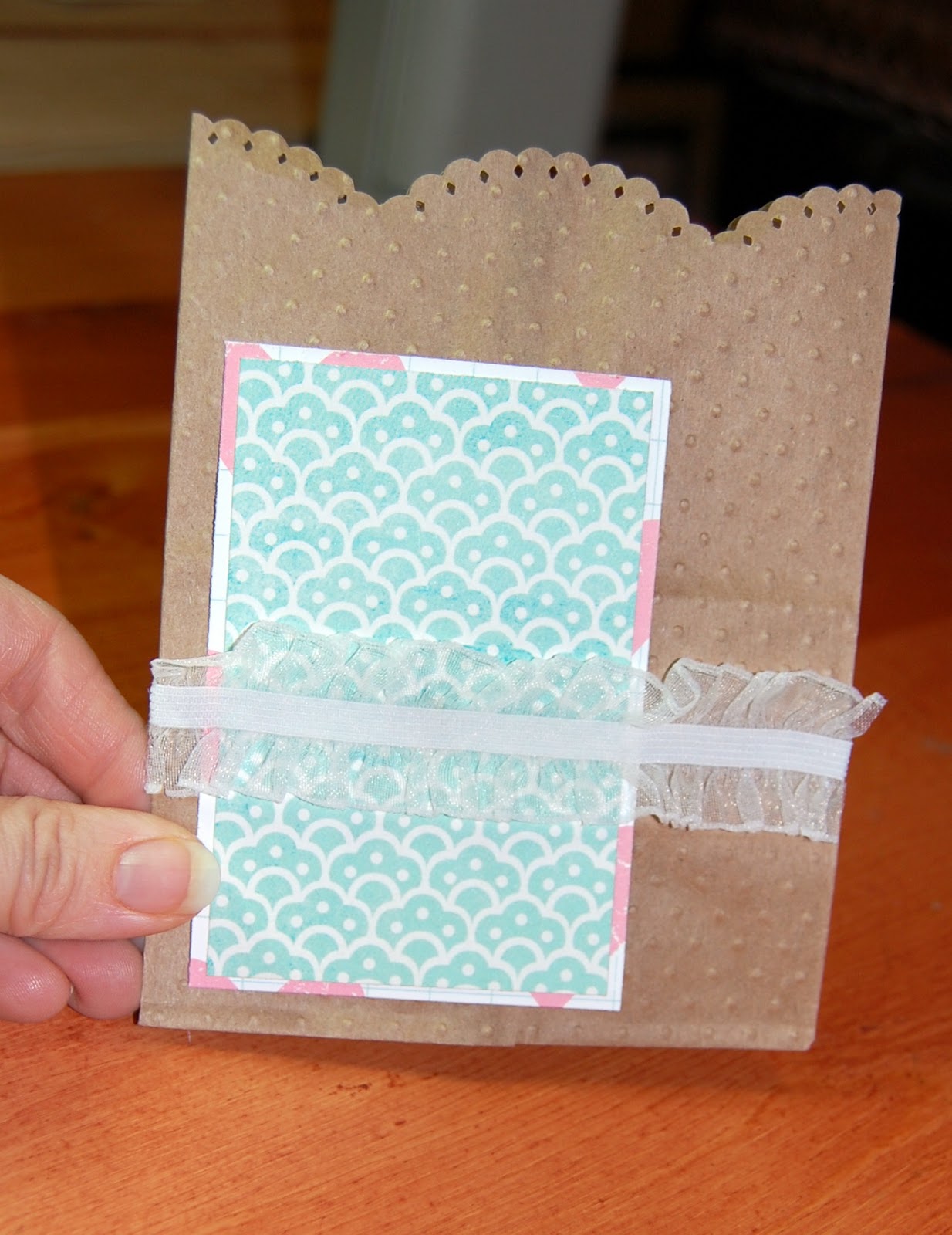
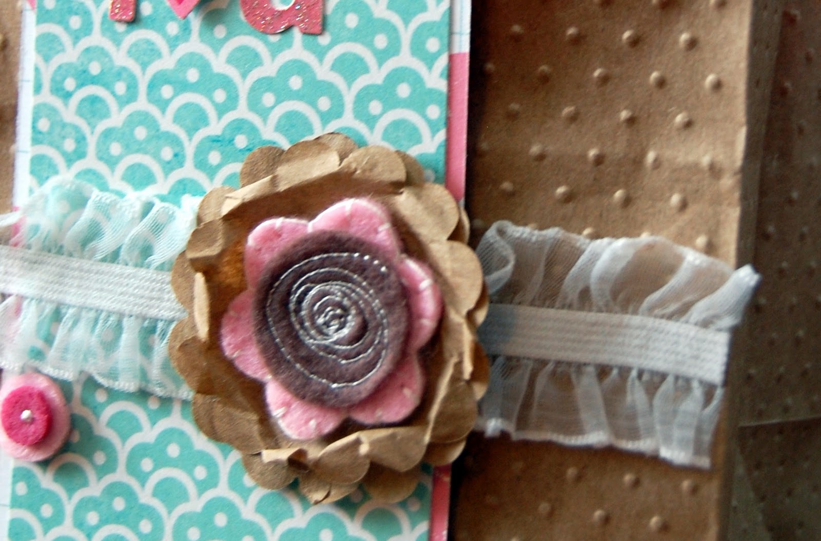
Now its time for you to put your personal touch on the bag.  I added some double matted paper and some sheer ribbon to start my 'love' look. 

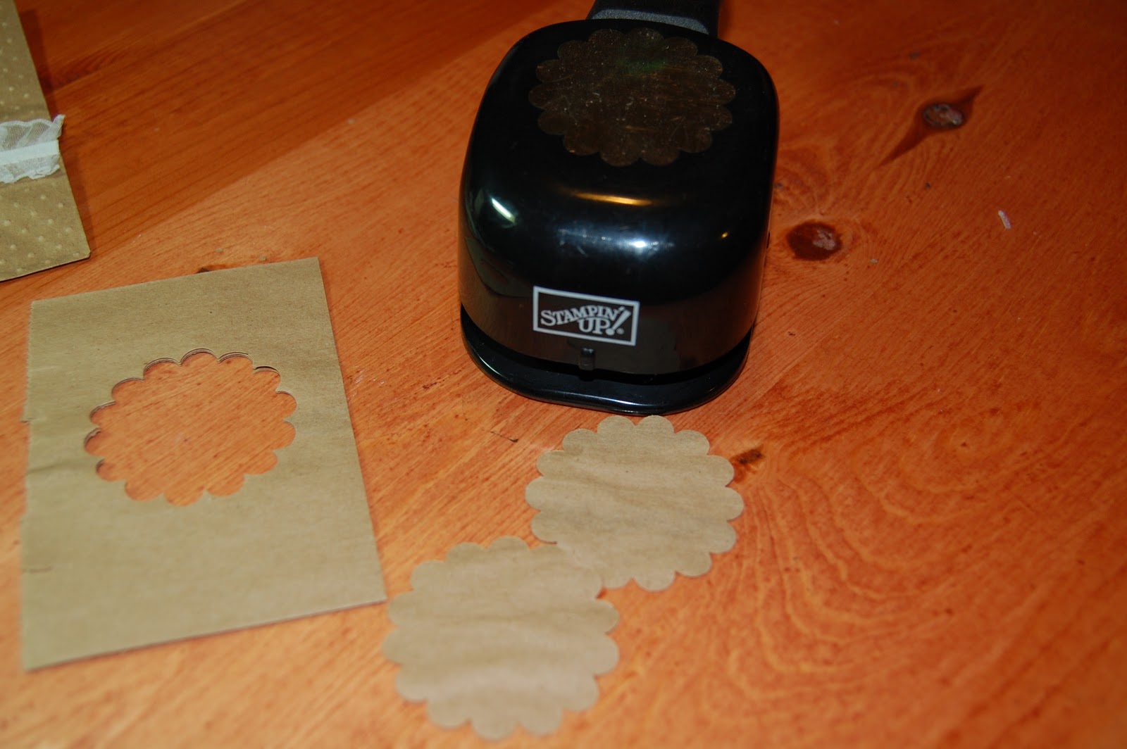
 Now its time to make use of that top part of the bag we cut off that was not embossed. Take a scallop or any circular punch and put it though the bag. Be sure the bag is closed and you will get 2 of the same shape.

Adhere one scallop on top of the other and then put an embellishment (flower, button, brad) in the middle an then push the top layer scallop towards the center of your embellishment to give it a wrinkled look.

Lastly all you need to so is finish decorating your bag! You will never look at a paper lunch sack the same way again!

Wednesday, January 18, 2012

Designer Showcase: Fussy Cutting

Break out those scissors! This week we are sharing some Fussy Cutting projects as part of our Designer Showcase.  Haven't fussy cut before?  There's nothing to fear!  Fussy cutting is when you cut around parts of patterned paper to use as elements on your page or project.  I know, sometimes it's just so hard to bring yourself to cut apart that beautiful paper.  But I think you'll find these examples very inspiring!


 Marlene says she doesn't do much fussy cutting. "But this paper was begging for it". I have to agree!  The bold floral pattern of this paper was perfect to be cut and used on her page!


Cindy likes to fussy cut and says she does it all the time!  On this first layout she cut that large floral design (behind her focal photo) from a paper.  It looks so perfect there!


In this one, Cindy cut the pumpkins from patterned paper.  They look like elements you would buy already made like that!


On this card, Cindy cut that cute little critter from patterned paper! She also hand cut the balloon!  Cindy has some real talent with scissors!


On this page, Heather cut that cute banner from a patterned paper.  So adorable!


Now instead of staring at all those beautiful patterned papers you have collected, why don't you try some fussy cutting?  It just may help you use up some of the paper you've been hoarding collecting!  Fussy cutting is also a great way to make one piece of patterned paper stretch to be used on multiple pages/projects.


Tuesday, January 17, 2012

Heather's Sketch & Template #9

Good morning everyone! It's Heather again, and I'm here to share a sketch and free template with you. I asked a few of my friends to contribute inspirational layouts for this post. I ended up liking the sketch so much that I made a few pages to share as well. You will find the sketch below. Please feel free to right click on the image and then click "Save As" if you would like to save the .jpg to your computer for later use.


Michelle contributed this page of her kids playing in the snow. I really love how she changed the sketch to work with the photos she had. I also love the misting on the blue paper and the super adorable snowmen!


The next page is by Amanda Johnson. She stayed pretty close to the sketch design, but she enlarged the title and that makes it have so much more impact! I also really like the way she added the brad to the wooden banner in the upper left corner.


Juliann did a wonderful job converting the sketch to 8.5 x 11 so it would work with her scrappy style. I think the way she overlapped the letters is really neat. I also love how she double matted the photos!


I am inspired by the way Jessica left the centers in the alphabet letters.  Her design choice really helps them stand out a little more on her blue background. She also cut a flower diecut so it would look like a cloud. That's such a good idea! 


Thank you all very much for using my sketch! I really appreciate your help and creativity. 

I created the next three pages. The first one is a paper page. (*All of the paper layouts in this post were created with supplies from Scraptastic Club kits!) I loved being able to use lots of different embellishments on this layout. The Prima flower was my favorite accent. It's just so pretty!


I also created two digital layouts using products from Becky Higgins and the other fabulous designers at Jessica Sprague's website. This page was for my Project Life last year, I was able to fit seven photos on one page!


This is the second page. Again, it was a page that I included in my Project Life. I used it twice because it was an awesome way to cram a ton of photos on one page. Don't worry, I didn't put them side by side in my book so no one will ever notice!


I followed the sketch and template pretty closely on my pages. It made scrapping go much quicker. That's one of the reasons why I love sketches and templates so much! 

If you're a digital scrapbooker and you would like to download the layered template freebie, you can click on either of the links below to download.


Friday, January 13, 2012

New Year Resolutions???

Do you make resolutions for the New Year? Do you keep them? This year I made my first resolution on New Year's Eve (first one ever!) and then I scrapped about it using a sketch challenge from Once Upon a Sketch.


Journaling on the back reads: "This is me 3 years ago, the last time I didn't mind being photographed. As the years go by it is inevitable that more lines start appearing on our faces. I'd like to say that I have more laugh lines now... but the truth is the frown lines seem to be more prominent. My motto for 2012 is more laugh lines, less frown lines. This means some changes in my lifestyle will need to occur. I don't do well with change - but life is too short to not have the time to truly enjoy the moments that make you smile".

Happy New Year!


Thursday, January 12, 2012

My Very First Sketch

I love creating layouts from sketches.  Using a sketch designed by someone else sparks my creativity, challenges me to go beyond my comfort zone, and helps push me to try new things.  They often serve as a jumping-off point for me to make something totally unique.

I've wanted to try making sketches of my own for awhile now.  But I had no idea how to go about translating my pen-on-paper sketches into the 'real' sketches that actual sketch artists make.  So I asked the ladies what software they use to make their sketches.  I learned that Cathy uses Photoshop CS4.  Dolores uses Photoshop CS5.  Pam and Heather both use Photoshop Elements.  I don't have any of those.  Is it possible, I wondered, to make a sketch using an ordinary program everyone already has?  Fortunately, the answer is yes. 

I started with the OpenOffice version of Word (Writer).  At the bottom left of the screen, there is a nice assortment of shapes.


In a short amount of time, it was fairly easy to translate my pen/paper sketch into something that looked more professional.  I printed out my sketch- it looked good!  But when I went to blog about it, I ran into trouble.  There was no way to export the document into the jpg, gif, or png that Blogger requires.  I tried a variety of things before deciding that the amount of effort I was putting into changing a .doc into a .jpg was exceeding the amount of time I'd spent making the sketch!  Unacceptable.   

So I ditched Writer and tried the OpenOffice version of Paint (Draw).  The control panel looks similar to the one in Writer but with a few extras.


I set about recreating the sketch I'd already made in Writer.  It wasn't too difficult.  Best of all, it just took one click to export the file as a .png, which I was then able to upload to Blogger.

And here it is- my very first sketch!

It's nothing fancy, but I like it.  For those of you who don't have Photoshop, you can create a perfectly acceptable sketch using Microsoft Paint or OpenOffice Draw.  I'd encourage you to give it a try!

Wednesday, January 11, 2012

Designer Showcase: Favorite Layouts/Projects from 2011 - pt 2

Didn't you love the post about the contributor's favorite pages of 2011 last week? I have more to share of the 2nd half of the group today.  It is really cool to see favorites since scrapbookers usually create a bunch of stuff in a year.

Dolores is up first today and sharing her favorites! Here style is this cool whimsical and sometimes graphic. Her favorites truly represent her beautiful style. I admire the time and effort she puts into her pages! Check these out!


Sara is sharing three amazing favorites. She creates bright, colorful and technical pages that really and eye-catching.  You can tell a lot of time and effort goes into these.. here are a few of her favorites!


Cindy is up next sharing a few favorites. With her beautiful simple style, Cindy creates some great pages documenting special parts of her life. I really enjoy reading her journaling. Let's look at her favorites!


Marlene has three pages also to share which are really tell great stories with each page. She also uses great colors and designs to tie together the whole story of each page. I can see why these are her favorites! Check these out!


What about you? Have you picked out favorites yet? Have a great Wednesday!!

Tuesday, January 10, 2012

Create a pretty punched border for your layouts!

I absolutely love paper punches.  I don't even know how many I own any more, after 11 years of scrapbooking I have lost count!  I think they are one of my favorite tools because they  have so many possibilities.  Today I want to share how to make a pretty frame for your layout using a simple border punch. I have a few of the punches that Martha Steward came out with that are called "punch around the page" punch sets.  They are a corner and side punch and the results are lovely.  However, you really don't have to have a corner punch to get a beautiful look.  I used a single EK Success border punch to create the pretty bright pink frame in my layout below.


It only takes a little planning to get good results.  I think it is easier to understand how to measure your starting piece of paper if you know how the process works.  Therefore, here is how I went about creating the frame.  Let's start with a diagram of how we are going to punch our paper. 
As you can see from this picture, we never actually punch our border completely down one side of the paper.  First we measure how deep the design is that is punched from the paper.  I took a piece of scrap paper and punched a design on it.  I then measured the depth of my design (see below).
My design was 1/2 inch deep. Our first punch on our square is going to start 1/2 inch from the edge of the paper.  I take my piece of paper and mark in pencil a line 1/2 inch in from the side, be sure to make your line long enough to be seen in your punch.
Now hold your punch upside down so that you can view the bottom of the punch.  Slide your paper into the punch and line the pencil line you made up with the side of your pattern.  Your pencil line should be visible where where you see the blue arrow below.  Now punch one shape while holding the punch upside down.

Your punched shape should look something like the picture below.


Turn your paper over and continue punching the rest of this side of your square paper.  Make sure you punched all the way to the edge.  Your paper should look something like the picture below.

We have one side punched but now we have to turn the corner.  You are going to turn your punch upside down again.  This time we are going to make sure when we slide our paper into the punch that our pretty punched edge is just outside the visible window of the punched pattern.  In the picture you can't see any of the decorative design I punched on the previous edge.

After you punch your corner you may have a stray piece of paper that you want to remove.  With the particular punch I choose I had this little tiny piece I didn't want in my finished frame (see the blue arrow below), so I just clipped it off with my scissors.

Continue around your square (or rectangle) keeping your design on each corner just outside your punch pattern.  You should have an easy time getting all the way around your shape.

To turn the shape with your punched edge into a frame, just decide on the width our your frame, mark a square and cut out the center of your paper using a rotary cutter, scissors or knife cutting tool.  My frame was a little over 1/2 in deep (including the design edge).

I want to give you a helpful hint on how to measure your paper if you are using a punch that has an even pattern that repeats. Your frame will have corners that look the same when you size your paper to fit the size of your punch.  Now that you have seen how the process works it is just a matter of doing the math to figure out the starting size of your square.  One side of your paper needs to be the length that is equal to one depth of your punch (in my case 1/2 inch) plus the length of the number of punches you want to make (in my case 4 punches).  So the square that I stared with was 1/2 inch plus  (4 punches x 2 inches long) 8 inches for a total of an 8.5 inches square. 

Hope you will give this a try and add a pretty punched frame to your next layout!