Wednesday, December 26, 2012

Designer Showcase: Year in Review


This week is filled with such emotion. There are celebrations ending, beginning and continuing. There is normal everyday life to be tended to. There is time spent looking back, and dreams looking forward.  It's a busy week, it's a wonderful week.  All of us at Ideas For Scrapbookers are busy with the same things at this time of year. We may not post every day over the next week or so, as we spend time with our families at the holidays.  We hope that you are doing the same.  As the quote in the image above says: "For last year's words belong to last year's language, And next year's words await another voice" ~T.S. Elliot. We hope that you are able to look back over the past year and have many wonderful memories, and look forward to creating many more in 2013.

In January, we would love to feature your work. We are looking for Year-In-Review pages and projects that you have created.  Please email them to Cathy at scrappycath(@)gmail(.)com   Just remove the parentheses from that email address.  I can't wait to see your projects!!

At this time of year there is also a spirit in the air, and in our hearts, of promise and hope. From all of us here at Ideas For Scrapbookers, we extend our hope of wishes for a wonderful New Year to you and your families!


Friday, December 21, 2012

Stepping out of my scrapping comfort zone!!

Hi, it’s Gael here today and I really stepped out of my comfort zone when I created the following layout.  I had a lot of fun creating it and using lots of old embellishments.  I was inspired by the wonderful Finnabair who uses lots of different embellishments on her layouts and then sprays them so the colours blend and match.
I must say it was a bit daunting when I first started but I soon found I was really enjoying myself and just kept adding different bits & piece.  The real fun part is you don’t have to worry about what colours the embellishments are as I covered them all with Gesso before spraying them.
On this layout I added lots of lace & ribbon, die cuts, embossed card, metal frames and of course flowers.  Once all the embellishments were stuck down I covered everything with gesso, then sprayed various colours of pink and then some black.  I found the black was a little too dark for my liking, so I added some silver rub-on to lighten it.  Lastly I added the photo.
I’m not really happy with how I did the title, so I might change that!! 
If you’re like me you keep all the bits & pieces that are left over from other layouts because I always think they might come in handy one day. Then this style is the perfect way to use some of them. 
I really enjoyed stepping out of my comfort zone and trying something totally different.  I’m actually book to do a couple of classes with Finnabair (Anna Dabrowska) in March 2013 and I really looking forward to learning heaps more about how she creates her amazing layouts.
I think a good News Years resolution might be to step out of our scrapping comfort zone occasionally and try something totally different.  I know I learnt a lot and had a lot of fun with this layout so will definitely be trying different things in the New Year.


Wednesday, December 19, 2012

Designer Showcase: Christmas


All of us here at Ideas for Scrapbookers wish you and your families a wonderful Holiday Season.  Can you believe that Christmas is less than a week away? Don't panic. Just concentrate on what is most important. As scrapbookers we are often very in touch with the important things in life. We do our best to capture all those memories and precious times spent with family and friends. The holidays are some of the most popular times that get scrapbooked.  So we thought we would have the Designer Showcase today be Christmas.  Here are some examples from the Contributing Artists to help you get thinking about how and what you might scrapbook from your holiday festivities.


This first page from Cindy is an older page of her, but one of her all time favorites.  I can see why! She has included some great photos. Her title captures the way her son referred to the gingerbread men, she included  traditional holiday colors.  The circle photo is accented to really show off his smile. I really love the use of the mini brads with the journal strips. They look like the candies decorating the cookies!


This 2 page layout by Cindy highlights many of her families traditions.  These are such great things to record to be able to look back on in years to come.  Some people do December Daily albums, but that can be quite overwhelming. Cindy shows us a way to capture all that goodness in a less stressful way.  Blocking the photos allows you to include many on the 2 pages.  Simple journaling can be added to support the traditions.  You can also add more personal journaling on the back of the layout as well.  A layout like this can be done each year so you can compare how the traditions have grown with your family each year.


Marlene has captured so much on this page, yet kept it somewhat simple.  She used a printed background of holiday words and phrases, which brings to mind many memories. She has accented the photos with a cute scalloped mat that she doodled on and included the names.  He title says it all "Best Present Ever".  A cherished memory captured forever!


This digital page is one that I made to capture a tradition that my family has added recently. We have many special ornaments for our tree. We also love all things Disney.  Each time we visit Disney, we now make sure to select a new Mickey ornament for our tree.  The title of the page is a play on the Night Before Christmas and the fact that Mickey is a mouse!

The decorations, food, activities and even stories and movies that we treasure at the holidays are all part of what builds our traditions. They also help to stir the memories and the emotions for us. So take time to capture photographs of your loved ones and and jot some journaling about all the traditions in your holiday celebrations.

Happy Holidays!


Tuesday, December 18, 2012

Off the Page

My sister has a very nice, framed art photo of a stack of books. One day she made an off hand remark about it and I thought it would make a great plaque. The result is a Christmas gift and made with scrapbooking supplies.

This project can be done with any die cut machine, I just happen to have a Cricut Expression II. Using a website, Cricut Craft Room, and the Printing Press cartridge I was able to cut the letters in a variety of shapes to add interest. The addition of a shadow for the letters gave depth. With the website you can lay out your project to see the scale and dimension. Using the grid on the monitor, I was able to create an inside and outside mat by telling the Circut to cut rectangles - one was a regular cut and the other was the shadow. First, the larger opening was cut, then I superimposed the smaller one into the larger one to line them up, (the program allows viewing of both images at once) the larger rectangle was deleted and the smaller one was cut. Each step/layer can be saved individually so if something doesn't line up it can be re-cut . The mats were cut separately from two different colors of cardstock. The Cricut wanted to cut a perfect rectangle and had to be slowed down to cut the mat evenly all the way around. The end product is 12 x 6.  I hope it will be well received.


Monday, December 17, 2012

Texture Paste - One Product , Many Uses!

Hello, this is Anupama Choudary. I use mixed-media a lot on my pages...Glimmer mists,  Gesso, Texture Paste, Acrylic paints, Inks, Chalks and so on. Of all these, I reach for texture paint the most while scrapping.
I made this page Just Love featuring my kids last week for a couple of challenges and I want to show you how texture paint can serve many purposes.


1. You can use texture paint with a stencil or a mask to create a beautiful pattern on your layout.


2. Brushing texture paint lightly on embellishments can unify them visually. In other words, it helps to tie different colored flowers, etc. together.


3. I felt that the bling was drawing too much of attention and used the texture paste to tone down the stones. 


4. You can use the medium to dress up chipboard.


A lot of traditional scrapbookers feel overwhelmed by mixed media. Start small and enjoy the creative process with this versatile product. 
Happy Scrapping!


Saturday, December 15, 2012

Reader's Page!!

Happy Saturday all!! Today I am sharing a beautiful reader's page. It utilizes Dolores' template banner template which you can download for free here.
Kelly creates her page using beautiful purples, greens, and a little bit of cute mouse paper. Those photos are priceless Disney photos and go so well with her design. Kelly works with Art and Ains Designs. Please store link here for some beautifully designed digital elements. You can also visit the blog for tons of more ideas here.


Thanks to Kelly for sharing her pretty banner page with us!!


Friday, December 14, 2012

Special Guest Artist!!

Hey all, happy Friday. I am a special treat today, a guest artist named Angela Holt. Perhaps you have seen her products before? They are amazing chipboard designs which are being sold at an online shop, Want 2 Scrap!! Angela is super talented and creates the most beautiful projects. Today she put together an online video tutorial which is such a cool idea. I am a visual learner, so this is just perfect for me!! Don't forget to visit Angela on her blog here. She has many more tutorials online and on her blog!! Let's get to know her!


I have been in the crafting industry for over 15 years. I have tried almost everything out there and found my true craft calling in Mixed Media and Paper crafting of all types. I live in the South in a little town called Greenbrier, TN which is only 20 mins away from Music City Nashville.  I share my life with my Husband, my only daughter and my 2 cats and little Chihuahua mix.  When I’m not playing my life roles, I go head first into my crafting. I’m an online crafting Educator, designer, product developer and artist, I’m also CHA Design Member and I have my own line of products with Want2scrap. I deeply love to bring my Southern personality to my online live classes to bring innovative techniques and designs. When I’m not doing my show, I love to awaken my crafting senses by trying out techniques and creating a few news ones. I love to meet and greet fellow artist and crafters alike. I find it most rewarding when my work and design inspires others to step outside their crafting box and craft something new and exciting. If you would like to know more about me and my professional crafting end of the world, visit my blog. I also invite you to like my fan page and to send me a friend request on facebook so that we can share in this crafting journey!! 

Link to the video demonstrating how to do the technique which is called Ribbon Weaving.   https://www.youtube.com/watch?v=oE9FwoX4TKI&feature=plcp


Angela Holt
Professional Craft Artist, Designer, Educator and Product Developer
CHA Designer

Thursday, December 13, 2012

Gingerbread Birdhouse


Cindy here!  Every year, I basically stop scrapbooking around Thanksgiving and don't start up again until after the New Year.  Holiday crafts and baking take place of the scrapbooking I'd normally be doing.  But just because I'm not putting photos on a page doesn't mean I'm not using my scrapbook supplies.

I recently decorated a plain wooden birdhouse using my scrapbook supplies.  Recognize any tools or products I used?

 
If you guessed paint, border punches, a paper trimmer, Glossy Accents, and Mod Podge... you're right!

I started by painting the birdhouse with a base coat of brown paint.  When that was dry, I carefully painted white everywhere the icing would be on a real gingerbread house.  I made the candy cane perch by wrapping a sliver of red paper around the white post, then carefully gluing the ends in place.  The shingles were made with Fiskars' Scalloped Sentiment border punch.  The small and large circles were from Fiskars' Bubbles border punch.


I added Glossy Accents over all the circles to make them shine like candies would.  Finally, I covered the whole thing with several coats of Mod Podge.  I love how it turned out!


Wednesday, December 12, 2012

Designer Showcase: 30 Minutes or Less

Welcome to another Wednesday!  All of us at Ideas For Scrapbookers would like to start off by wishing those of you celebrating a very Happy Hanukkah!!


This time of year is so busy, isn't it?  There are so many things going on.  We've got school events, work gatherings, parties to attend, shopping to do, holidays to prepare for and participate in....  Sometimes it's hard to find time to do it all!  But we don't want to see your scrapping and crafting suffer.  So this week our theme is "30 minutes or less".  We've got some great pages and projects to share that can be done in less than 30 minutes!!


Cindy has 2 pages to share with us this week.  This first one is just so cute!  The construction of this page is simple and quick, but the impact is lasting!!  Cindy used photos of her son and his grandmother at different times, but in the same basic pose and props.  She cropped them to the same size and aligned them on the designer paper.  She placed a heart (in a color that coordinates with her son's outfit) as an accent. Then added a title and journaling.  Fantastic memories recorded in no time!


This second page by Cindy is colorful and a great use of scraps of your favorite designer papers.  Cindy used the strips of paper to create a mat that really brings your attention to the photo.  She add a bit of journaling on a piece of paper, added a few elements for detail (apple and tags) and used the teachers name as the title.  Another special moment in life recorded!


Pam shares this beautiful, bright page with us.  She cropped each of the bird photos the same size and kept with a blocked design to help speed up the process.  Using paper strips as accents and a few die cut elements adds some shape and interest to the page.  Pam added some stitching around the edges for a little texture.


Anupama created this quick page. She used a great combination of designer papers to give her page a feel of traveling, vacation and leisure.  She tore the travel icon paper and layered it over some striped paper.  She added a touch of cardboard below her photo. Using small letter stickers, Anupama was able to quickly add her page title. A sweet wreath made from twine adds dimension to her page.


 This is a digital page that I made in a jiffy.  I used some plain paper in the background. I added some digital stamps on top to make it look like a designer/patterned paper.  The double frame was an element in the kit. I duplicated it to create a row of four. The word art made a great title and journaling all in one.


This is a quick Christmas card that I created. It's made from plain red, white and green card stock. I cut the white to look like a door and layered it.  I added an inked wreath and bow. A black brad made a perfect door knob.  A quickly made card with lots of holiday spirit.

We hope these samples give you some inspiration to create pages when you are short on time!


Tuesday, December 11, 2012

A New Zig Zag Template!

Hi!  Dolores here today to share a new template.  This one I put together with some big zig zag shapes that create an interesting background for your layout.  My sketch today features a single photo and I choose a wintry scene since we just had a snow storm come through my area.  Here is my sketch.

 
Below is my layout I created using the template.  I used a beautiful kit called "Once upon a Christmas:Caroling" by Kristin Cronin-Barrow and I love the frosty look it gave my page.
 
 
You can download the Photoshop template at the file sharing site below.  Hope you enjoy it!


Saturday, December 8, 2012

Free Holiday Printables!

Hey all, I was sent this and I thought I would pass it along! You can download free holiday (including Christmas printables at this site). Here is the link.
Here is a "print screen" preview image of the Christmas one which is really cute.

Have a great weekened!!

-Pam


Thursday, December 6, 2012

Christmas Hats

Hi, it’s Gael here today and I thought I’d share with you a fun tutorial I found on Pinterest.  I’m afraid I’m  addicted to Pinterest, there are so many great ideas for not only scrapbooking but any interests you may have.  The ideas you can find are amazing, if only I had enough time to try them all. 
This tutorial caught my eye as something different for a Christmas decoration.  I also loved the idea that it is made from old cereal boxes or similar.  You can use scraps of scrapping papers and decorate using colours that will match your theme for Christmas.
They are so much fun to make and really easy too!!
These are the hats I made –


 Here is a link to the tutorial which includes the pattern pieces, it’s called “The Mad Hatter meets Christmas” http://lifeartcollide.blogspot.com.au/2012/11/the-mad-hatter-meets-christmas.html
As a bonus the tutorial also includes a great way to make beaded pins. 
Thanks so much to Marilyn for such a wonderful tutorial.  It inspired me to make these cute hats and I would love to see how other people decorate them.


Monday, December 3, 2012

Trash to Treasure

Cindy here!  I've mentioned before that I am a huge fan of trash-to-treasure projects.  I hate throwing anything away if it can be used for another purpose.

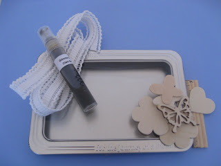
One of the many hats I wear is "Flamingo Four" coordinator for Flamingo Scraps. Each month, three other members of the Design Team and I each design with the same four products.  This month, we received Glimmer Mist, some wood veneers, some lacy trim and something that might be ordinarily considered trash - an empty Maya Road tin.

 
This is exactly the kind of challenge I love!  I thought about what I could store in the tin and let my design go from there. My son Trevor needed a place to store the flattened pennies that he's recently started collecting; the tin was just the right size.

The first step was figuring out how to cover up the brand name and slogan on the tin.  What would stick to the metal of the tin AND cover up the words without interfering with the closure of the tin?  Washi tape!  I layered torn bits of washi tape and it worked beautifully. 

 
Because Trevor's pennies are from our travels, I decided to back the opening with a map.  I found a 10-year old map of the western US that I haven't used in years.  I cut out the section of California where we live and attached it to the opening.  I misted the heart veneer, then I cut apart the trim and misted that.


When the mist was dry, I attached the trim and then added the heart.  


The tip of the heart points to where we live. 
 
Trash to treasure!  Have you ever made anything from an empty Maya Road tin or other manufacturer's packaging?  I'd love to see it!