Friday, March 9, 2012

Handmade Smash Book


Smash books are all the rage right now.  Just what is a "Smash book"??  Basically it is a way to capture memories and life moments. The idea goes back to the roots of scrapbooking when people made simple memory books. They stuffed them full of memorabilia, photos and mementos.  Then scrapbooking took on it's own art form.  The Smash book idea is to go back to that quick and easier way of capturing what is going on in your life.  You can quickly add journaling and photos, stuff in special treasures and there you have it, life captured and "smashed" into your book!

K & Company has a line of Smash books and coordinating products that are irresistible! Or...........  you can make your own smash book! The smash book I'm sharing with you today was made using digital scrapbook kits and office supplies.  You can make your Smash book as simple or as involved as you like.  It's all up to you.

At my local office supply store, I found a bunch of stuff that would work great in a Smash book.  Envelopes of any kind are great. You can save things like ticket stubs in them, or use them to hold supplies to make smashing easier, like paper clips or pens.  Those notebook dividers that you had to buy for your child's school supplies, make great pages and pockets in a smash book.  

Avery has some really neat clear or colorful PocketTabs that make a great addition to a page. They can hold CD's, journal tags, or more items you want to save.  They are self adhesive, so they are easy to add to your pages, and they have a built in tab which can help you organize your book. They come in different sizes too!


Let me walk you through my book so you can see how simple it is to create a Smash book for your self. For my cover, I used blank chipboard. I adhered some papers and elements to the chipboard using Mod Podge. The ones I used happen to be from a digital kit, but you can use any papers that you like.  As I was applying coats of the Mod Podge, I added some glitter to the title strip of paper across the front.  I also bought the K & Company rubber band and pen from the Smash book collection. The pen is cool. It is a pen on one end and a glue stick on the other. This really helps make adding things to your book easy. I used my Crop-o-dile to punch holes and bound the book with book rings. This will allow me to add pages to my book if I want.


Pages 1 and 2, I've got plenty of room for journaling and photos. See that funky tape holding my journal tag on? That's also from the K & Company Smash book line.  So easy to just tape things down, and they have several tapes that are so decorative. You could use Washi-tape too!


Page 3 and 4, In between these pages, I inserted a pocket divider.  I covered it with coordinating paper to make it look pretty.


Page 3 and 4 (again) - just to show you that I covered the back of the pocket divider as well.


Page 5 and 6, I did a bit more decorating on these pages. I used digi kits that are all about journaling, Illuminated Journal 2 and Illuminated Journal 3 both by ViVa Artistry. These kits are perfect for this type of project. Since my Smash book will be a journal of sorts, I thought it was neat to create pages that look like a journal inside a journal! You can make your pages super decorated, or very simple, whatever fits your fancy!


Page 7 and 8, more pages that express a bit about me. Hopefully they will encourage me to actually write and express myself in this book!  After all, it's not just about creating the book, it's about making it useful!


Page 9 and 10.  Here you can see one of those PocketTabs at work.  Here is a closer look
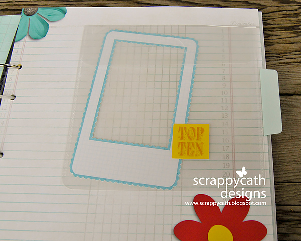
I've tucked in a frame and journaling element that I plan to use. Then I can use the pocket to hold special keepsakes!


Page 11 and 12, more tape! There is also another pocket divider. Right now it's holding some elements that I'll add to these pages when I start recording stuff.


Page 13 and 14, here I've included a decorated clasp envelope ( you can see the front and back) between the pages.  This will be great for holding some special items secure. You could decorate some of those return mail envelopes that come in all that junk mail. What a great way to recycle!

My book is a work in progress. That's why I like using the book rings for the binding. I'll be adding pages to this book. As it grows, I can change the rings to larger ones if I need to.

You can make Smash books for themes, time periods, moods, any reason you like. Maybe create one for a friend to record her memories while she is pregnant, or one for the time while planning a wedding. Maybe create one to capture all the fun you'll have on a special trip.  What ever you choose, just remember to have fun with it, and make it yours!

Thursday, March 8, 2012

Lego Party Decorations

My son turned 8 in February and he finally got the Lego themed party he had been asking for!   I thought I was in trouble when I first started looking for Lego Party supplies. All I could find were printable item, which I was not thrilled about using ink up on or Lego Star Wars supplies and that was not what we wanted. So I turned to my trusty paper crafting supplies to get the job done! I thought I would share some of my ideas for the Lego themed party.

Goodie Bags

I found these little bags at Wal-Mart for .25 cents each.  I bought extra and punched out circles and pop-dotted them to make it look like a lego brick. I purchased lego reading books for the kids and Cole made each of his guests a unique lego creation. The goodie bags were a bit hit!


Decorations:

This is a candle holder that I filled with legos and then made a few lego flags out of cardstock and BBQ skewers!

This is a banner I made out card stock by cutting the paper in to 'bricks' an then punching circles out and pop-dotting them- so easy!

I had more banner bricks than I needed so I tied them on the back of the chairs.

Lots of balloons and bright table clothes and its a PARTY!


I decorated the house while my son was not around and he when he saw the decoration she was stunned! He said I did an amazing job! :) 

Think about how you can use your current paper craft supplies for your next party!


Wednesday, March 7, 2012

Designer Showcase: Playing with Color

Today we are having a little fun with color. First we used some basic math and then we threw in a splash of color. We went with a simple palette. We are showcasing projects that use black and/or white +1. So they can have black or white (or black and white) plus one other color.  Sounds easy doesn't it? Sometimes these limits make it very difficult to create. But take a look at what the designers have to show you!


For her page, Pam used white plus yellow. Isn't this adorable?  OK so her photos are really special. But the bright yellow is so happy and cheery. I love the way she has done the papers in a sun-ray design. Makes the whole page feel happy!


I have a card to share. I did white + blue. In this case a Tiffany blue. It is the brides color, this is a shower card. But I'm guessing you figured that out by the umbrella.  Turned upside down to catch all the happy wishes for the new couple!


Black and white + tan = a wonderful page from Heather. I just love the heart that is all filled up with love!!  Then take a look at all those layers. Really neat how she used small amounts of paper and trims to have such a big impact on her design.  This is a great idea for how to use up scraps of paper that you just can't part with. Another idea I like on this page is the neat, straight border around the page, It contrasts with the staggered layers, and scattered splatters (that's a tongue twister!)  to keep the eye centered on the page. Neat idea!


This is another one by Heather that uses the white and black + tan = gorgeous equation! On this page Heather has used more white and shades of tan with black accents. It gives such a warm feeling.  The treatment to her photograph really adds to that feeling. I like the mix of patterned papers and the journaling around the page is really fun.


Marlene did a page that is black + white! I love how much detail she was able to get on this page with just the 2 colors.  The way she did her title really gets your eye moving on the page, and the three swirls repeated in the upper and lower corner help you take in the whole page.  I also like the use of circles below the square/rectangle photos, adds so much dynamic to the page.


Vicky has 2 pages to share with us. In the first she has used white + a soft rose color. This makes a real vintage beauty.  The bits of lace peeking out and doily are super sweet. The distressing and curled edges make it oh so shabby chic!  I really like the way she laid out the heart doily, photo, flowers and ribbon. It reminds me of a hand help bouquet of flowers.


How gorgeous is this page? With just black and white, Vicky has created a lovely page that is timeless. Black and white are so classic. Each of Vicky's layers builds a gorgeous frame. The filigree corners blend so well with the patterned paper in the center.  I really like the soft touch that she added with the dainty flowers at the corners of the photo.

Try limiting yourself to just 2 or 3 colors on a project and see how fun it can be. You just might spark some brilliant creativity!

Tuesday, March 6, 2012

A Cutaway Circle Template to Share!

Here's a template to frame one of your special photos.  I used a circle shape to cutaway a section of patterned paper and create a layered frame for your photo.  The frame draws the attention to  your photo and gives you a beautiful line to add elements to your page.  Here is my layout called Happiness is...


I created this page using a kit by LDrag Designs called Enjoy Life.  It's bright colors sure give me that feeling of loving life.  Here is the sketch for our paper scrapbookers.


For our digi scrappers I have created a template in Photoshop.  You can download it from either of the file sharing sites below.


We always like to see pages from our readers so if you create a layout using a template or sketch, share it with us!  Enjoy!


Monday, March 5, 2012

Creating New Looks While Scraplifting Yourself

Happy Monday, it's Pam here. Hope your week starts out great!
As I have mentioned before I like to scraplift my own designs when I get into a scrap rut or I when I love the design. However, I do love the whole creative process when making a layout and I often don't want two layouts which look the same. I often try to come up with new looks to my pages each time. So, when I scraplift a design that I love, I make sure it doesn't look completely copied and that can be fun to achieve. :)
Here are some tips on how I go about this. I am sharing two examples today. Here is the original page that I scraplifted. It is a few years old. Notice the vertical circles with the text wrapped around the curves.


Here is my new page.  As you can see it utilizes some of the same ideas.


Here are some tips to change up your page as I did here.
1. Flip your design. Notice the text is on the left side rather than the right side.
2. Change up the color scheme. While both layouts feature my son, the color scheme is completely different.
3. Take away and add paper. If you look closely you will I added more paper on the second layout and dropped the bottom striped paper.

Here are the two layouts in my second example. The latter is the newest page.

There are quite similar but different too. Here is how I achieved that.
1. Change the photo arrangement. As you can see I altered the amount of photos as well as the placement and sizes.
2. Change the shape theme. using different hanging shapes on my page really changes it up. Hearts was used on my Autumn Love page while flowers were used on my Cherish layout.
3. Add more or less of the main paper elements. I think the biggest difference for me looking at this is the number of banners hanging down. Going from five to three makes a huge difference!

I hope this inspire you to scraplift your own pages!!

Friday, March 2, 2012

Reader's Pages!

Happy Friday to you!
I am sharing three great reader's page by Libeeti. You may remember her from older posts and a special post ... and I was very happy when I got an email w/some new pages as I love to feature projects here. Libeeti's blog is filled with some gorgeous projects, seriously you need to check them out.. so go hope over with this link for some great inspiration: http://creationswithlove-li-bee-ti.blogspot.com/ .

Libeeti is sharing three page w/no die cut machines just like the post I shared last week. Her pages today show how she cut three bracket shapes with just her scissors or by using punches. As you will see the outcome is really really creative!  At first glance you might think she bought or die cut each shape, but then you will see she did it all by hand. Whether it was creating those cool bracket shapes or the banner, she rocked these pages. Check these out!


Thanks Libeeti for sharing your pages w/us. Do you have some reader's pages you would like to share using one of the ideas, tutorials, or templates? Send it to me at scrappingpam73@yahoo.com and I will be happy to share it!

Thursday, March 1, 2012

This and That

I am not trying to sell anyone a die cut machine, but I use mine all the time and have been learning to work with software to take my projects a little farther.  I welded a couple circles together to cut my picture to appear like looking through binoculars.  To get the machine to cut exactly where I wanted, I first cut a template out of scrap paper, then placed the photo under the template and stuck it to the mat.  I could see exactly where the cut would be made.  The pattern was removed before cutting.  Measuring never works for me, at least not with the precision I was looking for this time.  The brown shadow piece used the same template with a couple rectangles added.
The tree and the branch were machine cut then put through a crimper.  I did the title backwards from what I usually do.  I welded the shadow (brown) and cut it in one piece.  The standard letters were cut individually then adhered to the shadow.  For a little more texture, I stamped the blue letters with white ink using an acrylic feather stamp.
To get the mottled look of the background paper, I lightly applied swirls of blue distress ink in a vertical motion.  To tone that down, the paper was sprayed with water  so the color spreads out and blends.  The paper was  allowed to dry and  an iron pressed the paper to uncurl it.
I really love to combine techniques to build a page.  It makes me happy to work on a page like this one and I easily lose track of time.