Thursday, September 30, 2010
What To Do With The Leftovers?
I find myself getting over whelmed with using up what I have and making room for new goodies so I created the leftover basket as a place for me to keep products that I like but have used most of them however, they are not with my regular scrapbooking supplies.
So when do I use my leftovers? Well my favorite thing to do with my leftovers is to make cards and tags. When I have a bit of free time but dont want to get in to a scrapbook page I will go to my basket and whip out a few cards. Its also great if you want to travel to a friends and do some paper crafting, all you need is your leftovers, scrap paper and tools and you can make lots goodies! The best part is you can feel good knowing you are using up your stash!
Here are two cards I made in 10 mins out of my leftovers!
Enjoy!
Wednesday, September 29, 2010
Designer Showcase: Page Using 3 Products or Less
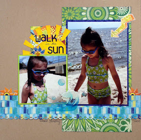
First up is a cute page by Heather! She used the three products: paper, stickers and stickles! Check out how cute this is!
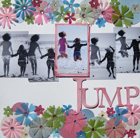
Nancy is sharing a couple pages with us. This first adorable page features the three products: chipboard, flowers, and bling! Check out neat this turned out!
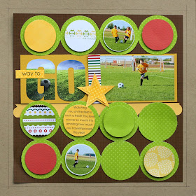
Nancy also created the next layout! This next neat page features paper, buttons and chipboard! This turned out great for only using 3 products!

Here is a page by me using 3 products. I got creative and did lots of shapes instead of embellishments! The 3 products I used are: paper, stickers, and scalloped paper.
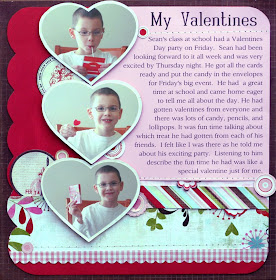
Here is one more page by me using paper, die cuts, and a white pen!
I hope you are inspired to try 3 or less products!

Tuesday, September 28, 2010
Easy handmade Hydrangeas
 The hydrangeas are made with circles. I used three circle punches to create the two different size flowers. My punches are 1 half inch, three quarters of an inch and 1 inch in diameter.
 You will need five circles for each flower, four circles of the same size make the petals. One circle 1 quarter of an inch smaller is the base which you will use to glue your petals.
On my layout the large flower is made with four 1 inch circles for the petals and 1 three quarter inch circle for the base. The small flower is 4 three quarter inch circles for the petals and one half inch circle for the base.
 I recommend that you try lightweight paper for your flowers. We are going to fold and glue each petal and the lighter weight paper is easier to handle. To get started, after you have punched your circles fold each petal in half.
 Now we are going to create second fold. In the picture I have drawn a line to indicate where this second fold will be.
 Once you have your second fold your petal should look something like this. Now carefully unfold the petal.
 Now place glue in the folds you just made and then fold the petal again. Hold the petal a short time to give the glue a chance to dry.
 Do these same steps for the other three petals. Your petals should have a slight curve to them now which gives them a more realistic petal shape.
Our petals are still too round to be just right, so now we will do just a little trimming.
 I have turned one of my petals over and drawn lines on the back of it to give you an idea of how we will trim them. We just want to take a little bit of the roundness out of the bottom of the petal near our fold. Cut just a little away to create a slight point near the fold. Try to stay on the lower half of the petal, we want the top half to stay round. In my picture I put a couple of small horizontal lines to mark the half way point. You won't cut these lines, they just give you a visual point for half way up the petal.
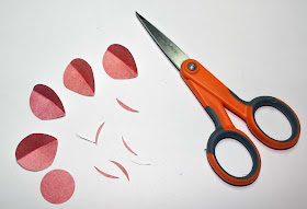 Above is a picture of my trimmed petals, you can see I just took a little bit of the paper away.
 I chose at this point to distress my petals. I used a Walnut distress ink on my darker flowers and Victorian Velvet on my light pink flowers. This is, of course, optional. You might decide to do something like Glimmer Mist or chalk to enhance your petals.
The darkened edges give the petals more definition and helps them stand out on the finished flower.

Now it is time to assemble our flower. Using the small circle as a base, glue two petals to the circle lining the points of the petals up in the center of your base. Now glue your remaining two petals on top of the first two spacing them evenly between the first petals. Line your points up in the center.

Add some rhinestones, pearls or other pretty centers to your flowers and they are ready for your layout!
Hope you have fun with these! I will probably use them often on my pages, cards and gift boxes.

Monday, September 27, 2010
8.5" by 11" Template/Sketch!
Here is JPEG version as a preview to the template.
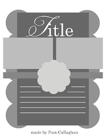
Here is a link to the digital layered template. To learn how to use clipping masks to use this template, click here.
http://www.4shared.com/photo/B4HId9bl/pc_fast_8.html
Here is also a sketch of the page for those who want that.
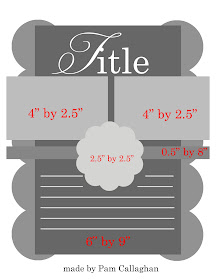
Here is a 12" by 12" version of that template I made using GCD Studios Independence Collection!
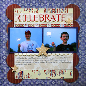
Enjoy!!

Saturday, September 25, 2010
New Two Curves Template
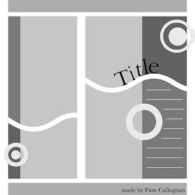
Here is template without embellishments or title in case you want that :)
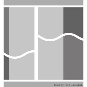
Next is the digital layered template. You can visit here how to use clipping masks on the template to use it for your digital page!
http://www.4shared.com/photo/p173AH4q/pc_2_curves_template.html
Lastly, here is the page I created with it!
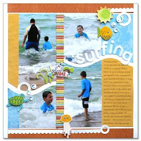
Enjoy :)

Thursday, September 23, 2010
Double Page Layout Ideas by Suzanne!
You can visit Suzanne on her fabulous blog: http://scrapwithsuzy.blogspot.com/ to get some more great inspiration!
Suzanne also runs a really COOL challenge site. I checked it out and it so fun. There is a new challenge every Wednesday! Here is the link so make sure you check it out: http://thepapervariety.blogspot.com/ .
Here is her post for today! I hope you as inspired as I am to create new pages!!
-Pam
______________________________________
Double the fun! Twice as nice! A perfect pair!
I take a lot of pictures. And I have a hard time deciding which ones to scrap. Don’t get me wrong - I love embellishments, patterned paper, fancy titles, and lots of bells and whistles; but when it comes down to it - the pictures tell the story for me. Most of my layouts are 2 page spreads, so I make the most of the things I just mentioned.
Even though the majority of sketches and layouts that I bookmark are beautiful one page layouts often with one main photo, I adapt it to fit my style. I think the easiest way to do this is to either a) repeat a design element or b) “stretch” a mat across the 2 pages. I thought I would share some of my favorites!
Here – I used photo corners, but I put 2 on the left page and 2 on the right. I also repeated the bracket border, in smaller horizontal sections and then again vertically.
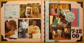
On this layout, I used a bracket frame for the main image on the right side and repeated this element in the journaling box on the left. I love to pair a one photo layout with one that uses more candid pictures.

A patterned paper border with a craft mat across 2 pages brings these 2 layouts together. Another example of a one photo layout paired with a page of candids.
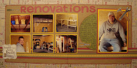
Pictures of same size and orientation bring a linear feel to a double page layout.
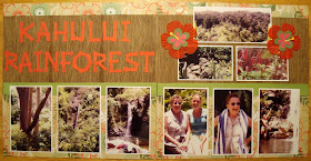
Banners are so popular right now! String a set across 2 pages for a fun double spread.

I couldn’t leave without one layout from my wedding album! This is one of my favorites – using all of the above suggestions. I stretched the photo mat across the 2 pages and repeated the border and flower embellishment.
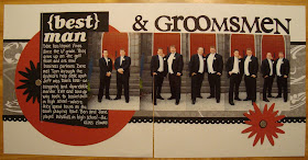
I hope you enjoyed these double page layouts and I was able to give you a few ideas and designs to inspire you to scrap multiple photos on multiple pages, while making the most of your supplies. Visit my blog for more projects! :)

Pocket Organizer
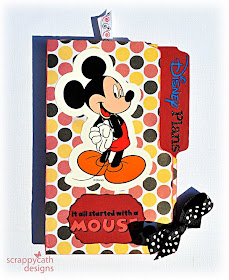
Today I'm going to share a crafting project that could have many uses. I made mine as a Disney trip planner, but it could also be used as a planner or mini-album. You could use it to prepare for the holidays to track your card list, gift buying and budget. And this project is easy on your budget. It uses supplies that you probably have on hand. The base is a file folder.
 I re-used a file folder for my project. You'll need a file folder with the tab on the left, adhesive, papers, trimmer and embellishments.
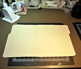 See the coffee mug in the background? Yep, it's Mickey! Just one of several Disney mugs I have. If you look closely in some of these photos, you'll see that I even have on a Mickey watch. I told you we love Disney!
Let's fold the file folder to create the pockets. First open it so that the tab is at the upper right. Then fold the bottom up about 4 inches as shown in this photo.
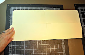 Now fold the left edge in toward the center until the straight part touches the center line. (see below)
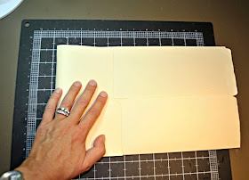 Fold the right side in toward the left until the "binding" area or back edges, line up.
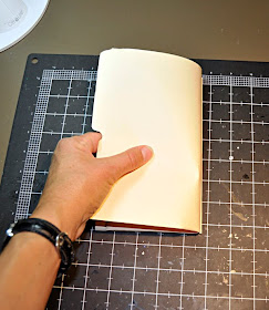
After the final fold, your folder will look like this:
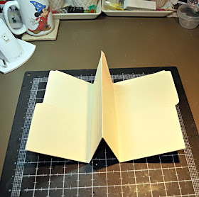
Now you can use your papers to decorate the inside pages, and your front and back covers. I also inked the edges.
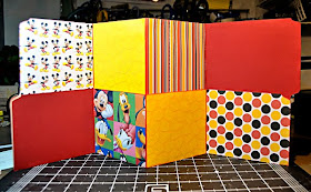
Use your adhesive to seal the outer edges of the pockets. Embellish your pockets and cover. Create cards or inserts and place them in the pockets. I created places to track dining reservations, our agenda, Hidden Mickey's that we find (we love those!). Since I may re-use this planner, I attached those lists to cardstock using brads, so I can add more or replace them as needed. I also created a pocket to keep receipts. For that I recycled a return address envelope, you know the kind that comes in your junk mail?!
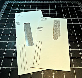 To make this, just seal the envelope, then trim off one of the edges to create the pocket. Cover it with pretty papers. I attached some ribbon through an eyelet to use as a pull for the envelope.
I placed eyelets at the base of the front and back covers, slipped some ribbon through. I knotted it on the inside and use it to close the accordian book or planner.
Here is a look at the completed inside pages of my planner.
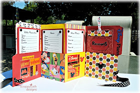 I hope you enjoy creating something handy with this versatile project. I saw a great holiday planner made in this same fashion in the ScrapMatters Newsletter. You may want to check that out for inspiration too.
Wednesday, September 22, 2010
Designer Showcase: Projects Using Glimmer Mist
First up with two glimmer mist pages is Heather. I love how she used just bit of glimmer mist coming of the corner of her papers to give it that perfect touch! It really matches well with her pages!
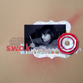
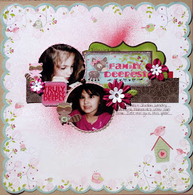
Lisa is sharing three glimmer mist projects with us! As you can see, Lisa used masking with glimmer mist on her the first two beautiful pages! On her third page, she used glimmer mist along the edges (with a little bit of masking) for a cool effect which goes so well with her themed page!
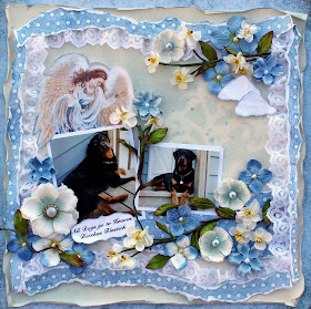
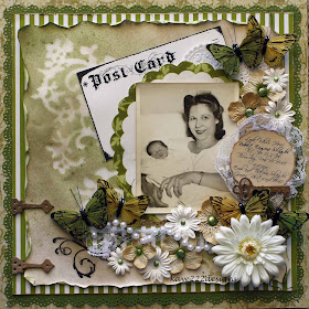
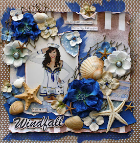
Nancy is sharing two pages with us! On Nancy's first pretty page she misted the seam binding and big flower to match them to the page! On the second page (which the photo was taken by Michelle Unruh) she masked the paper to match the background paper. Such cool looks to these pages!
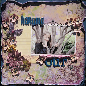
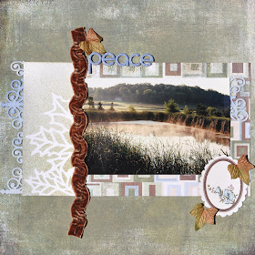
Sara is also sharing two pages with us!! In these two fabulous examples you can see the glimmer mist was used in the background and matches her color scheme so well. It really gives a neat effect on each page :)
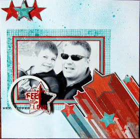
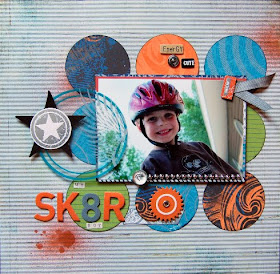
Lastly, I am sharing a beautiful page by Dolores! She colored cream flower (near the title) to match her page using glimmer mist. I love this idea since I have a lot of "cream" flower laying around! I will have to try this!
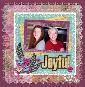
I hope these pages are as inspiring to you as they are to me!! :)


