Happy Wednesday! Today the contributors are sharing fabulous page with buttons! I know they will inspire you to create that perfect button page!
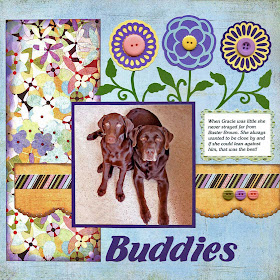
The first page is by Dolores! She used buttons in the center of three flowers. She also used three buttons on the bottom to finish off the page. This turned out so beautiful and the buttons are that perfect touch to her page!
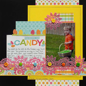
This next page is by Heather. Heather used the buttons as the center of her glittery flowers. I love how she lined the up the flowers and put one extra one at the top!! A fabulous Easter page and the buttons really add a lot of detail to her page!
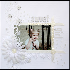
Susan created this next gorgeous page! This is really beautiful how she kept all light colors on her page and she used white buttons to frame her photo. It really makes the photo stand out well!
Delaina created these next two pages! I love how many buttons she used on the top page! She made a tree even prettier by accenting it with buttons. Such a clever idea! The bottom page shows how she lined up the buttons and how neat that effect looks!
I am also sharing a page I did a while back with buttons from Tessa Ann!
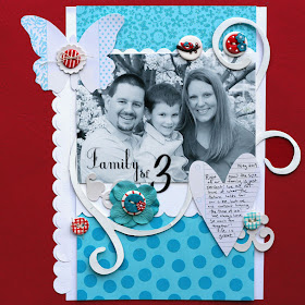
I hope these pages inspire you do some pages with buttons! If you want your button page featured on the blog, send it to me at scrappingpam73@yahoo.com .
Wednesday, March 31, 2010
Tuesday, March 30, 2010
Mini Album Madness
I don't know about you but I LOVE mini albums. It gives me the opportunity to create on a small canvas. You can make them as simple or as ornate and decorative as you choose. There are so many designs, shapes, and themes to choose from. You can surely find something to suite your occasion and they even make great gifts. You can find them made of cardstock, chipboard, canvas, acrylic or all mixed together for a unique look. You can ink them, paint them, cover them with paper or sew on them till yoour heart's content. Anything goes on these little bundles of creativity. Mini's are a great way to try new products and techniques on a small scale and achieve the most fabulous looks around. Go ahead and take the Mini plunge...you'll be glad you did. I have included a few examples of a couple of mini's I have created. Check out my blog if you'd like to see more details...
http://delainas.blogspot.com/
Monday, March 29, 2010
Reader's Pages!
I received some fabulous reader's pages in my inbox and I can't wait to share them with you!! Today and sharing three pages from three scrapbookers!
The first page is Monica. She made this neat page using the principles that guest designer Alicia G. posted about using visual triangles. You can read the original post here. Monica also used circles just like the Designer Showcase:Circles post here! I love the way her page turned out, so fun with all of those Mickeys on there!! You can see Monica's blog here, so make sure you check that out ;) .
The next page is by Libeeti! I posted her first scrapbook page last week and this week she sent me her next page using flowers just like the Designer Showcase: Crazy for Flowers. You can see that post here. This page turned out so beautiful!! She used flowers perfectly and the tones of the page are so pretty! You can read more about Libeeti on here blog!!
This last page is by Irit! She also used used flowers like the Designer Showcase: Crazy for Flowers. She used so many beautiful flowers on this page plus all of that bling! I am totally loving her floral page ;) . You can read Irit's blog here. Make sure you visit her blog for more inspiration!
Thanks so much ladies for submiting your pages!!
Would you like to be featured on this blog? Simply use one of the templates, techniques or other ideas on this blog. Send me an email at scrappingpam73@yahoo.com and I will feature you projects!!
Sunday, March 28, 2010
Tutorial on Creating Vignette in Photoshop Elements!
I love creating vignettes on my photos. It just gives that perfect focus to the center of the photos. Today I am showing you a SUPER EASY tutorial that anyone can do with Adobe Photoshop Elements ... even those who don't know the program well. I have created detailed instructions and screen shots of each step!
Here is the before and after of what I made, before I start the tutorial!
Step 1: Open your photo in Elements.
Step 2: Click on the Elliptical Marquee icon. You can see it circled on the screen shot photo below on the left hand side tool bar. Start at the TOP LEFT side of the photo and drag that to the bottom right until you get what mine looks like below. You will see marching ants around that area.
Step 3: Go up to the top tool bar and go to SELECT>INVERSE.
Step 4: Go up again to the top tool bar and go to SELECT>FEATHER.
Step 5: A box will pop up, type in the number 200 (you can also try a lower number in later uses to see what a different effect that has).
Step 6: Go to the layers palette on the bottom right side. You will be clicking on the icon labeled "create a new layer." A blank layer will show up.
Step 7: You will need to make sure the foreground color is black (you can also try brown or any color you like). Click on the very bottom left color icon that says "set foreground color." If you need to change your color, click on that and make it black.
Step 8: In the left hand tool bar again, click on the Paint Bucket Tool. Go to the outer edge of the photo and click on it. It will paint that area black.
Step 9: You are going to want to get rid of those marching ants. Go to SELECT>DESELECT on top tool bar.
Step 10: This is optional. I like to lower the opacity on that black layer. Go to the bottom right tool bar and you will see the opacity tool. Slide that to the left until you get the desired amount of color.
Step 11: Right click on that blue layer on the bottom right hand side. After right clicking go down to flatten image. Save that image under a different name than the original and you are done!!
Let me know if you have any questions :)
Saturday, March 27, 2010
A Page of My Birthday Boy & Sketch!
Hello!! Today is Sean's 8th birthday!! So, please leave a comment to wish him a happy bday!
This post is so late b/c I woke up with a horrible migraine.. one of those where you can't move and if you do, you get sick. It was that bad. So, about an hour ago it went away completely!
In addition to creating my page, I used the brand new GCD Studios Chip Art tool. I don't usually work with paints and I have never worked with modge podge before. But this tool is totally addicting. It is so easy to use and there is a tutorial on how to use it here. Trust me you don't have to be an artist to use it and I must say this tool is now one of my favorites. I am already brainstorming ideas on how I can use it next! I made this page about my son when he was much younger ... around 1 years old. I hope you find inspiration from it. You can see I used the Chip Art tool on the hearts. I embossed hearts into the large hearts, painted and put modge podge on top! I also used the GCD Studios Ella Blue Collection (one of my all time favorite collections) on this page.
Here is a close-up of one of the hearts!
Lastly, here is a sketch of my page for you to work with if you like! (I edited the sketch because I was off a little with the dimensions.
Friday, March 26, 2010
Creating A Beachy Page by Marlene!
This is the first layout that I have done using a picture from our recent vacation. Getting my son to allow his picture to be taken is difficult so I love this picture because he looks so relaxed and happy. We were having such a great time being together after ten months of separation and it shows in this photo. I wanted the layout to reflect the casualness of the beach and the contentment of the occasion.
The background paper was created to hint of waves and the subtle variations in colors at the beach. I cut a mesh bag that had contained Clementine oranges. Any type of mesh bag will work but this one has thick lines which created a sharper grid. The edges of the mesh were secured to a cutting mat outside the cardstock one edge at a time working to flatten the plastic. A stipple brush can be used to apply acrylic paint, but I used a dauber here for an uneven application of the color. I have also had good results using multiple colors by allowing each color to dry before applying the next.
Embellishments and title were cut with a Cricut using the Life Is A Beach cartridge. All of the edges of the cuts were outlined using a Stampin Up watercolor pencil, then blurred with a water brush. Fiskars border punches called sunburst and waves were used to give just a tad more definition. For this page, I was going for an uncluttered but not particularly clean look ... like the beach.
(CLICK HERE TO LEARN MORE ABOUT MARLENE)
Introducing Our Featured Artist for March 26!
Glad it's Friday, how about you? I am sharing a friend and fabulous scrapbooker today for the featured artist. I really like how she always makes her pages unique and fun! You can see this by checking out her beautiful gallery here. It's always neat the friendships you make online and so I asked her to be a featured artist! I know you are going to love her idea today, so let's get to know Marlene!
I live in the Upper Peninsula of Michigan and I am the mother of two adults. My son currently is stationed in Nicaragua serving in the Peace Corps. My daughter goes to the local college and should finish next spring. I work as an administrative assistant, my husband and I hope to both be retired by 2011. Most of my life I have dabbled in this and that to find a creative outlet, about 8 years ago I discovered scrapbooking. I am a multi-media kind of scrapper and continue to learn new techniques and improve my craft. Like many others, my most frequent subject matter is my family and recently I have been documenting the stories of my children as they were growing up. I like to write and enjoy telling stories in my pages but sometimes let the picture say it all. I don’t claim to have any particular style and scrap whatever catches my fancy, I might choose a photo from 20 years ago or one from yesterday. The closest scrapbook store being a three hour drive is a huge motivating factor for making my own embellishments and creating patterned paper. I enjoy all aspects of scrapping so I don’t mind improvising a bit.
Here is her fabulous gallery again: Scrap4brains
Check back in a bit for a fabulous idea and technique from Marlene!!
Thursday, March 25, 2010
Easter Project Ideas!
I have been scrapping a lot of Easter photos lately. I'm trying to finish last year's photos before this Easter. It'll never happen because I take entirely too many photos, but I'm having a blast trying. I ordered the March kit from Scrapbook Deals 4 You, and it was crammed full of the We R Memory Keepers Hippity Hoppity line. The colors matched so well with my photos. If you’re looking for Easter papers, I definitely recommend this line.
Here are a few of the Easter themed layouts I’ve made lately. If you want to see a product list feel free to visit my Scrapbook.com gallery. (My user name is miracles_momma over there.)
If this paper line is too bright for your Easter photos, I’ve done a bit of research just for you. I looked for lighter Easter colors and found two lines that look really soft and sweet!
Check out American Craft’s Dear Lizzy line here…
http://americancrafts.typepad.com/studio/2010/01/dear-lizzy-american-crafts.html
Jillibean Soup also came out with an adorable line called Egg Drop Soup that you might like as well!
http://jillibeansoup.typepad.com/my_weblog/2010/03/easter-projects-to-enjoy.html
Wednesday, March 24, 2010
Designer Showcase: Crazy for Flowers!
Happy Wednesday!! It's time for more inspirational projects! Today is Crazy for Flowers!! With all of the flower scrapbook items available anyone can create a beautiful floral page! The contributors and I are sharing some our favorite flower pages.
First up is Susan. I am sharing two different pages because I love how she uses flowers in such a unique way on both! The first page is the perfect baby page with flower accents. The second page is such a cool way to do flowers on a page!
Next is Cathy! She made this all digital page and it turned out so pretty! I love how the flowers are scattered around on the page! The other accents are beautiful as well.
Heather made this beautiful whimsical page and used lots of flowers to match the flowers in her daughter's hair. This page is scrapped perfect for the "Fairy" theme!
Dolores created this beautiful floral page and used a lot of flowers to frame her photo! I love how it makes the photo "pop" and the gorgeous colors she used for flowers!
Here is a page by me! I lifted the design from a previous featured artist's page, Lisa aka Kaye222. You can the original page here. I LOVE Lisa's page and had to try this design out! I don't normally use a lot of flowers but I thought it would look nice here growing out of the grass.
I hope this inspires you to create your own page with flowers! If you want to be featured on the blog, send me your pages with flowers!
Tuesday, March 23, 2010
An Easter Egg Template!
I recently went to a crop and had the pleasure of making some new friends. One lady had some adorable photos of her daughter with the Easter Bunny. I asked her if I could create a page with them and share it, share graciously said yes. So here is a cute egg shaped template that you might try with some of your special Easter photos.
This template is pretty simple and should fit on letter size paper. I used a pattern paper for my background and a solid for the stripes, but you can get really creative and make the top and bottom pieces of the egg different paper from the middle. Here is my layout using the template.
I embellished by layout with some die cut shapes that I cut out with my Silhouette. I thought these bunnies were really cute and fit in nicely with the photo of this darling little girl of my new scrapbook friend! She is truly “Eggs-tra Special.”