This is one of those skills that takes a really keen eye, or just a lot of guts to give it a go. Mixing up patterns together on the same project can be really intimidating. A great guideline to make it easy for you if you're just getting started trying this is to use papers from the same manufacturer/line. They've already done the coordinating for you. The colors go well and the patterns are a good mix.
If you want to pick and choose papers from your stash and try mixing them, here are some great examples from our Contributing Artists.
Marlene created this page. I love the design. She told me this page nearly put itself together. I wish my pages would go together so easily and look as wonderful as this! I like that she used colors in her papers that pull the colors from her photos. Her papers were all part of a monthly kit. So some coordinating has been done, but not quite as readily as staying with one manufacturer/line. Marlene chose a larger yet subtle pattern for the background with the grid paper. She then built a base on it using a small print (polka dot) with a contrasting darker color. On top of that she used a medium sized pattern (floral) which goes back to the light shade. She also used border punches which helps to add distinction to the patterns. The photo is matted on plain cardstock, but surrounded with a border cut small patterned yellow paper. Off topic, but I also like the balance that Marlene gave her page by placing a string of elements under the smaller "string" of photos and one larger element above the larger photo (made larger by the yarn).
Pam shares this great example of many patterns on one page. Her papers are by GCD Studios and My Mind's Eye. First, she kept her colors bright and her backgrounds lighter. Pam took advantage of the off white paper behind her photos. Not only is it a great neutral color, but it has a fantastic pattern that lends itself well to blending with other patterns. The grid design on it goes great with blocked shapes (the red and green papers), as well as stripes (the dark blue and yellow papers). But since the grid is on a diagonal, it coordinates just as well with strips on the diagonal ( the light blue paper). By blocking her design, Pam also gave the eye a break between each of the patterns - another great tip for coordinating patterns on the same project.
Cindy shares this great tip for combining patterns - use moderation. She started out with the large dot pattern as her background paper. This gave her a great base to coordinate with. She used those color when selecting other patterned papers for her page. She created a mat for her photos using a medium sized pattern in one color and kept it trimmed close. She cut several different patterned papers into narrow strips. This allowed her to include several patterns without creating a large conflict to the eye. Another great tip that she incorporated on this page, is how Cindy made the chipboard letter mimic the background paper, but reduced the size of the dots.
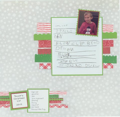
Again using moderation, Cindy was able to include 7 different patterned papers on this Christmas List page. She kept her background a medium sized pattern in a subtle light shade. This allowed her to build some cheer on her page with those seasonal colored patters. Cindy added to the whimsy and fun of the page by cutting them with different scissor shapes too. Another neat thing bout this page that has nothing to do with patterns. I love that she included her sons actual hand written list. What a great way to really preserve those memories!
Here are some neat ideas in this layout by Gael. Her background is a large subtle print orange paper with a wispy look to it. This makes it a nice choice for adding other patterns on top. She then used some yellow striped paper to add an analogous color and blue dotted papers to add a complementary color by the color wheel. This adds some contrast and more vibrancy. To create the frame for the photo, Gael cut out a Prima tag - great reuse/recycle idea. Down the sides she rolled up small pieces of the accent papers to add dimensional texture to her page. What a great idea for using up scraps of paper! Another idea for using scraps of paper is the pretty bow that Gael made from paper at the top of the page. Adds just a bit of floral pattern to tie in with the journal tag and flowers on the page.
I hope this gives you some ideas of ways to combine patterned papers on your next project!


Great tips!
ReplyDelete