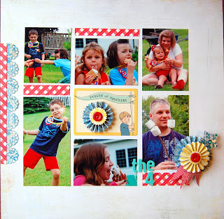
Here they are!
I found it easier to use more than one photo when they were turned black and white. This made these 'flow' better for me when creating my layout.
Although, there is more than one photo on this page I did feel like one photo still needed to be the focal point. Therefor, I like to highlight the 'main' photo, in this case with the frame.
I was pleasantly surprised with this layout. I really had a hard time placing them on the page until I clumped them together!
Ok, this is the same photo but there are three of them, this counts as more than one photo right? :) I really loved using the same photo multiple times, especially if it was a small size.
I knew when I printed these photos that I had to do a layout that showcased them all. So I was sure to get wallet sizes prints to accompany one large photo.
Lastly this one was a challenge! I was only trying to use up some scraps on this layout. I really love how the simplicity of the layout makes each photo sand out on its own.
So, this is how I go out of my comfort zone! Be sure to push yourself once an a while. Try something new!


Love them all Sara! Way to step out of your comfort zone! I'm the opposite to you... I love to pack multiple photos on a page, I struggle doing a page with only one photo!
ReplyDeleteI'm the same as Cathy- I have the hardest time using only one photo on the page. The more pics, the better! I love what you made.
ReplyDeleteLove all your multiple photo pages!!!!!!!! It is a great idea to use wallet sized photos. That gives me an idea :-)
ReplyDelete