Welcome to Wednesday and Happy Leap Day! Today for the Designer Showcase we are sharing some quilling projects.
Check out this gorgeous project by Nancy. She has created some beautiful blooms in a vase for this card. I love the curves of the stems and the deep colors are so rich. She even adds detail to the vase with the 2 rolled golden quills.
Cindy and her husband quilled hundreds of vellum swirls and hearts to decorate the tables at their wedding. Cindy saved some and used them on this layout. What a great idea. Now she's got a page that is filled with memories and mementos of that very special day!
Cindy recently taught a beginning quilling class. These are the projects that the class learned and accomplished. They are also pretty! Cindy shows the quilling used on greeting cards, tags and place cards.
Quilling is a great way to make use of left over strips of paper. We hope this gives you some inspiration to give it a try!
Wednesday, February 29, 2012
Tuesday, February 28, 2012
Heather's Sketch 12
Hi everyone! I'm back with another free template to share. This template features more hexagons because I'm on a hexagon kick lately. In fact, I used the negative hexagon cut from the last sketch I posted on my example page. So if you have the free .svg file from my last post, you'll be all set to work with this sketch.
The sketch was based on this layout that I created with my February Scraptastic Club kit called "Hearts A Flutter". I loved these photos of my daughter concentrating while addressing her Valentine cards. She always works really hard to pick out the perfect card for each one of her friends.
I only have a few extra example pages because I was too sick to send the sketch out early! Marlene came through for me with this absolutely adorable snow themed page. I love the letters that she chose for her title work, and the layered octagons totally rock!
Nancy also supplied an example page using the sketch. I love the awesome color combination she used and the super fun title she chose for this layout about her husband making his own cheese for the first time. I think it's great that she adapted the sketch to work without the hexagons too!
I was able to create a digital layout with the sketch this week. I did it yesterday morning! There's nothing like waiting until the last possible minute. Right? I used some Jenni Bowlin Studio digital supplies from the store at Jessica Sprague's website to complete this page about my son playing at the park.
Before I go, I have a free matching digital template that I made in Photoshop Elements for digital scrapbookers. Please click the link below to download it!
Monday, February 27, 2012
Marble Painting
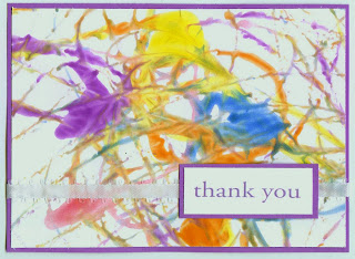
Do any of you remember marble painting from back in your preschool days? I love marble painting. It's quick, easy, inexpensive... and just as fun for adults as it is for kids. The finished marble art is beautiful on its own, but you can also use it anywhere you'd use patterned paper. Here's a quick card I made using a marble painting as the background.
To make a marble painting, you'll need: marbles, washable paints (I like Crayola), paint cups (mine were once applesauce containers), white paper, low-stick tape, and an empty shoebox.
Put some paint into each paint cup. If the paint is thick, dilute it with some water. You'll want the paint to be a bit runny. Drop a marble in each cup.
Make loops of low-stick tape, then attach a piece of paper to the bottom of the shoebox. Pick up a marble and drop it in the shoebox. Pick up the box and wiggle it to make the marble roll around. When there is no more paint left on the marble, put it back in the paint cup. Continue with different colors until you are happy with the design.
Here is Trevor's finished paper.
Of course, you don't have to drop the marbles in one at a time. You can put them all in at once if you want.
You could use a larger cardboard box if you wanted to marble paint on a 12x12 sheet of paper. You could add glitter or a pearlescent powder to the paint for a different look. You could start with colored paper instead of white. The possibilities are endless!
Friday, February 24, 2012
No Die Cut Machine, No Problem
Hey all, it's Pam here! Do you need some ideas for using your exacto knife or scissors to create some neat shapes without a die cut machine? I own the Making Memories Slice, but I don't own any of the big machines. I do use my Slice, but I really enjoy cutting things out and using my exacto knife. I find it kinda fun. I also enjoy finding new ways to use my exacto Knife!
1. My first page features a template I created in PSE. First I will share with you the page before I go into how I went about doing this page. The buttons on the banner was inspired by page (I think?) is by Greta Hammond.
I created the banner and letters all in one in PSE... that was my first step. Here is a screen shot of the image. This was easy to make with the oval cookie cutter shape and the letter from font pharmacy (if you computer savvy give this a try but maybe with a different font or word).
After I created my template I flipped it horizontally and copied and pasted into The Print Shop. I do all of my printing there, but I am sure you can use Photoshop to print as well.
The reason you are going to want to have it backwards is because you are going to print this on the REVERSE side of your paper or cardstock. Once you have printed simply cut this out using scissors or your exacto knife, flip it back over and you will have the finished banner word (with right orientation)! I also have included the PS file if you would like to download the template and below is the JPEG version for traditional scrappers.
Here is link:
http://www.4shared.com/photo/KKsF4rjn/pc_cuteness_banner2.html
Here is JPEG image. The title is already flipped, so just print on REVERSE side of desired patterned paper, cut out letters/banner and flip:
2. The next two examples feature leaving space around the shapes I have cut out for a neat look. For this first page, I cut out a bunch or different sized hearts and traced on outline on my papers (leaving a little space). I cut out that traced border and put my hearts inside. Check out my page. The ribbon w/hearts was inspired by an older page by Robyn Werlich! Love her stuff.
3. My third page also features the same technique as the second page, except I used two different pieces of papers as the border for my butterflies. I wanted the butterflies to look like they were flying up the page. Both pages feature no die cutting, just scissors and and exacto knife!
Do you have some cool ideas for cutting out shapes? Share them below :)


Thursday, February 23, 2012
Simple Card Sketch
Today I am here to show you a super simple card design and 3 different cards created with the the design.
Simple card design, huh! To me a sketch or design is just a starting point. Its not meant to be copied identically, it servers more as and aid to your creative style. We are going to take the sketch and change the size and style, here we go! Oh, one more thing this sketch the best for using up your scraps!!!!
This cars is pretty strait forward from the sketch. Four coordinating papers cut down to fit the card size and adhered side by side. I added a simple cream strip with a sentiment and cork star with a stamped image layered on top. Simple.
Here is card #2. I selected a more pastel color pallet out of my scrap bucket for this card. I also embossed the pink card stock paper to give it a 'pop' and rounded the corners of the 2 outside paper strips for a softer look. Topped it off with a pretty pike and a hand made banner - up, the post of the banner is a tooth pic!
I went to a square 6x6 card therefor changing my size of my strips of paper. I also decided to make the strips in to flag and over lap them just a bit. I added the decorative boarder to the top and some embellishments and its done!
Lets recap the things to change to make this card different:
*Card Size
*Paper Colors
*Paper Strip Size
*Alter Paper Strips (flag bottom, rounded corner, border punch the bottom or sides, so many options)
*Number Of Paper Strips (only use 3 or 2 and leave part of the card showing!)
*Embellishment and sentiments to keep the card unique
Wednesday, February 22, 2012
Designer Showcase: Snow
It's nearly Spring time here! Even though this winter season has been milder than some years, we are still anxiously looking forward to the warmer temps and sunnier days! So we thought this would be a good day to have a Designer Showcase of Snow projects!
Cindy shares 2 of her favorite snow pages with us today. Snow on Father's Day? Wow! That would be unheard of in my area. Cindy is a master at the multi-photo page. This one has some really cool things I want to point out. I really like the 2 vertically set photos on the top and bottom that seem to "break out" of the rectangle. They make me think of the mountains where these photos were taken. I also really adore the simple, but very dramatic snowflakes drifting down from the top of her design. Very clever!
Don't you just find yourself looking all about at this page by Cindy? Her design keeps your eye moving about the page taking in all the wonderful photos and journaling. The blue of the background paper seems to extend the sky from her photos right out on to the page! The little touch of red on the scalloped edge balances perfectly with the colors of her son's coat!
Dolores has really captured the feeling of cold, bright, brilliant snow on her digital page. That glittery background paper sets the tone. The intricate blue snowflakes tucked in so nicely give the feel of a gently snowfall. I also like her choice of brown as an accent color in her title and elements. It picks up the coloring of the stark trees and her beautiful dogs!
When I saw this page by Vicky, it took me back to winters of my childhood when we would ice skate on the frozen lake. The fancy lacing that she did looks so much like my old ice skates! The vintage image adds to that old time feel. I like how Vicky highlights the colors of her photo with her choice of blooms.
There is so much to adore on this page by Vicky. So just take your time and take it all in. The distressing, the crocheted doily and lace all add to the vintage shabby look and feel of the page. Her gorgeous blooms done in white are so perfect, like snowflakes on this page! This page really needs no journaling. But you could easily add some to one of the paper tags tucked behind the photo.
After viewing all these beautiful snowy pages, you may be feeling the chill of winter. So I thought I'd leave you with a "warmer" project. This is a round wooden box that I dressed up in chilly winter style to store hot cocoa mix!
So gather up the photos you've taken this winter, make yourself some hot cocoa, and have fun scrapping!
Tuesday, February 21, 2012
Fun background templates for your gorgeous pages!
I just love all the great backgrounds that I have been running across lately. Heather did a fun hexagon background just recently. You can catch it here if you didn't see that post. I had enjoyed mixing multiple patterned papers with a strip background, click here to see the post. Today I am sharing two more backgrounds that I came up with while experimenting with shapes this week. I think both make interesting backdrops for photos and allow for the use of multiple papers too! Here is the first background, I call it a crescent background.
I had fun using graduated colors in the papers I chose to fill the background. The page was created using a beautiful kit by LDrag Designs called Sweet November. Here is the sketch for our paper scrapbookers.
A crescent shape is really very easy to cut from paper. Just cut two circles, overlap one circle over the other, trace your cutting line, then cut your crescent. Once you have a crescent shape use it as a pattern for the rest of your background crescents.
The second shape I experimented with was a bracket. I joined a few brackets together to create a wavy line, then built a background with that wavy line. Here are some example layouts using the template.
Here is Maggie, my very sweet and cooperative dog. She never seems to mind me taking her picture. This layout was created with another kit from LDrag Designs called Summer Sherbet. I have one more example to share.
For this layout I used four different background papers on the wavy lines. The kit is by Siamese Studio and is called "Love Is". I have just found this designer and thought she created a lovely romantic kit. Below is the sketch for our paper scrapbookers.
Each wavy line is just under an inch wide so you can fit 12 wavy lines on a 12 by 12 layout. I have created PhotoShop template files for our digi scrapbookers. You can download the files from either of the two file sharing sites below.
4Shared: Crescent Template
MediaFire: Crescent Template
4Shared: Wavy Bracket Line Template
MediaFire: Wavy Bracket Line Template
Hope you enjoy experimenting with these backgrounds. We'd love to see what you create! Thanks for stopping by.
Monday, February 20, 2012
Peony flower Tutorial
Here is a fun and easy flower tutorial to make a peony flower. No difficult techniques or fancy tools/products required!
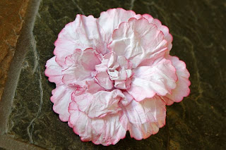
What you'll need to create this flower is:
-- white cardstock (the cheap stuff from Michael's is just fine!)
-- chalk ink color of choice (I used pink)
-- 6 scallop hearts using a punch or die (your choice of size - depending on the flower size you want to achieve). My punch is 2.5 inches = 3.5 inch flower on done!
-- 2 scallop circles using a punch or die (about half or 2/3 of the size of the heart size you use - mine is 1.5 inches). You could alternatively use a small flower punch.
-- water mister
-- brad (you will not see it so don't use a decorative one)
-- tweezers
-- paper piercer or anything to poke a small hole through 8 paper layers
STEP 1 - Ink your hearts and circles (or flowers) - you do not need to blend the ink.
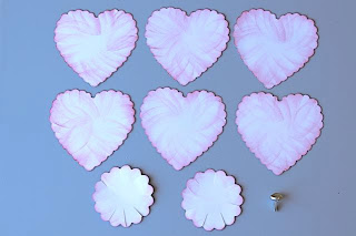
STEP 2 - Cut a slit a every second circle scallop "valley". You may end up with odd number as I have so for the last one cut in the middle of one of the "mountains". Skip this step if using a flower punch.
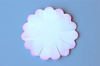
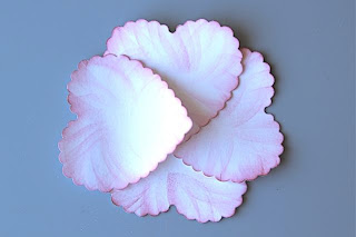
STEP 3 - Water mist all of the hearts and circles and stack 4 hearts like this:
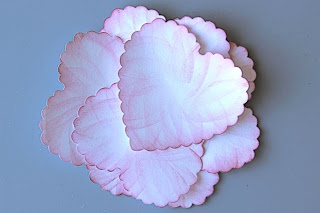
STEP 4 - Add 2 more hearts but place them a little closer to the middle than the first 4.
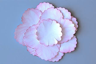
STEP 5 - Add your 2 circles to the pile and mist a little more
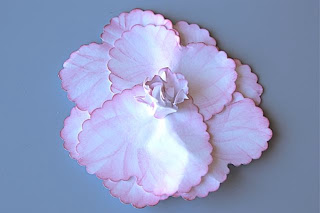
STEP 6 - Poke a hole with your paper piercer, secure the brad in the middle and start scrunching the circles toward the centre in to a tight paper wad - for nice creasing.
STEP 7 - Do the same with one heart at a time and give the entire thing a good tight squeeze. Let it sit like that for a few minutes. If your flower is very wet, you may need to let it sit for a while. You want the petals to be barely damp so that when you open it up, they curl back well instead of flatten out.
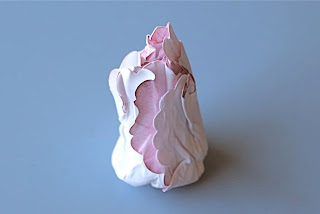
STEP 8 - Carefully pull back the hearts tips a bit and shape curved down like this:
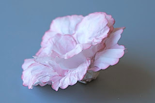
STEP 9 - Using your tweezers, twist/shape the centre as desired. Let it dry overnight or speed things up with a heat tool until completely hardened.

DONE! That's it. No complicated tool or techniques!
Here is a variation from a past project, using only the large hearts with patterned paper and a bunch of berries instead of the circles. This worked better for a Fall layout about my boys.

What you'll need to create this flower is:
-- white cardstock (the cheap stuff from Michael's is just fine!)
-- chalk ink color of choice (I used pink)
-- 6 scallop hearts using a punch or die (your choice of size - depending on the flower size you want to achieve). My punch is 2.5 inches = 3.5 inch flower on done!
-- 2 scallop circles using a punch or die (about half or 2/3 of the size of the heart size you use - mine is 1.5 inches). You could alternatively use a small flower punch.
-- water mister
-- brad (you will not see it so don't use a decorative one)
-- tweezers
-- paper piercer or anything to poke a small hole through 8 paper layers
STEP 1 - Ink your hearts and circles (or flowers) - you do not need to blend the ink.

STEP 2 - Cut a slit a every second circle scallop "valley". You may end up with odd number as I have so for the last one cut in the middle of one of the "mountains". Skip this step if using a flower punch.

STEP 3 - Water mist all of the hearts and circles and stack 4 hearts like this:

STEP 4 - Add 2 more hearts but place them a little closer to the middle than the first 4.

STEP 5 - Add your 2 circles to the pile and mist a little more

STEP 6 - Poke a hole with your paper piercer, secure the brad in the middle and start scrunching the circles toward the centre in to a tight paper wad - for nice creasing.

STEP 7 - Do the same with one heart at a time and give the entire thing a good tight squeeze. Let it sit like that for a few minutes. If your flower is very wet, you may need to let it sit for a while. You want the petals to be barely damp so that when you open it up, they curl back well instead of flatten out.

STEP 8 - Carefully pull back the hearts tips a bit and shape curved down like this:

STEP 9 - Using your tweezers, twist/shape the centre as desired. Let it dry overnight or speed things up with a heat tool until completely hardened.

DONE! That's it. No complicated tool or techniques!
Here is a variation from a past project, using only the large hearts with patterned paper and a bunch of berries instead of the circles. This worked better for a Fall layout about my boys.


