Wednesday, June 30, 2010
Designer Showcase: Book of Me Pages
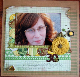
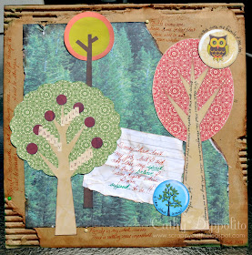
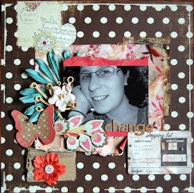
First is Cathy! She created two beautiful pages all about her! Cathy had this to say about her first page, "On the Changes in Life page, I used a lot of symbolism. I had just become another statistic of the down turned economy and had been laid off from a job I really enjoyed. I made the page on a piece of card board that I peeled and roughed up. It represents me, been through a bunch of stuff in life, but still sturdy. You can read more about the other symbols at my gallery here."
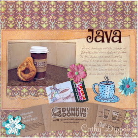
Here is a neat page she made about how much she loves Java!
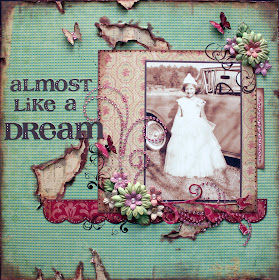
Susan created three wonderful pages about her! On this first page, Susan had this to say about it, "Me when I was about 5 years old. I won a school beauty pageant. My mother made my dress…I felt like a princess. I did a lot of distressing on this layout, to give it the look of old wallpaper in the background. I used K&Co papers, added a few rubons, some flowers, and a few bling swirls."
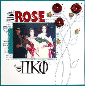
On this next gorgeous page, Susan explains the reason behind this page, "The Rose of Pi Kappi Phi is a photo of me at about age 18. The stems and leaves were machine stitched freehand. The flowers are layered and glued together and then smushed for depth. I used a background “word” stamp behind the photo. All lettering was cut with the Silhouette."
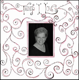
The last page by Susan shows us some awesome doodling. She said this about her page, "The Things I Love layout is all doodling with a photo of me at age 58. I doodled all the swirls in pencil, erased the lines where I wanted my words, wrote the journaling in pencil and then drew over all of it with a black pen. I added touches of red with a pen and then smudged a little red chalk on the layout."
The next page is by Nancy. She created this fabulous BOM page for a challenge over on thecolorroom.ning.com! I just love the techniques she used ;)
Sara created these two gorgeous page all about her! These turned out so colorful and fun and she used the embellishments so well on her pages! Check out the way she uses big blooms!!
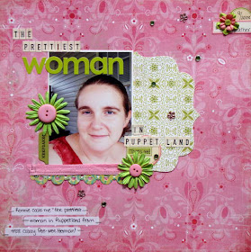
Lastly, is three fabulous page about Heather! She had this to say about her first page."The first layout I have to share from my Book of Me is about my nickname. My husband calls me "The Prettiest Woman in Puppetland" from the old Pee Wee Herman show. It cracks me up, so I had to scrap about it."
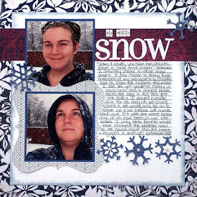
On this second page Heather said this about it, "The next one, is about how much I love snow. We rarely get it in Louisiana, so every time we do it's a treat. I included lots of journaling on my layout to capture all of the details."
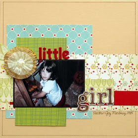
On Heather's third beautiful page, Heather said this about it, "I really loved this photo my Mom took of me digging in the closet for stuff that I wasn't supposed to be messing with."
I hope you have enjoyed seeing these book of me pages by the contributors!
Tuesday, June 29, 2010
A Tip for Easy Paper Weaving
I feel weaved elements can add texture and interest to your layout. To create the circle you see here I cut 1/2 inch strips of two different papers, one patterned paper and one solid paper. I then took a very thin piece of 12 x 12 white cardstock and used it as a base to hold my strips in place while I worked on weaving the strips together. I used a removable adhesive that comes in a runner dispenser and placed adhesive along one edge of my cardstock. I laid all my solid color strips side by side securing one end of each strip in the adhesive. I gave myself just a tiny bit of space between the strips as I laid them out since the paper weaving process does need some room in order for the end product to lay flat.
After the solid color strips were secure, I used my removable adhesive to add additional adhesive to the right and left edges of my cardstock. With the adhesive on the edges of the cardstock, each strip I weave can be anchored on both sides and your weaving won't come apart as you work not matter how much you move the paper around.
Keep working up your page anchoring each strip as you go. When you have finished weaving the entire page you are ready to trace your circle on the woven page. The lines you draw for your circle will become your cutting lines.
When your circle (or any other shape) is drawn on the page, you can keep all these woven pieces together by stitching with a sewing machine just inside your cutting lines.
When your stitching is complete you can cut out your shape. Once your shape is cut you no longer need the base paper, so just carefully tear it away from the back of the circle and this will make your piece less bulky.
Here is my second example for you. In this layout I used on of Pam's templates as my background. It's the beautiful Die cut flower template. I then decided to make two individual woven flowers for the page. In this case my strips are just 1/4 inch wide because the shape is so much smaller.
This picture is actually me when I was about a year and a half old. Just about everything kids wore in the 50's is different from today!
Monday, June 28, 2010
Another New Contributing Artist!
1. What is your favorite aspect of scrapbooking?
I have to two favorite aspects of scrapbooking. I love that I will always have these memories for myself and future generations to look at and remember my families story. Secondly, I love all the friends I have been through scrapbooking. When I started my son was only 3 months old and I did not know many other moms but I have found a great group of girls who have given me lots mommy help and more through the years.
2. What products/kit clubs are a must have for you?
I love paper! Its like I can never have enough paper! I also have an addiction to punches. There is so many things you can do with punches and its great because you get so many uses out of one tool.
3. How many pages do you think you completed in 2009? Was it more or less than you wanted?
I really have no idea how many pages I completed. I know did not give myself as much time to scrapbook as I would have liked but I am getting better at that in 2010!
4. Is there any secret advice on how you complete your pages?
Challenge yourself to step out of your comfort zone. I think we are all capable of things we thought were undoable.
5. Name 5 of your favorite fonts.
Well, this is tough for me because I dont actually use fonts. I usually use my own hand writing, stamps or stickers.
Here are two of her favorite pages!
We are so lucky to have Sara!! Welcome to the team!
Sunday, June 27, 2010
Using Watercolor Pencil & Penny Black Stamps!
Step 1: Stamp your image onto plain cardstock. I used the Penny Black Nature Trail Ted stamp.
Step 2: Select you watercolor pencils. I used three different shades of blue: light, medium and dark for the overalls.
Step 3: Gently shade in area with different colors. I used light blue all around and added a bit of medium and dark blue. Here is what the overalls looked like shaded.
Step 4: You will need a very thin brush and a bowl of water. Get just the very tip of the paint brush wet, so you almost can't see the water. Gradually paint over and blend the colors together like my image below. If you need to dry off and repeat in a new area. Make sure you let the water dry before you go to a new place to color.
I repeated this step for the entire image. You can see my final card here.
Here is another layout where I did a bit of blending on the stamped image (Penny Black Shindig stamp) which sits on the "5". I used a Penny Black stamp (Paisley Swirls) in repeat for the "5" texture.
Hope this tutorial helps a bit when using watercolor pencils! :)
Big Green Giveaway WINNERS!!
Here are results.
#35 won the green album, thickers, and chipboard!
- Joy said...
-
I love your blog because the layout isn't all fussy, it's really like a magazine and so easy to navigate.
- June 21, 2010 1:40 AM
Congrats winner! I will contacting you later today! Thanks to everyone who sent in sketches and gave comments about the blog ;)
*** I forgot to announce that Lydia picked the Father's Day Rak winner. and it was:
- Suzy said...
-
I had been thinking about a project for Father's Day and have a tutorial on my blog for a coupon book I designed
http://scrapwithsuzy.blogspot.com/2010/06/fathers-day-coupon-book-tutorial.html
Thanks for the chance to win !! :) - June 7, 2010 10:14 PM
Saturday, June 26, 2010
Reader's Pages Made Into Sketches!
First up is an innovative page by Chiara C. I love the original layout for several reasons. The design is so unique and fun and the way she created the scalloped border is really cool!! So check out the original page along with the sketch. You can visit her blog here: http://kykyscrap.blogspot.com/
The next beautiful page is by Melanie K. I love this design because it really flows well and shows of the photo in a creative way. That banner on the top is so cool! Here is her page and the sketch I made of it. You can visit Melanie's blog here: http://digisci-mk.blogspot.com/
I will keep doing turning the pages sent to me into to sketches, so if you sent me a page, I will let you know when I am posting it :) Thanks to Chiara and Melanie for sending me these FABULOUS pages!!
Thursday, June 24, 2010
Creative Uses for Leftover Chipboard by Dani!
First, cut your scrap paper into a square a little larger than the size of the letter. Wad it up a few times and then open it back up again. Glue it to the letter, making sure to keep the wrinkles in it. For more wrinkles, you may want to do more than one layer, or use thicker paper/cardstock. Also, depending on the color of paint and the color of the paper, you may want to glue the patterned side down, leaving the 'back' facing up as the front of the letter.
Then, paint over the front of the letter. I, personally, like to apply a thin layer of paint so that you can see some of the paper below. Once it's dry, decorate it if you wish.
(CLICK HERE TO LEARN MORE ABOUT DANI)
Introducing Our Featured Artist for June 25!
My name is Dani. I've been married nearly 4 years to my soul mate, a soldier. We have one son that will be 1 in July. We've lived in 3 different states since we've been married, and will be moving again within the next year. Right now, we're on the central coast of California. It's pretty, but not home. We're originally from Alabama. When I'm not crafting, I love to exercise! Running is such an amazing stress relief! I also enjoy photography and Alabama football! ROLL TIDE!
I've been crafty my whole life, but I've been scrapbooking for a few years now. I honestly wasn't too hooked until my son was born. I design for Momenta, as well as another challenge blog and challenge forum. I really enjoy what I do, especially if I can involve paint and bright colors in there somehow! Right now, I'm addicted to altering take-out boxes! Oh, and I just want to throw in that I'm lucky enough to have a husband that not only appreciates my craft, but will also occasionally scrap with me! =)
Don't forget to visit her blog here: http://alongcamedani.blogspot.com/
Check back in a few for a great idea by Dani!!
Zip Dry Glue
Before I got my bottle, she also passed along a tip from Mike (The Beacon Glue Guy). “The best way to keep Zip Dry caps clear is to not store it with the application cap. After you are done using the glue, let the cap drain into the bottle, unscrew it and store it with the flat cap. To clean out the application cap, I usually shove a popsicle stick into the cap and let the remaining glue dry onto the wood. The next time I use it, I yank out the stick and the dried glue comes out with it. The glue won’t stick to the inside of the cap too well.”
I loved the glue from the first time I used it! It dries so fast you won’t believe it. It bonded burlap to paper, photos to glitter paper, buttons to paper, and so much more. It even holds those big, bulky Prima flowers down! It is acid and lignin free and archival safe. My favorite part about the glue was the fact that my paper and photos didn’t wrinkle like other wet glues. I really didn’t believe that part of the description on their website, but let me tell you it is true! It dries very clear, and none of it showed through on my project at all.
In the layout above, I used Zip Dry to adhere the burlap to the paper base of my layout. Then I used the Zip Dry again to adhere the photo to the burlap. You can see that there was no wrinkling or warping of the photo or the background paper. I also used it to adhere the chipboard bird.
In this layout, I used the Zip Dry to adhere my photos to the glittered cardstock that is so famously hard to stick things to. I had no problems! It bonded quickly, and hasn’t peeled off like so many other glues do with the glittered cardstock. I also used it to adhere the Pink Paislee fabric strip. It didn't bleed through the fabric, and it holds really well.
*Please note that I have not been compensated in any way for this review. Beyond the original RAK of the bottle of glue, I am not getting anything out of this review other than sharing a super cool product with my fellow scrapbookers!*
Wednesday, June 23, 2010
Designer Showcase: Projects With Transparencies!
First is Dolores! She created this amazing page about her husband (I love that she used three photos of him in that hat!). This is what she had to say about her page,"This layout has my DH when he was between 3 and 4 years old. His dad told us they had visited a local fire station and Mark got to try on a helmet. Before I married my DH he worked as a part time firefighter. He has great memories of this job. I could not find any pics of Mark when he was working in California, but he had saved his uniform and helmet. So...I asked him to put them on so I could take a picture (he he he), because I had the idea for this layout. It is amazing what us wives will ask our husbands to do, and they put up with us."
Here is the special transparency she bought at Hobby Lobby to create this page!
Susan created three amazing pages with transparencies! Her first page is a transparency that she made by stamping flower images (with Stazon ink) repeatedly across a transparency.
This second beautiful page is using Hambly Transparency! This turned out so cute!
Susan's third page is using a is a PSE brush that she printed out on a transparency. Neat idea!
Heather created two innovative pages using transparencies. Check out her first page! She used a transparency from Hambly!
On this second beautiful page, Heather used transparent clouds and a fence!
Lastly, I am sharing a few projects by Nancy! I love that transparent arrow on her first page! It is a really neat effect!
Her next page features a transparent title. That goes so well with the page ;)
Her last project is using an acrylic album! She painted the edges of the clear plastic! This is really cool!
I hope you have enjoyed seeing some ideas for transparencies!
Do you want to share your favorite project using transparences with readers? Send me an email at scrappingpam73@yahoo.com and I will feature your projects!