I've had several girls ask me about editing a photo to leave a portion of it in color, so I decided to write a tutorial about it. I use Photoshop Elements 6.0, and you'll be seeing screen shots from that specific program, but you may be able to adapt some of the steps if you're using a different program.
First, Open your photo in Photoshop Elements. Go to your layers palette and right click on your photo. A menu will come up, choose Duplicate Layer from the drop down menu.
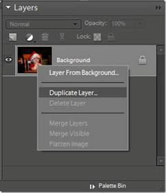
You will then see two identical copies of your photo in the layers palette. Click on the top photo to make it the active layer.
Click on Enhance, and then click on Convert to Black and White. A new window that looks like this will pop up.
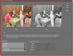
In the bottom left hand corner of that window you will see a menu that says Select a Style. This gives your black and white conversion several different looks. As you click on them the Preview image on the right hand side will change. You can also adjust the Red, Blue, Green, and Contrast of the photo using the manual sliders. When you are happy with your changes you can click Ok to commit changes. You can see my before and after images in the preview above. (Of a different photo, I edited before.)
Next, Select your Eraser tool from your Tools menu, and make sure the black and white copy is selected in your layers palette. Carefully click on the photo on the portion that you want to remain in color, to erase the black and white copy and allow the color copy to show through.
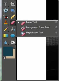
Once you erase all of the portions of the black and white photo that you want deleted, go to Layers in the top menu bar, then click on Flatten Image. Then you can save your completed edit under a new file name so you do not save over the original. Here is my finished copy.

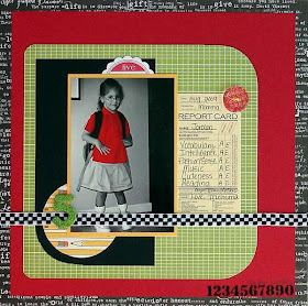
There are several different ways to achieve this look, but I find this one to be the simplest to explain. Here is a layout with that I completed with a photo that I edited to leave a portion in color.
Sunday, February 28, 2010
Saturday, February 27, 2010
Embrace Negative Space Layouts
I for one love negative (white) space on my Layouts. I have the hardest time filling the page up to the edges. I get a feeling of calm from the naked areas on the page. You don’t have to stress over the creation of the negative areas on your page. Try to imagine imaging a complete Lo in the center of the page or even in one of the corners. The use of bold color can help in achieving a well balanced negative space LO. I tend to color my layout in a triangle. This gives me the feeling of balance and creates a flow across the page. The background paper does not have to be a solid cardstock. I use lots of different patterned papers for the backdrop of my negative space Los. You can use lots of sketches to create a negative space LO as well, even if the sketch was intended for a full page LO. Try duplicating the sketch on a small scale in the center or on one side of your background paper. There are so many different ways to achieve this favorite look of mine. I hope you’ll give it a try. Here are a few examples…
Thursday, February 25, 2010
A Sketch and a FlowerTechnique by Susan D.!
When I originally started working on this lo, it was totally ment to turn out a different way. However, when I started working on it, I wasn't "feeling" it. I am "sure" you know exactly what I mean when I say that. I did know I had it in my mind to use the bottle caps with my son's photo's in them as the flower centers. I also had planned for my lo to be more "Pammyish". Well, that didn't happen either. I ended up going the extreme opposite. That's how it is sometimes. Your scrap pages just "evolve". That is what happened here. In my head I saw a cluster of flowers, and this is what I came up with for my lo. Through the help of a friend, Liz Qualman, she was kind enough to turn my lo into a sketch for me. Otherwise, I would have been sending Pam a pencil drawn sketch. I am hopeless at Photoshop for that sort of thing. My thanks go to her for helping me out. I hope you find my sketch inspiring, and I can't wait to see what wonders you do with it!
For my tutorial, I am going to show a different twist to the flower I used on my lo. The supplies you will need are paper, circle punches (or whatever you use to make circles), scissors, adhesive, bottle cap and charm.
First you will want to cut or punch your circles. The size and number of layers is totally up to you. Once you have circles, you can fold them so you can cut them down to different sizes. Sorry for the out of focus photo. It was hard taking a photo with one hand and holding the camera in the other! However, I think you can get the idea.
Now take your various sized circles and scrunch them up. This will give them more of a dimensional look to them.
Next cut or punch your paper to fit the top of your bottle cap. You will want to go ahead and glue this paper on to the top of the bottle cap. Now you can glue the charm or whatever you choose i.e. button, small flower, alphabet... on top of the paper covered bottle cap.
Lastly, glue the bottle cap and various sized circles together. You should now have a cute bottle cap flower!
Pattern paper by October Afternoon "Fly a Kite", Misc. ribbon and bottle caps
(CLICK HERE TO LEARN MORE ABOUT SUSAN)
Introducing Our Featured Artist for Feb. 26!
Hello everyone!! Yes, it's Friday already, this week went super fast! It's time again for our talented featured artist! Today I honored to share an artist who has an amazing style and is quite well known in the scrapbook industry ... and is a friend. I get to work with her on Pebbles Inc and have seen lots of amazing project done for the Pebbles blog! She does amazing work so don't forget to check out her gallery. It's time to get to know our featured artist, Susan Dupre!
I studied interior design back in 1995, the first time I lived in London, England. After getting my feet wet in the industry, I opened my own business. I soon found I was attracted to every style of design out there. In 2004 and in London for a second time, I gave birth my little guy Hayden. After procrastinating three years after his birth and having put interior design on hold for a while, I decided it was time to start scrapping my little boy's life. I was in San Francisco visiting a friend, and I stopped into a scrap store. I bought a few things planning to start "that baby book" soon. I remember checking online, and I found a site called scrapbook.com. I immediately got involved in challenges to help me learn. This was in March of 2007. I have never looked back. I never dreamed it would become all that it is for me today. My hubby actually hates it when I say I actually love scrapping more than interior design. Since then I have only grown as an artist, and I have been so fortunate to have been published and to be on mfg. design teams. My style and tastes in scrapbooking is just the same as interior design. I love it all - from vintage, fun and funky, edgy to clean and simple. I can't begin to tell you just how many wonderful friends I have made out there too who are fellow artists. What a pleasure it has been to have meet several of them in person, and what an honor it is to be asked to be a guest for this site. Thank you Pam.
Here is her fabulous blog: http://www.scrappysusandupre.com/
And her beautiful gallery: ScrappySusan
Check back in a few minutes because she is sharing not only a sketch but also a technique! You will love it ;)
Sweet as Honey
For this layout, I really wanted the word “honey” to look like actual honey. So I dug through my stash and pulled out every yellow and gold letter I had on hand. But nothing looked right! They were just letters… and they definitely didn’t look like honey. So I did what any crafty gal would do. I made my own!
First, I took some raw chipboard letters and painted them with a bright yellow acrylic paint.
Then I sponged lightly around the edges with a slightly darker shade of yellow paint. While they were still wet, I sprinkled a tiny amount of gold glitter onto each letter.
Next I misted everything with a healthy coating of Pearl Glimmer Mist and allowed to dry.
Once they were dry, I generously coated each letter with Glossy Accents, careful to eliminate any air bubbles as I went. Then I added a bit more glitter to each letter and left to dry completely.
Remember how Winnie The Pooh's honey pot always had honey dripping down the rim? I wanted that same effect on my letters. So once the first coat of Glossy Accents was dry, I placed my letters at an angle by just resting them on a pen. I then glopped some more Glossy Accents on them and allowed it to freely drip down each letter.
After some more drying time, I had letters that looked like I just flipped the ol' honey bear over and wrote with it. Here's a close-up of the end result:
Sweet, huh?!
Wednesday, February 24, 2010
Designer Showcase: Color Scheme!
It's the 150th post for Ideas for Scrapbookers. COOL HUH?
Today is another designer showcase, where I share a technique or idea and some of the contributors share their take on it!
I am sharing a color scheme today. It is one of my favorites!! I think you might now why ... fresh, bright colors along with KRAFT!! I do love my kraft paper. I made this in honor of Valentine's Day but also added in a little extra -- teal! I will show each designers take on it and how the modified it to fit their page.
Here is the layout by me that inspired the color palette:
Here is page by Cindy. She used lots of the teal and red and also added two more colors, a darker teal and black. Isn't it neat how the black makes all of the colors pop? Such a cute page!
Here is a page by Cathy! She used the original colors with a kraft background, but also added a few more colors to complete her quilt! She arranged the quilt pieces in such an interesting way! Fabulous take on the color scheme!
This is a page by Dolores. She use the original colors and used a teal background! It is neat how she used more teal flowers and used a little red in the ribbon and heart! A nice page!
Lastly, we have a page by Heather! She chose to make red and pink as her primary colors to go along with these adorable photos! Heather did a great job of modifying the color scheme to fit her page!
If you want to share your page using the color scheme, please email me at scrappingpam73@yahoo.com . Your page will be featured on the blog if you would like ;)
Tuesday, February 23, 2010
New, New, New!
Hi everyone!! I have a brand new sketch/template to share! I made this layout below first and then decided it would make a cool template and/or sketch!
So, first I am sharing the sketch of the page for traditional and hybrid scrappers!
Next, is for hybrid and digital scrappers! Click on the link, download and open in Photoshop. Here is a preview and the digital layered template.
Click on this link to download:
http://www.4shared.com/file/228383138/bbce6cb/pc_circleflower_template.html
Have a fabulous day!
Monday, February 22, 2010
Enhancing Projects with Border Punches
I enjoy using border punches on all sorts of projects and during this past year some great new punches become available on the market. I have a special fondness for a few of the Martha Stewart “Punch Around the Page” punch sets which include a border punch and a matching corner punch. These punch sets will let you put your design uniformly completely around the edge of a rectangle or square. As a result these punches are never far from my scrapbook table. I think border punches are beautiful on their own, but they can take on a new look when you layer them. I have created two examples with a few of the punches I own. First a layout with pictures from the beautiful Shenandoah Valley where my sister in-law and her husband have a farm called Tall Oaks.
In this layout I wanted lots of earth colors, blues, greens and touches of burnt red and brown. Since my layout design was simple, I added a punched border to add interest to the grouped pictures. This is where I used a Martha Stewart punch set. I used a light green paper to punch the border design and then backed it with a bold blue color so the punched design would really stand out on the page. I wanted a nice break between the pictures and my title area, so I took a simple Fiskars scallop punch and punched 3 strips in different colors, gradually changing from the bold blue to tan color. When placing the strips I made sure each row of scallops offset the design with the previous row. The result was a nice texture break in the page than really anchored the pictures at the top.
I love making cards almost as much as I do scrapbooking. While I’ve only been at it a year or so, it has been a rewarding experience. I have found people appreciate so much the time you take to make a personal card. I got inspired to use border punches more in card making when I attended a Stampin’Up class hosted by Rochelle Hart, a friend of mine who is a Stampin’Up demonstrator. We made a number of beautiful cards that day, but I did come away with a favorite.
The card has an embossed rose that is painted with water based ink (the kind of ink you buy to re-ink stamp pads). Rochelle taught us how to do this in the class. Both the rose stamp and the ink are from Stampin’Up. The card incorporated a layered punch design that is so easy to do. For my card above I used the Fiskars lace border punch. Once again the pattern is offset in the two punched rows to create a more interesting look. I really like the touch of elegance the punched rows add to the card. Now when I sit down to make a special card, I take a second look at my punches to see how they might enhance my project!
In this layout I wanted lots of earth colors, blues, greens and touches of burnt red and brown. Since my layout design was simple, I added a punched border to add interest to the grouped pictures. This is where I used a Martha Stewart punch set. I used a light green paper to punch the border design and then backed it with a bold blue color so the punched design would really stand out on the page. I wanted a nice break between the pictures and my title area, so I took a simple Fiskars scallop punch and punched 3 strips in different colors, gradually changing from the bold blue to tan color. When placing the strips I made sure each row of scallops offset the design with the previous row. The result was a nice texture break in the page than really anchored the pictures at the top.
I love making cards almost as much as I do scrapbooking. While I’ve only been at it a year or so, it has been a rewarding experience. I have found people appreciate so much the time you take to make a personal card. I got inspired to use border punches more in card making when I attended a Stampin’Up class hosted by Rochelle Hart, a friend of mine who is a Stampin’Up demonstrator. We made a number of beautiful cards that day, but I did come away with a favorite.
The card has an embossed rose that is painted with water based ink (the kind of ink you buy to re-ink stamp pads). Rochelle taught us how to do this in the class. Both the rose stamp and the ink are from Stampin’Up. The card incorporated a layered punch design that is so easy to do. For my card above I used the Fiskars lace border punch. Once again the pattern is offset in the two punched rows to create a more interesting look. I really like the touch of elegance the punched rows add to the card. Now when I sit down to make a special card, I take a second look at my punches to see how they might enhance my project!
Sunday, February 21, 2010
A Fun New Sketch!
Friday, February 19, 2010
Creating Polished Stones Out of Paper by Gabrielle
I'm often asked how I come up with some of the idea's I used on my layouts, and the answer is that I'm often inspired by products, photo's, print ad's and in this case TV! When I was working on this l/o there was an episode of America's Next Top Model on TV and the girls came out wearing these huge polished stone necklaces. And I thought, ...hey, I could make that out of cardstock to decorate my page! Above is the result and here is how I did it....
You will need the following items:
~ Some bright blue cardstock (sky blue, bright blue or turquoise)
~ Circle punch or scissors (for other shapes)
~ black in pad
~ black fine point pen
~ white gel pen (like Inkssentials or Signo Unibal)
Step 1
Punch out circles of blue cardstock (or you can cut out odd shapes that you've seen polished rocks come in....I used a scissor to cut out the rounded diamond shapes on the left side of the layout). Now take your ink pad and rub around the edges of your cut pieces, creating a soft shadow that will give your 'stone' a 3D effect......
Step 2
Take a fine point black pen and randomly draw on black veins. Try to keep them running in one direction, although they can slightly wrap towards the top and bottom. Go lightly with the veining towards the middle of the 'stone'.
Step 3
Now to give your faux stone more of a rounded look and some shine add a slightly curved thick line of white with you white gel pen. ....Easy-peasy! You've made your own faux polished stone!
To add a different look to the stone you can mount it on a 'metal' base as I did in the l/o above. I did this by simply painting some plain black cardstock with some metallic gold paint, stick the faux stone to it and following the edge of the faux stone cut around it leaving a small edge (approx. 1/8 of an in or smaller)
Here are a couple close-up pic's of the faux stone in my l/o.....
You don't have to stop with turquoise polished stones. Try using cardstock in other colours (pink, green, purple), or perhaps try spritzing some dark wine colour cardstock with a gold glimmer mist to get a 'gold fleck' stone look (just follow the above instructions without the 'veining', just give it some shadow and highlight) I thought I would give pink cardstock a try in order to get a pink granite look. Below is a card I made up using the same method as above but with pink cardstock.....
There you have it! a quick and easy way to add a fun design element to your scrapbook pages and cards!
(CLICK HERE TO LEARN MORE ABOUT GABRIELLE)